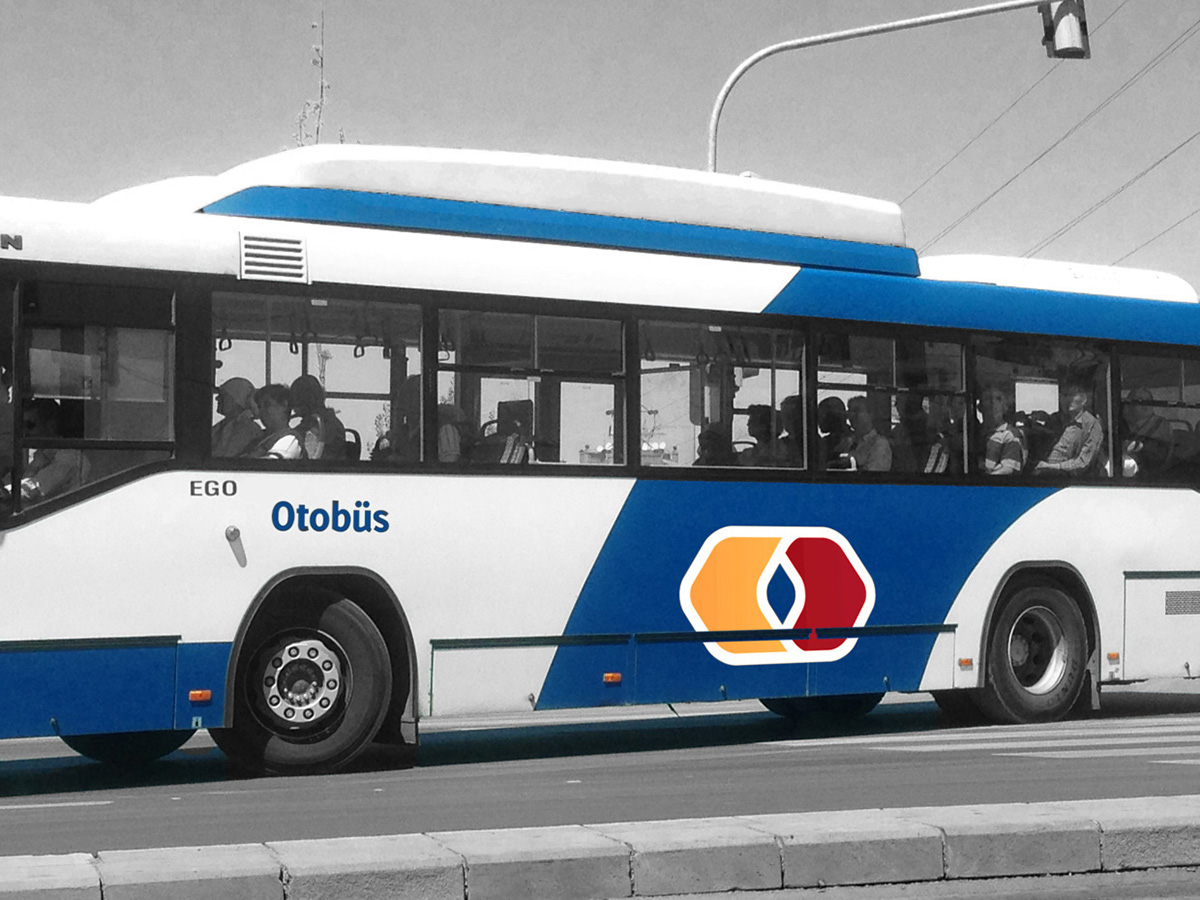
Buses are the most common way to get to somewhere in Ankara. The bus services of the municipality lack an identity for a long time and this project aims to bring style to the widespread transport service of the city. Although the bus services are managed by the main transport organization of the city (EGO) and the buses have EGO logo on them, the bus services are rebranded as a single organization in the project. One of my main purposes on this project was to create a distinguishable identity for municipality buses.
In Ankara, (and in many cities of Turkey) individual drivers use their own buses and serve in the bus lines that municipality set. These buses accept only cash, you can't use ticket cards that you use on municiplaty's services including buses and rail services.These buses look slightly different than municipality's buses, and it is pretty hard especially for tourists to distinguish the buses on the street: "Is it the one I can use my ticket card?" "Should I take off my purse?" Even us, people who live in Ankara can hardly differentiate if the approaching bus is municipality's, or not. So, a strong image and identity for municipality buses is an urgent need.
What we firstly created is an esthetic sign that can be used on so many different objects. "Otobüs" is the translation of "bus" in Turkish, so the letter "O" is represented on the sign. The logo has many different color versions that all use the specified colors. - This new logo for the municipality buses solves the problem explained above. After learning the sign once, anybody can easily recognise it on the bus, or on the bus stop, and can decide what to do next. What we created here is a sign that means bus, but doesn't look like one.


(directions, the comings and goings, arrows) + (wheel, letter "O", continuousness, sustainability)


Another current issue of the bus services is the lack of voice. The brand, the company doesn't communicate and interact with the customer, the passenger. All citizens are affected by this situation, and not only that, the tourists, the people who are needed to be hosted kindly, have a real big problem: Lack of translations. To solve the language and the voice problems radically, an icon language is developed. These icons can explain complex situations to any person of any nationality, it doesn't matter if you are Turkish or American. (Turkish and English text will also be provided with the icons.) Just like the ones on IKEA assembly manuals. With the icons, our voice can be heard by any person. This creates a friendly image on passengers' minds.


As mentioned at the begining, the bus services are branded as a single organization in the project. So, a different name was needed for the bus division of the main transport organization. To use a boring and usual name like "Bus Services Ankara Inc.", we have chosen simply "Bus". As the logo aims to represent the word "Bus", using only the word "Bus" on the logotype wouldn't be so strange. The logotype only includes this word. This may look funny to Turkish people at first, just writing "Bus" on a bus, but it serves to achieve our goal. The logo gains the meaning we want to emphasise. On official documents, the logotype will stay as Otobüs, but the longer and more formal name "Bus Services of Ankara- Ankara Otobüs Hizmetleri" will be used.


Line signs.


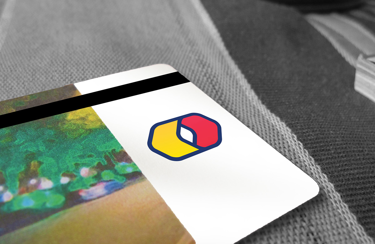
After December 2013, passangers will be able to use smart cards, Ankara Kart (like Oyster in London, or Mobib in Brussels) on buses and other transport systems, but the classic magnetic card system will probably continue. These cards can be used on any transport system run by the municipality, so there won' t be a card special to bus services. Anyway, a card design special for the bus services is included in the project.


Bus services also have a really succesful app. The app is redesigned with the new branding rules. The current design of the app looks complicated, and has functions and buttons that users don't even know what they do. The number of buttons on the home screen is reduced to 3, enabling users to find their bus according to line, stop, or location. Another


Document format.


Business cards.

This project doesn't have real connections with EGO, the main transport organisation of Ankara. Bu projenin EGO Genel Müdürlüğü ile bir ilişikisi yoktur, tamamen eğitim amaçlı gerçekleştirilmiş bir çalışmadır.


