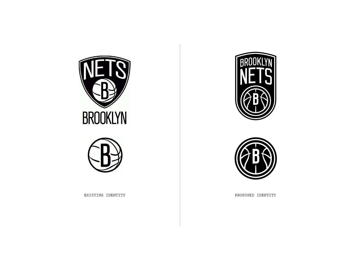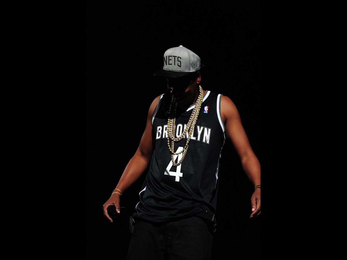
In April of 2012 the Nets' new identity was unveiled. The logo was reported to have been designed by Brooklyn's native son, Jigga man himself. For as many fans as there were to celebrate the team's new look, there were just as many left disappointed. I was in the latter camp. I love that the logo isn't fancy. And to be honest I was excited by what I didn't see –bevels, cartoon type, flares, or any of the other embellishment that have littered the world of sports for the past decade or so. However, I was left underwhelmed by the overall lack of sophistication. With the anniversary of the new identity I'd like to share my unsolicited approach.
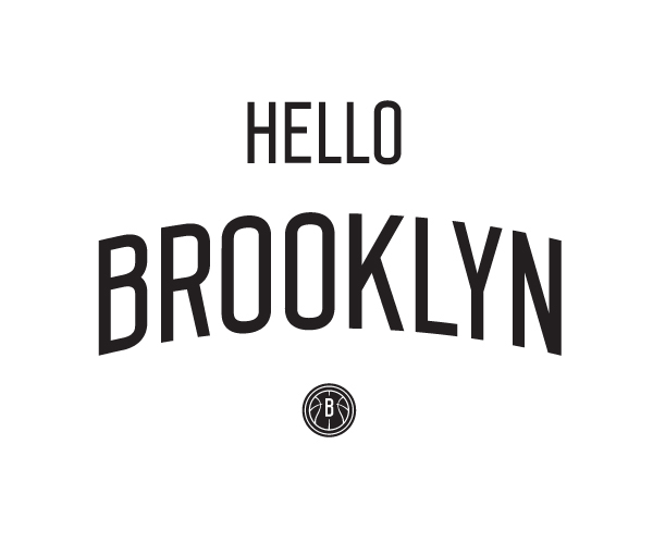
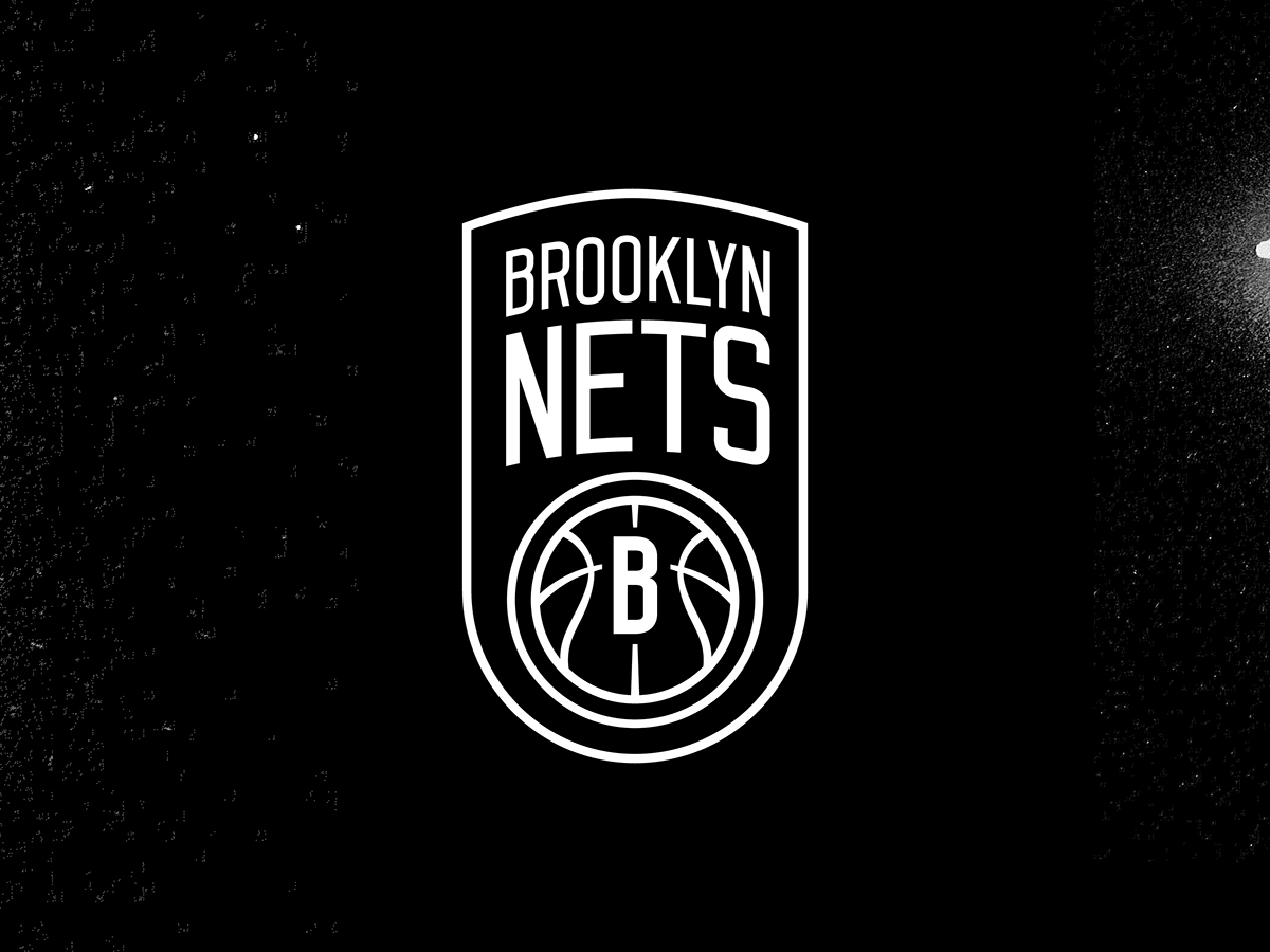
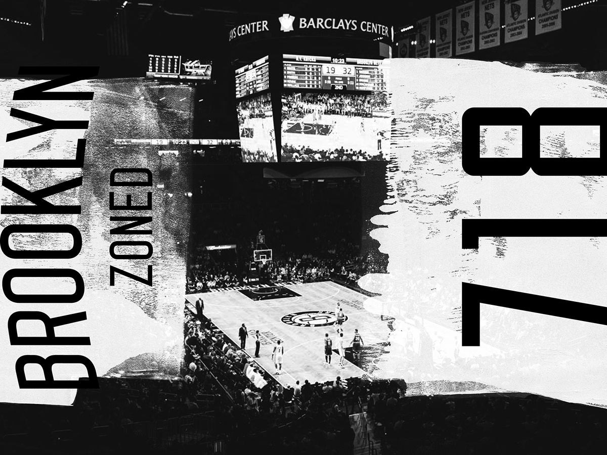
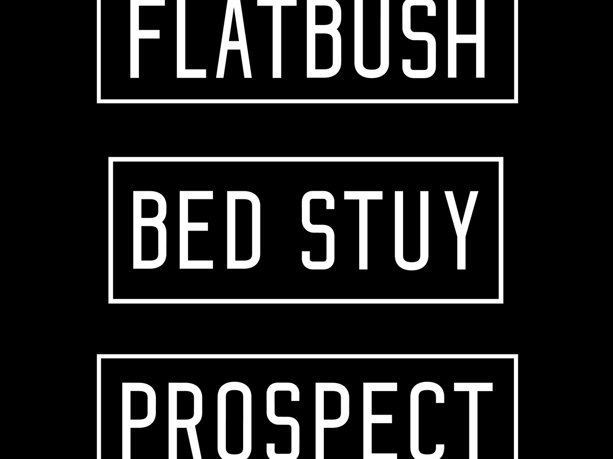
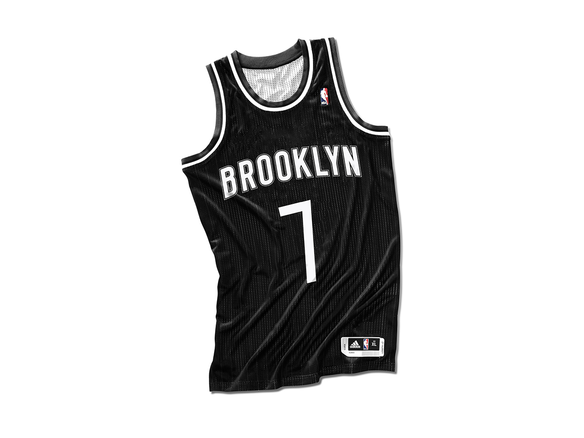
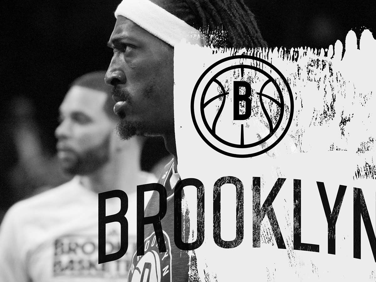
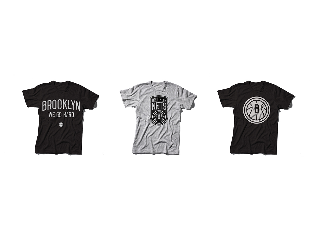
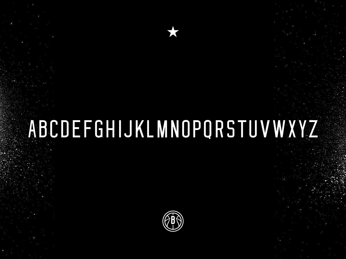
My version references the same iconic subway destination signs as the original. I juxtaposed the gothic style custom sans serif typeface with textures that pay homage the teams gritty new home and their scrappy style of play. The proposed identity keeps the team name on an arch but does not compact the letterforms like the original. In my rehash, the NETS name stands tall, retains its weight, and reads in the order of the teams proper name–with "BROOKLYN" preceding "NETS." The existing identity places Brooklyn under the shield because there is no real estate within it.
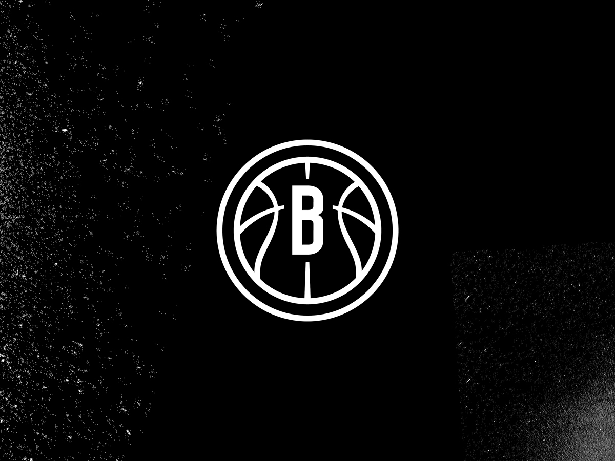
The orignal monogram could have been a lot cleaner. By using the center groove as the anchor, I was able to simplify the mark and allow it to read more clearly, specifically for small applications. Overall, I feel my changes improve the team's look while leveraging a graphic style reflective of their new city and attitude.