

BRISBANE SCHOOL OF HAIRDRESSING
Rebrand, Stationery & Multipage Document
Brisbane School of Hairdressing prides itself on being the largest and longest established hairdressing school in Queensland. However, until recently, the company’s brand architecture had become quite dated which was evident with the typography, imagery and overall aesthetic of the company’s print and web presence.
BSOH needed a contemporary identity which would attract a younger audience, stand out against the competition and work consistently across a variety of applications.
The concept for the BSOH logo was based on trimmings of hair found on the floor of a hair salon. This graphic was also the basis for the BSOH Salon logo, created to effectively identify the salon as their own entity within the design school. The identity comes to life when supported by vivid imagery and simple, clear typography creating an overall modern look for the company.


Business Card
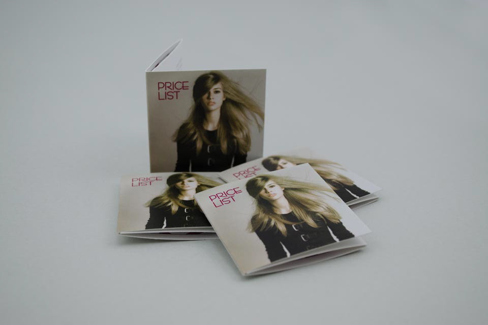
Pricelist
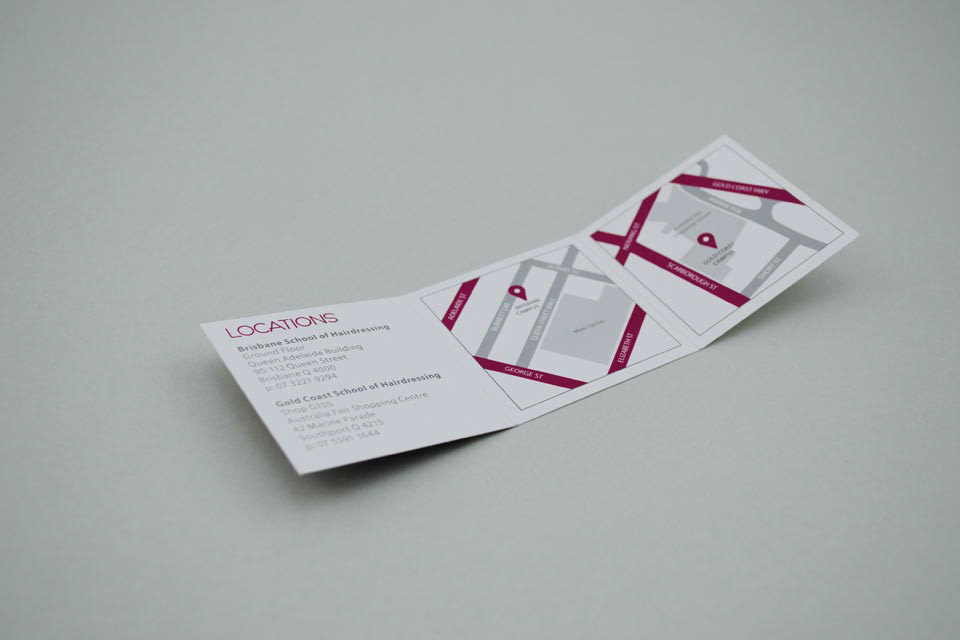
Detail: Map in Pricelist
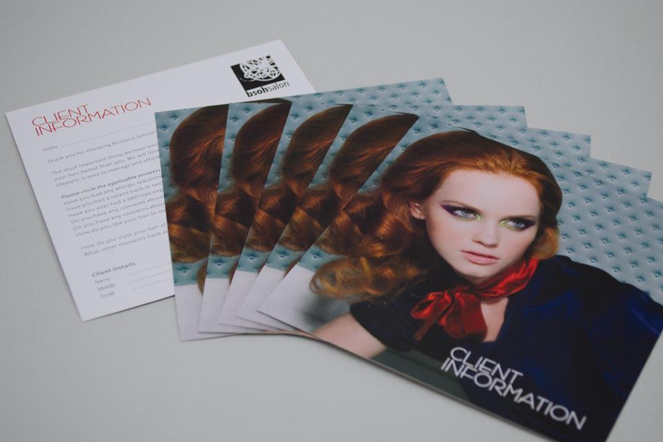
Client Information Forms
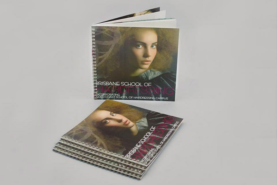
Student Information Booklet

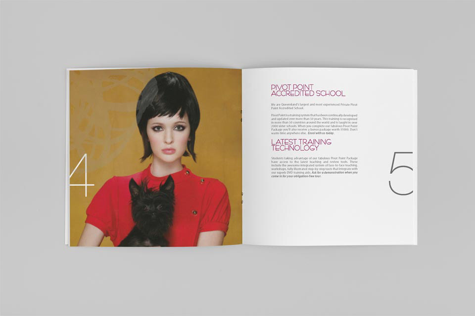
Student Information Booklet: Contents

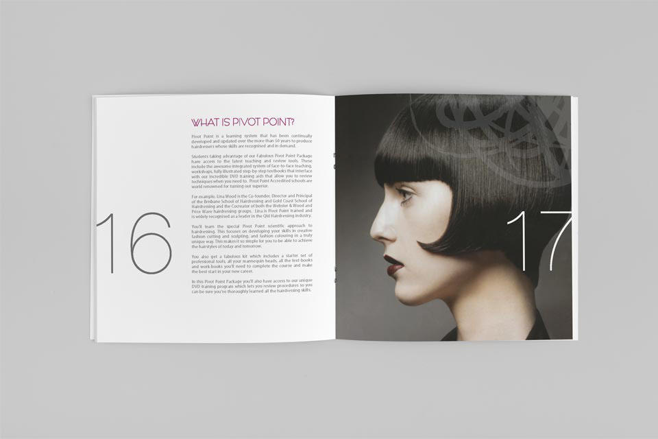
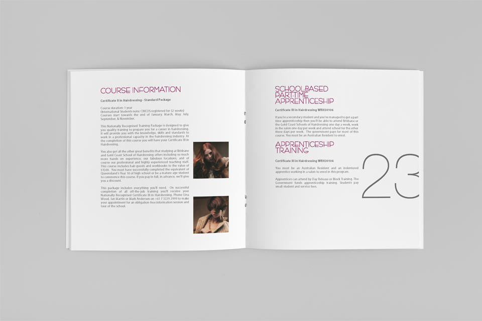

Inside Detail: Student Information Booklet