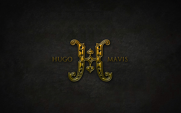
A logo and invitation card design requested by a couple - Mavis & Hugo. Design concept based on the name of the couple. Two “m” Joint together to form “H”. As they requested romatic and classy look for the logo, classic ornament element been added to the logo.
As for the wedding card, the theme for the card is inspired by a meaningfull chinese adage. The adage meant Two birds flying together with love - lovely couple. So my idea is to put two fethers which represent two birds - the wedding couple and present the meaning of the adage. The cuople parents is conservative, so they don’t like white (as in white is more to funeral color :(). To fullfilled the couple’s dream while satisfied their parents qualification, two different colors were used, which is white and Bronze. The card filled with ornament watermart with the gold and embossed logo infront, which made the whole card look classy and expensive. The couple love it very much and the guests as well. What do you think?
As for the wedding card, the theme for the card is inspired by a meaningfull chinese adage. The adage meant Two birds flying together with love - lovely couple. So my idea is to put two fethers which represent two birds - the wedding couple and present the meaning of the adage. The cuople parents is conservative, so they don’t like white (as in white is more to funeral color :(). To fullfilled the couple’s dream while satisfied their parents qualification, two different colors were used, which is white and Bronze. The card filled with ornament watermart with the gold and embossed logo infront, which made the whole card look classy and expensive. The couple love it very much and the guests as well. What do you think?