
The first piece I created for this project, this is the modified version with the blue leaf.

Standalone logo and tag line.
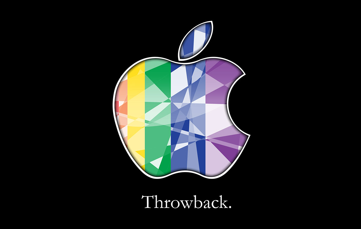
Slight variation, leaf colors only blue. This doesn't make much of a difference here, but it gets tricky later on when dealing with the website for reasons seen below.
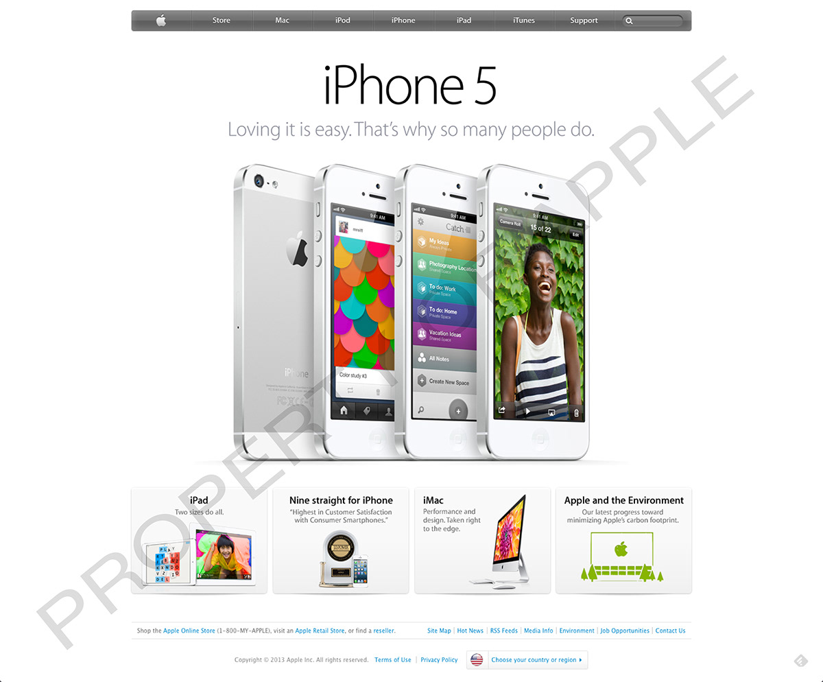
Apple's website, as of 4/15/13.
First iteration of the website with new splash screen. Just a gradient with large blur to reduce excess whitespace and accentuate the "Throwback" message.

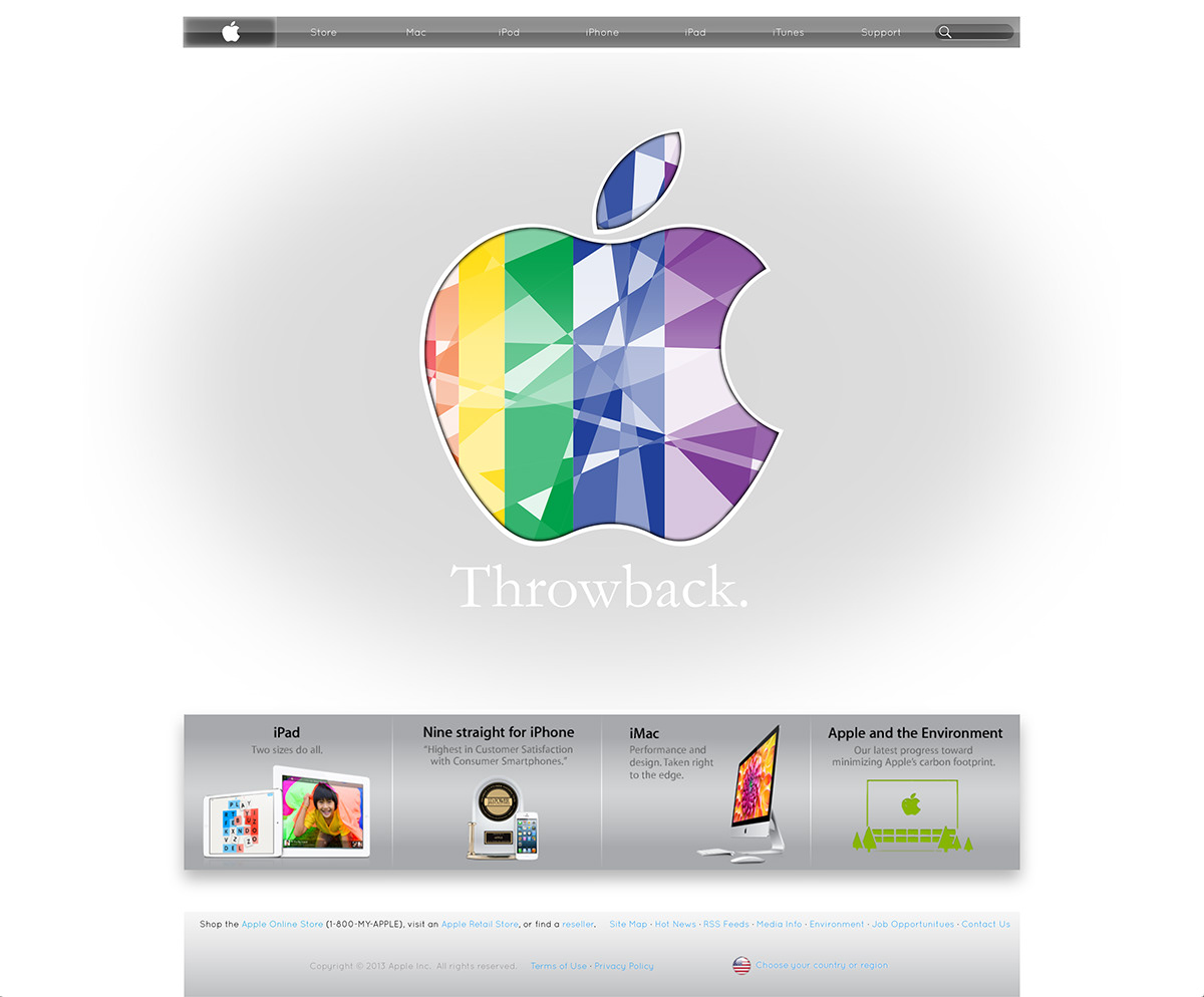
This second iteration took a great deal more time, but I was pretty happy with the result.
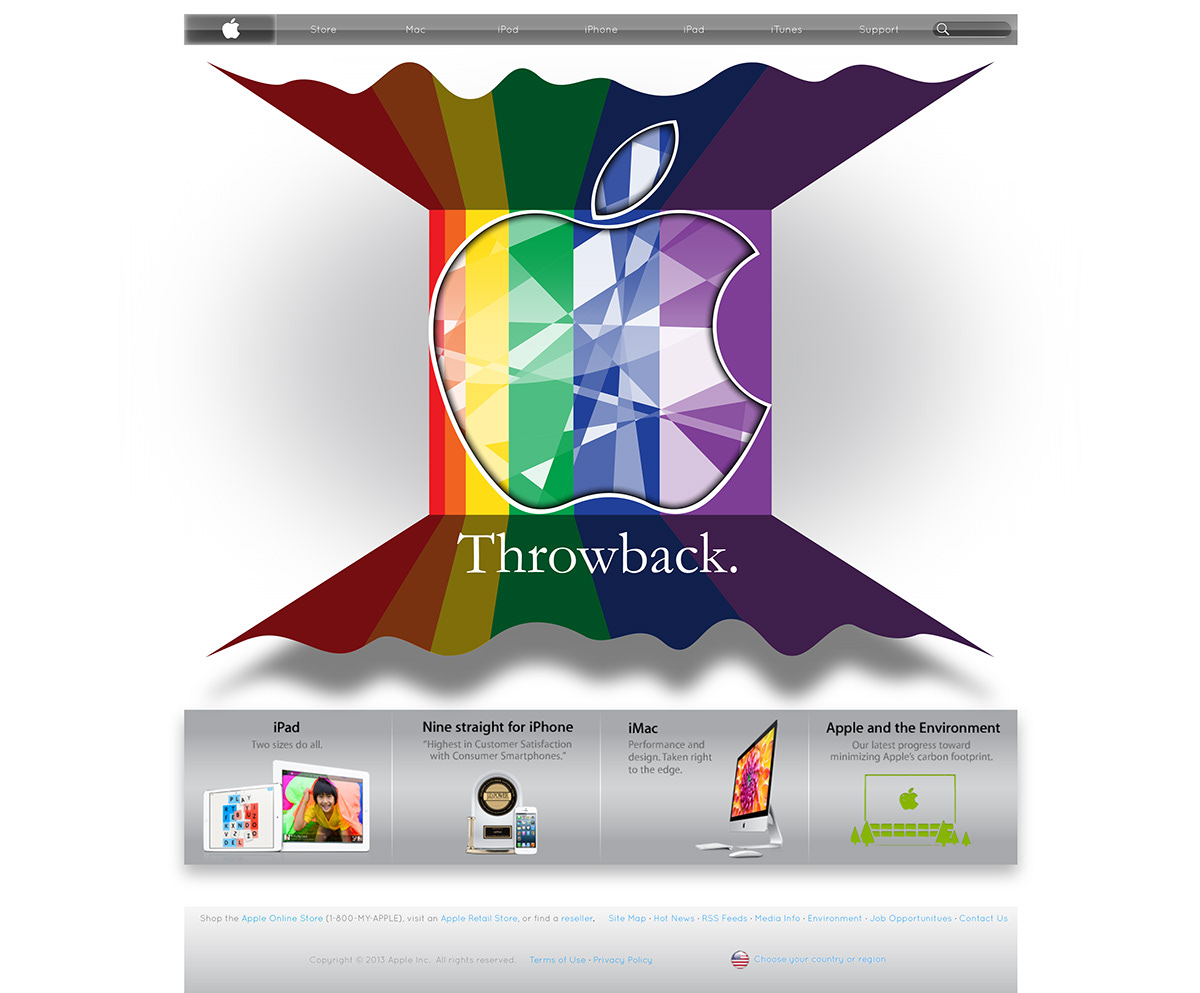
Third iteration. All elements from the second remain; the splash screen was scaled down a bit to allow for a substantial shadow underneath the ribbon.
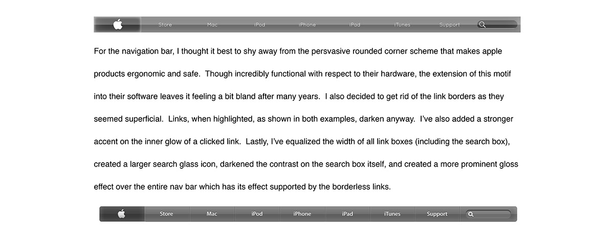
"For the navigation bar, I thought it best to shy away from the persvasive rounded corner scheme that makes apple products ergonomic and safe. Though incredibly functional with respect to their hardware, the extension of this motif into their software leaves it feeling a bit bland after many years. I also decided to get rid of the link borders as they seemed superficial. Links, when highlighted, as shown in both examples, darken anyway. I’ve also added a stronger accent on the inner glow of a clicked link. Lastly, I’ve equalized the width of all link boxes (including the search box), created a larger search glass icon, darkened the contrast on the search box itself, and created a more prominent gloss effect over the entire nav bar which has its effect supported by the borderless links."
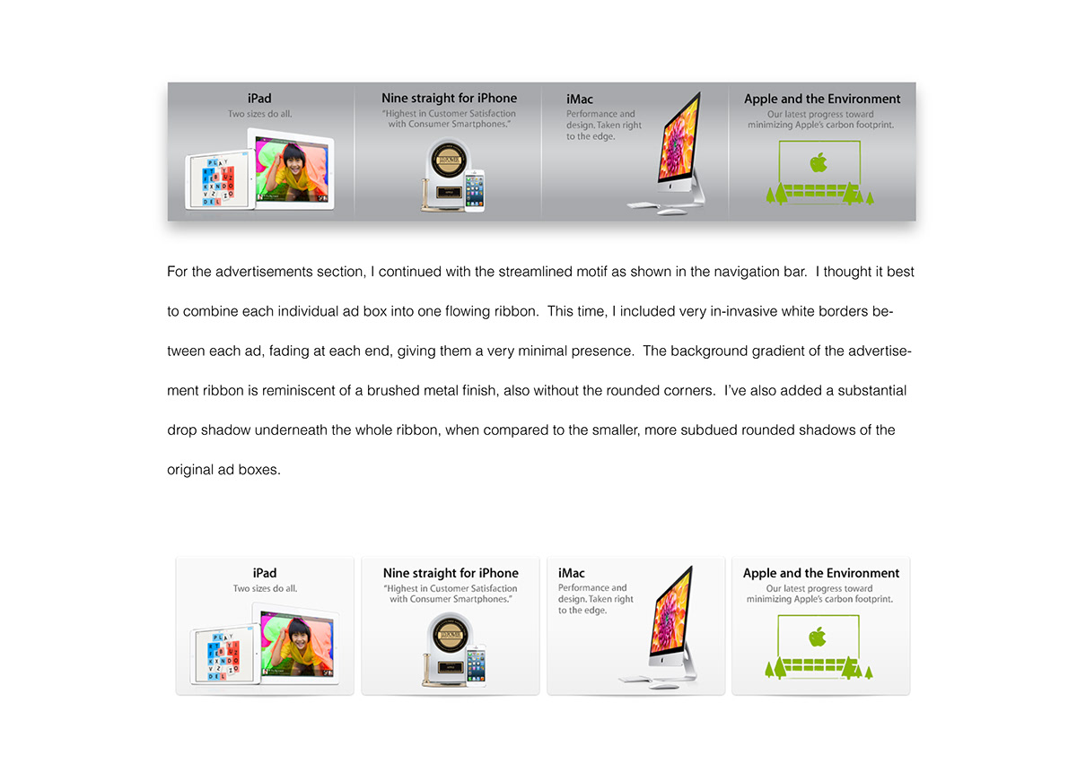
"For the advertisements section, I continued with the streamlined motif as shown in the navigation bar. I thought it best to combine each individual ad box into one flowing ribbon. This time, I included very in-invasive white borders between each ad, fading at each end, giving them a very minimal presence. The background gradient of the advertisement ribbon is reminiscent of a brushed metal finish, also without the rounded corners. I’ve also added a substantial drop shadow underneath the whole ribbon, when compared to the smaller, more subdued rounded shadows of the original ad boxes."

"For the footer, I have made minimal changes. All content remains exactly the same, however - added the same chrome ribbon from the ads secition, with a transparency transition gradient effect, creating almost a sort of reflection of the ad section ribbon. I removed the borders between lines from the original footer, and also substituted borders from between footer links with interpuncts. Lastly, I removed the button-like border from the language selection link as I figure the blue text already creates a redundancy. The removal of these various borders / button leads to a less cluttered enviornment."

"For the main splash content, I decided that I’d like to introduce a possible evolution in Apple’s brand. I condsidered the progression of the company of the last decade, along with it’s continued direction after the passing of Steve Jobs. It seems as though Jobs’ tumutlous relationship with the company led to many mixed feelings. One thing that was aboslutely clear, however, was that the level of innovation was unsurpassed while Jobs had led the company.
Taking cues from the original logo (and brand vision) from 1976, I adapted a new fascia for apple’s rebrand. I decided to align the rainbow background vertically. Most notable are the fractures within the center of the apple logo, indicative of the various unique parts that align perfectly to form the company we all know. The logo maintains a tactful white boarder with a dark inner glow, evoking a subtle 3D effect. The rainbow ribbon extends behind the apple logo, up to the boarders, where I’ve expanded the ribbon and darkened it to further the 3D effect. I’ve added “warped” top and bottom boarders to give distinction and asymmetry to the mostly symmetrical ribbon, along with a prominent shadow for the bottom ribbon. Lastly, I’ve continued in apple trend with a singular thought “Throwback” to refer to the direction of the overall message. The font used was apple’s original font (Garamond)."
Taking cues from the original logo (and brand vision) from 1976, I adapted a new fascia for apple’s rebrand. I decided to align the rainbow background vertically. Most notable are the fractures within the center of the apple logo, indicative of the various unique parts that align perfectly to form the company we all know. The logo maintains a tactful white boarder with a dark inner glow, evoking a subtle 3D effect. The rainbow ribbon extends behind the apple logo, up to the boarders, where I’ve expanded the ribbon and darkened it to further the 3D effect. I’ve added “warped” top and bottom boarders to give distinction and asymmetry to the mostly symmetrical ribbon, along with a prominent shadow for the bottom ribbon. Lastly, I’ve continued in apple trend with a singular thought “Throwback” to refer to the direction of the overall message. The font used was apple’s original font (Garamond)."

