
API
— Brand Identity
API are specialist suppliers of process piping packages for the mining industry. API supply high quality stainless steel and alloy pipes for transmission of liquids/gas.
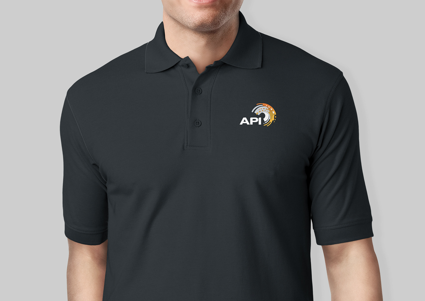
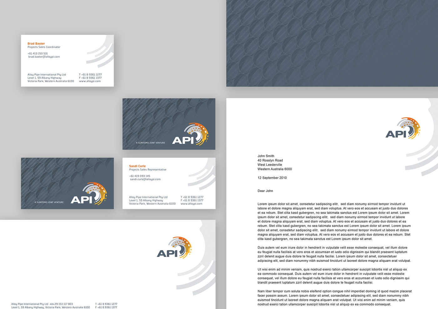
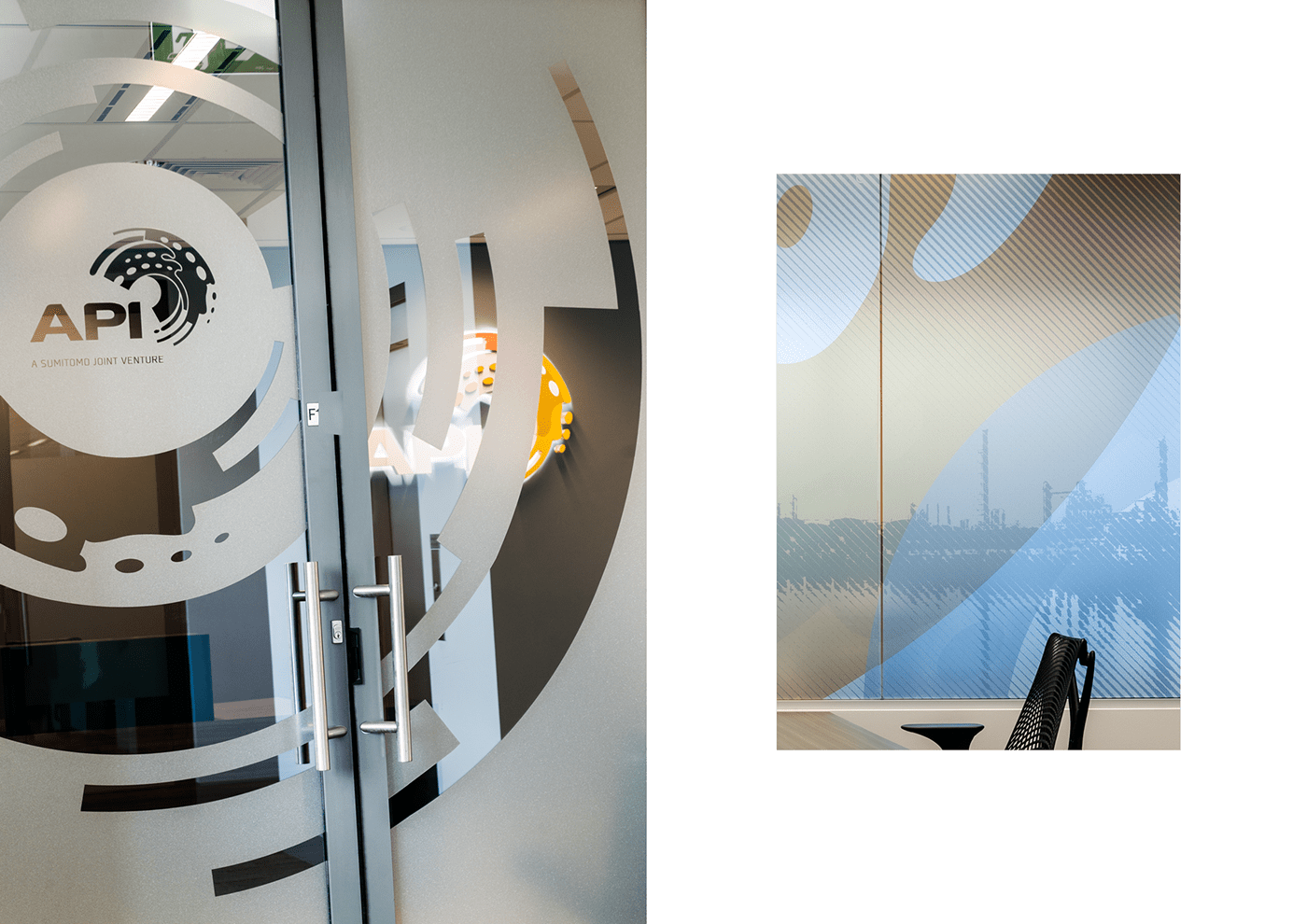
API's new re-branding was to show them as a global boutique, niche, well respected conglomerate with high quality global standards and service. The logo needed to be solid, exotic and fierce - 'like a tiger'. The symbol itself encompasses the grey of pipes and orange to yellow gradient, which refers to transmission of liquids and gas.
Brand Touchpoints: Logo & Brand Personality, Stationery, Promotional Collateral, Signage, Website Design


Branding, Design & Art Direction at Luminosity
Photography by Rob Frith
Client API Resources


