Kaya Consulting
— Re-Brand Identity
Rebrand for KAYA Consulting dealing with People Smart Business Solutions. Kaya's clients span a range of industries from mining to oil and gas, health, construction, agriculture and financial services etc KAYA wanted to realign their new brand identity with the quality of its services and to communicate value proposition and service offering to their current and future clients. The new brand was assist with positioning the company as a respected leader in the industry, and create a high perceived value for their consulting services.
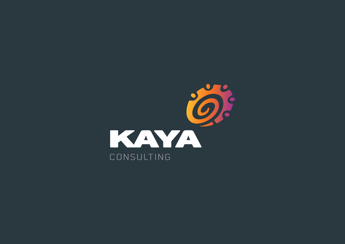
Their new brand was to incorporate a contemporary, modern, fluid, dynamic, moving and changing feel. The word 'KAYA' in Japanese means rocks of wisdom and KAYA's previous brand focused heavily on cogs and people that conveyed the ideas of the interaction between systems and people. KAYA Consulting was also started their business in South Africa and still carry out operations there and in Australia.
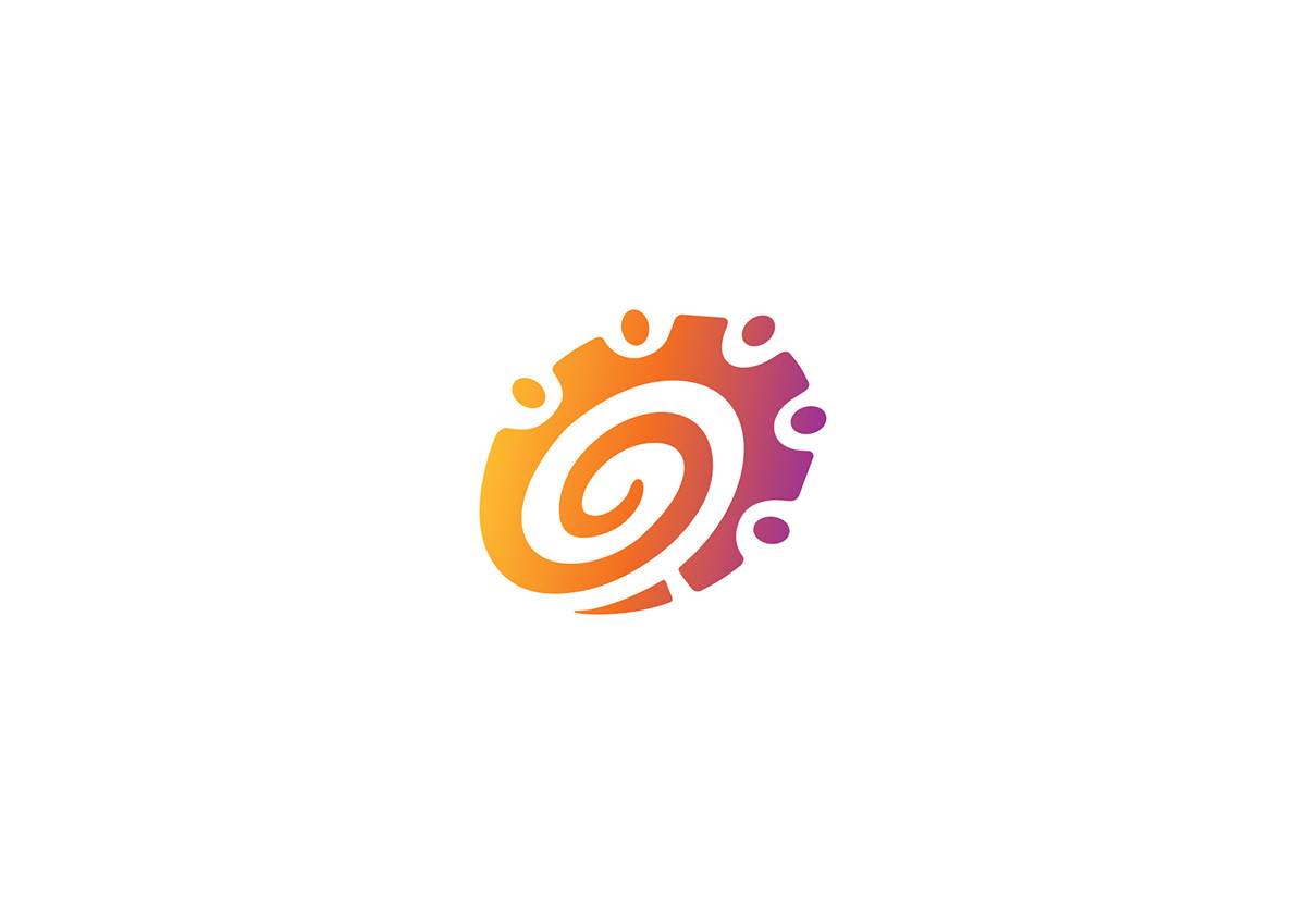
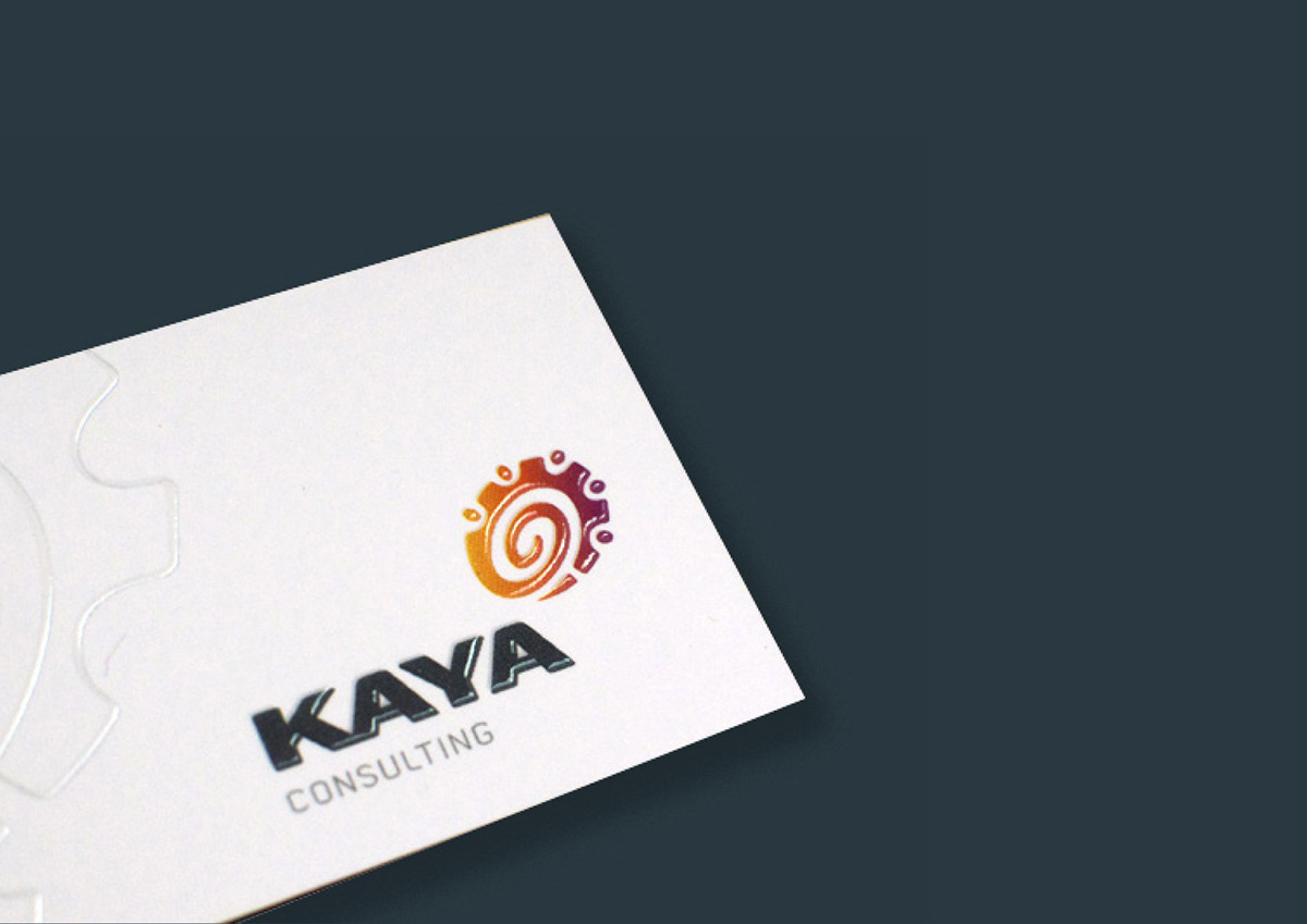
The new KAYA logo and symbol incorporates interlocking cogs and people to create a dynamic commune symbol which includes movement and change created by a graduated colour symbol. The symbol also represents a person's thumb print giving it that personal touch and hinting at KAYA South African tribal background.
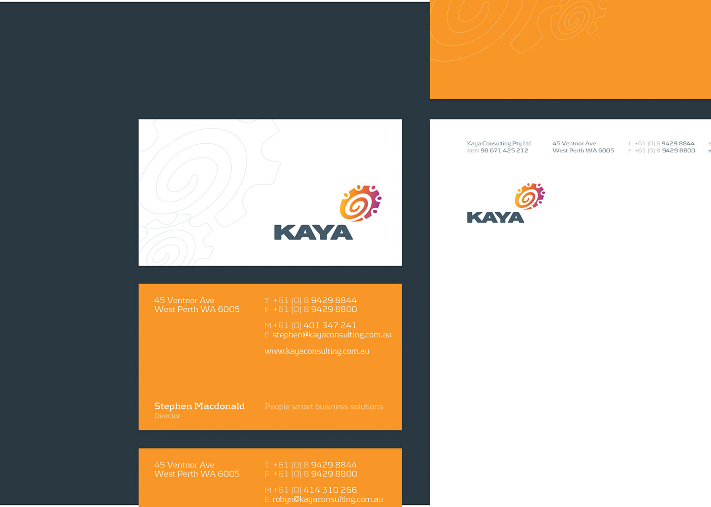
Brand Touchpoints: Logo & Brand Personality, Stationery, Promotional Collateral, Product Branding, Website Design and Photography.