Bot is an enhanced water beverage, and they came to me and the agency 160over90, with an interesting challenge. Take a beverage, that had originally been marketed to 6-12 year-olds, and find a new target audience without losing it’s biggest piece of brand equity, it’s personality. Through our research we determined the best market for Bot was women right out of college, 22-30 year-olds. We created a new brand for Bot, but kept the characters, which were the most recognizable part of the brand, plus they had personality. With brands like Kid Robot, Hello Kitty, and Harajuku Lovers thriving among this audience, the characters made a lot of sense. We just needed to find the story of how they fit into the audience’s lives.
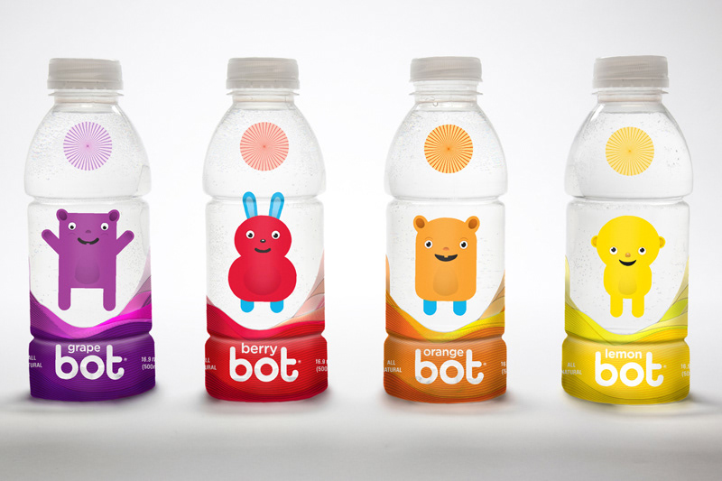
For Bot the characters came to represent youthful optimism, and these characters lived in that world between reality and the ideal dream. Their world was the aura of those who choose to live life on their own terms. The redesign of the packaging was the most important piece of collateral to show this ethereal world the characters occupied. Each flavor had a unique character, and around them and the bottle the drinker saw a hint of the rolling, shifting hills of the Bot world.
For Bot the characters came to represent youthful optimism, and these characters lived in that world between reality and the ideal dream. Their world was the aura of those who choose to live life on their own terms. The redesign of the packaging was the most important piece of collateral to show this ethereal world the characters occupied. Each flavor had a unique character, and around them and the bottle the drinker saw a hint of the rolling, shifting hills of the Bot world.