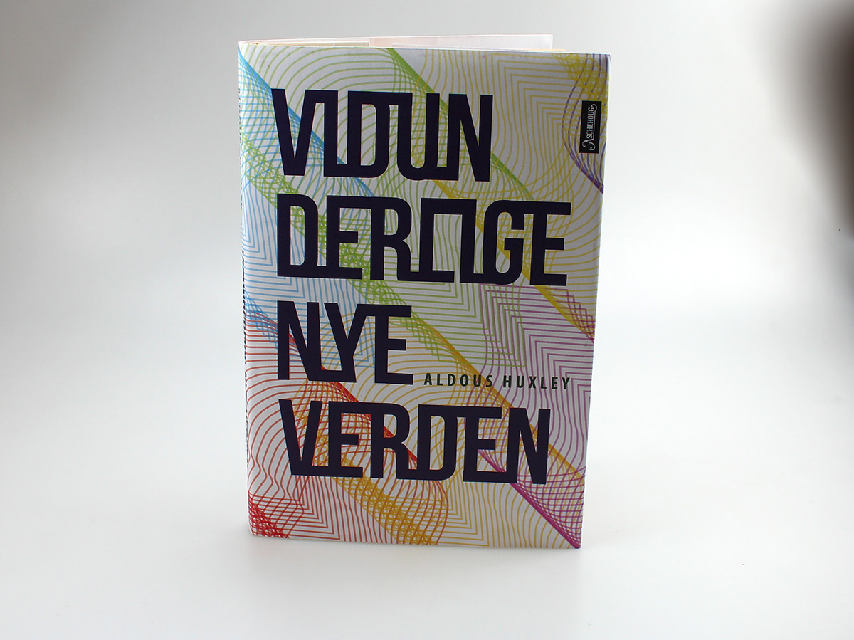
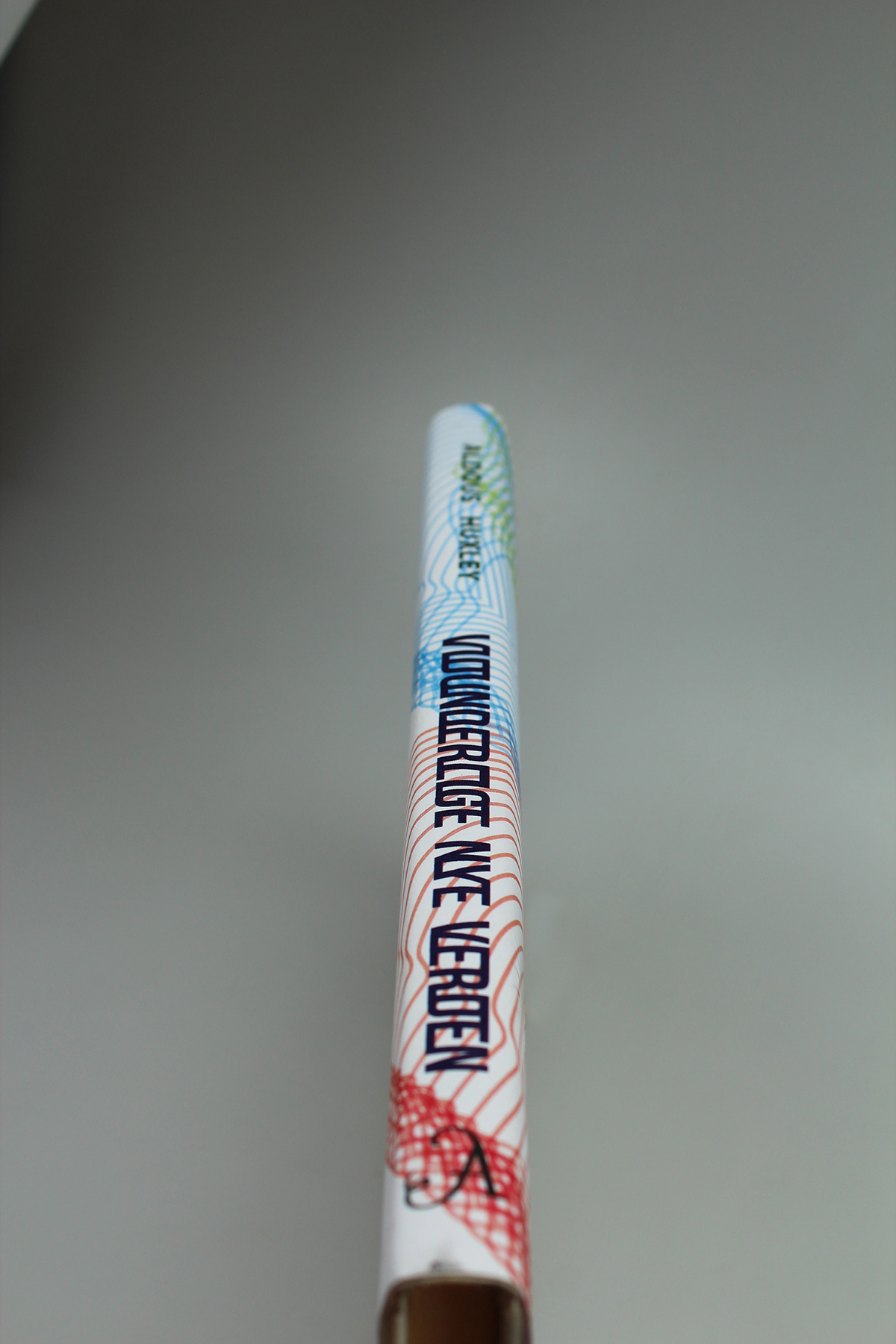
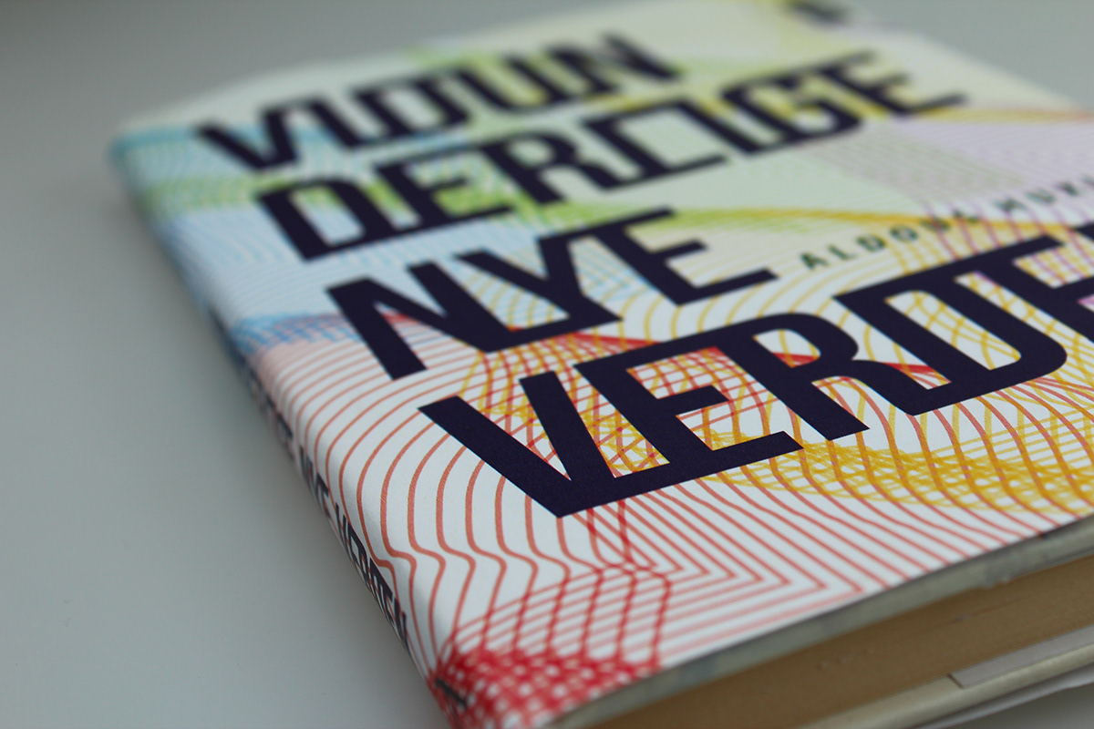
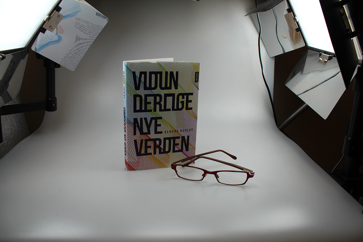
During my First year at NKF we got this exercise; to make a book cover of Brave New World (In Norwegian: Vidunderlige nye verden). It needed to illustrate or correlate to the book’s contents, while it also had to create interest and sell the book.
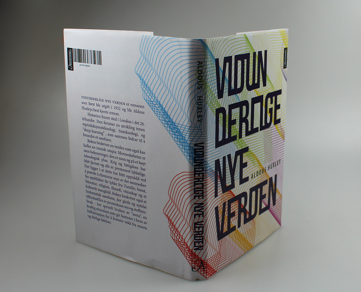
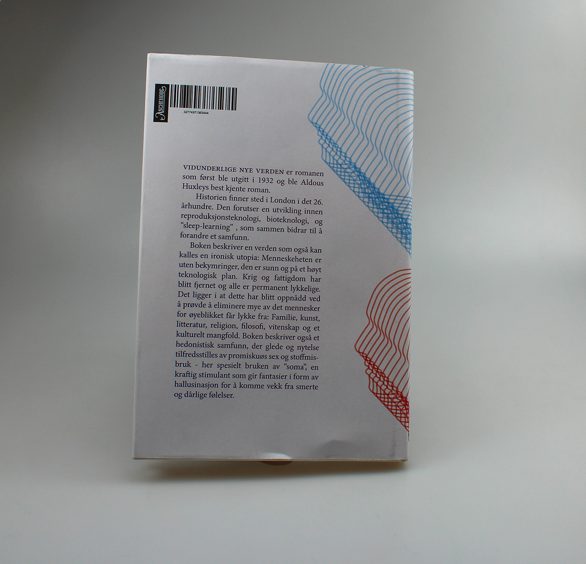
When I read the book I got a feeling that in this story, everything is controlled, and it seems like free will does not exist anymore. That is the feeling I was aiming for when I was making the design for the book. Therefore I chose to make a pattern of the contours of human heads, all of them identical. I made it in a way so that when you first see the book, you can not see what the pattern is made out of, but if you turn the book to look at its back, you figure it out.
I used light colours because everyone in the book is happy all the time; there is no such thing as depression, crying, loneliness, or sorrow. When they are feeling a little down, they just drug themselves so that they are not feeling anything but happiness. Though the title of the book is set in a darker colour. That is because this way of living makes no sense, if you want to experience real happiness; you have to experience real sadness too. The dark colour here indicates that this book does not have the answer to what a good life is, rather the contrary.
This is a fictional school project done in collaboration with the NKF.
