

Blur Studio
Logo and Branding
Logo and Branding
BlurStudio is a state-of-the-art visual effects and animation studio built on asolid foundation of artistic talent and client relationships. Welleducated, highly motivated digital artists, work in an environment in which isdevoid from corporate bureaucracy, is relaxed, edgy, where artists can thriveand strive for creative excellence is the company’s goal. Artists are given and environment where they canthrive and creative excellence is the sole measure of success.
Blur works on a variety of different projectsover the course of a year that it provides the company with an opportunity toemploy a lot of different styles and aesthetics. Under Blur’s roof,light-hearted, cartoony projects coexist frequently with realisticscience-fiction action pieces, what ensures that there’s always something forthe artists to enjoy working on.
Current audiences are businesses, game andentertainment production studios who need production trailers, CG motion FX andpromotional media branding. .Theiroriginal animation is targeted to anyone who appreciates quality animation.
Blur’s CGI unique presentations appeal toaudiences who are savvy and familiar with the dimensional imagery that hasbecome prevalent in high quality media of gaming and large screen. Blur hasbrought that kind of quality to the commercial campaigns as in the Eureka, Pennzoil, SuperbowlXLII and TeenChoice 08 as well as the game and movie trailers where digitaleffects would be expected.
Blur strivesto provide high visual quality, computer graphics animation for a variety of entertainmentand commercial media in an open creative environment and do it as efficientlyas possible.
Strategy
In creatingthe logo and branding for Blur Studios, I wanted to emphasize the company’s innovativeapproach to imagery. In a published interview with FiringSquad.com, Blur’s co-ownerTim Miller had stated the “the artists (at Blur) always want to push the (creative)bar”. I thought that this statement was descriptive of the company, that theirpresent logo did not reflect that attitude, so I used it as a focus in the logoand branding design, “Pushing the creative edge”.
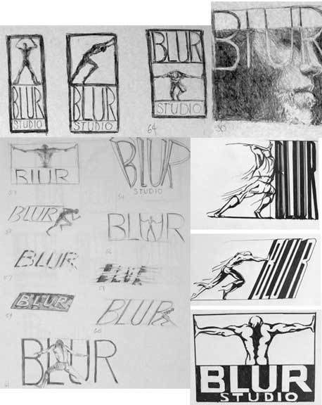
Sample of selected sketches for the Blur logo design.

The final design incorporates a athletic figure, shown fromthe back, with the sleeves roll up, ready to work. The figure is positioned with the arms raised,hands at either side of the picture plane, head down as if to open up thenegative spaces as it pushes against the edges of its boundaries.
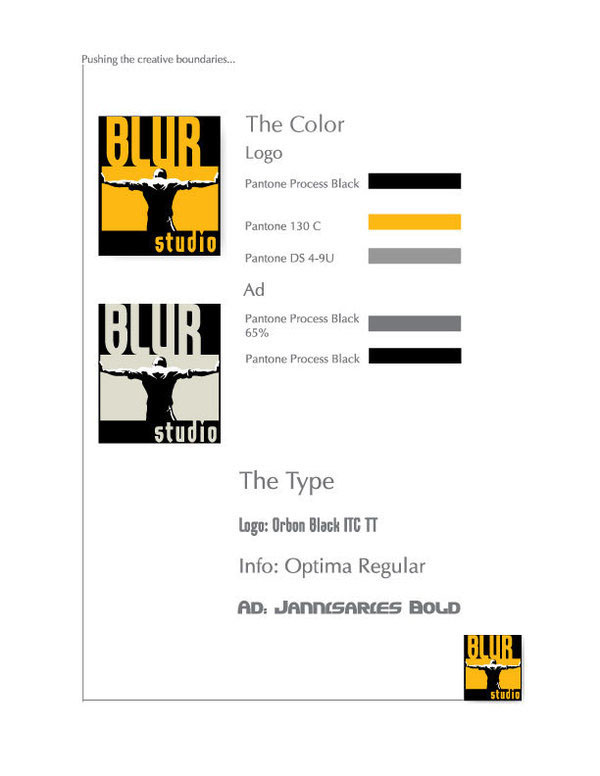
The yellow-orange and black color used in the logo is highintensity and high profile that is reflective of the company product attitude. Pantonecolor samples are listed to the side.
An example of the black and white version is also depicted.
The type for the logo, info and advertisement designs are also listed
An example of the black and white version is also depicted.
The type for the logo, info and advertisement designs are also listed

Stationary set for this branding includes the business card, letterhead and envelope, a presentation folder with the front and back depicted as well as the inside containing stationary, business card insert and the branding tag line on the inside.
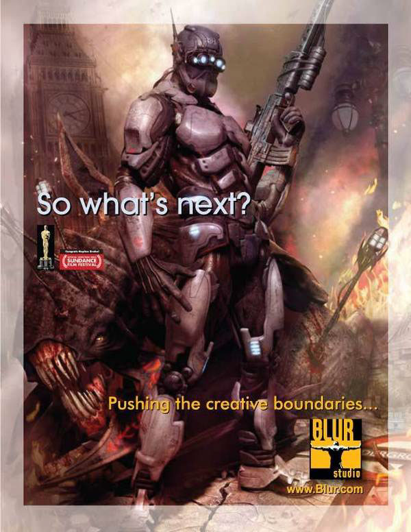
Magazine ad with "hunter" image and tag line.

Second Blur ad featuring images that highlight the company's achievements, including awards for their animated file, "Go for Broke".
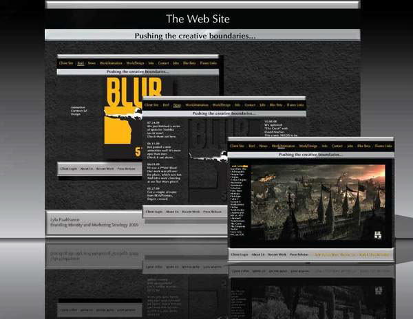
The website redesign with three pages shown that includes the black and white version of the new logo and how it would look at the lower right hand corner of one of their videos.


