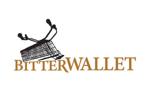
Logo redesign with new direction
A consumer blog for the UK deal community, I was tasked to redesign their website in a new direction, so I started with the logo.
With the keywords: Clean, Sharp, Serious, Informed, Informative, I wanted that reflected in the use of colour and type. I kept the distressed trolly as part of the logo, because it still holds brand equity with the community and didn't want to alienate them with too much change. The trolly also adds to the edginess which you can still hear in the blog's voice.
With the keywords: Clean, Sharp, Serious, Informed, Informative, I wanted that reflected in the use of colour and type. I kept the distressed trolly as part of the logo, because it still holds brand equity with the community and didn't want to alienate them with too much change. The trolly also adds to the edginess which you can still hear in the blog's voice.
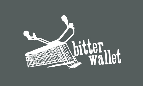
Original logo