Objective: Bigelow Tea is an American, family owned company with a deep sense of tradition, but these qualities are not represented by their current brand and packaging. The goal was to redesign the brand in a way that reflected the quality of Bigelow’s products.
Audience: Current tea drinkers, health-conscious individuals.
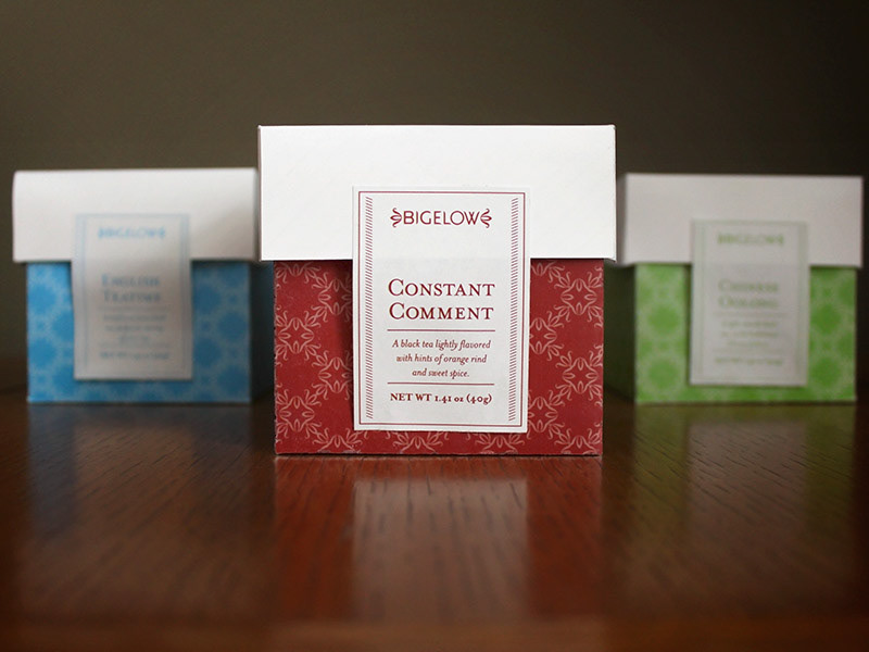
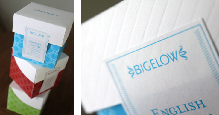
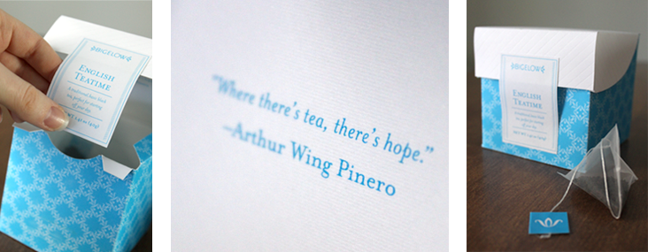
Solution: The brand and packaging to reflect more of the company’s history by drawing on traditional Victorian imagery. The flourishes on either side of the primary mark are inspired by the design of old plantation houses, while the customized geometric type conveys a more contemporary tone. In the same way, the patterns used on the packaging are reminiscent of Victorian designs, while the vibrant colors help the packages to stand out on shelves, and allow used to differentiate between different flavors of tea.
........................................................................................................................................................................................................
Brand Mark


........................................................................................................................................................................................................
Tea Packaging
Tea Packaging
........................................................................................................................................................................................................
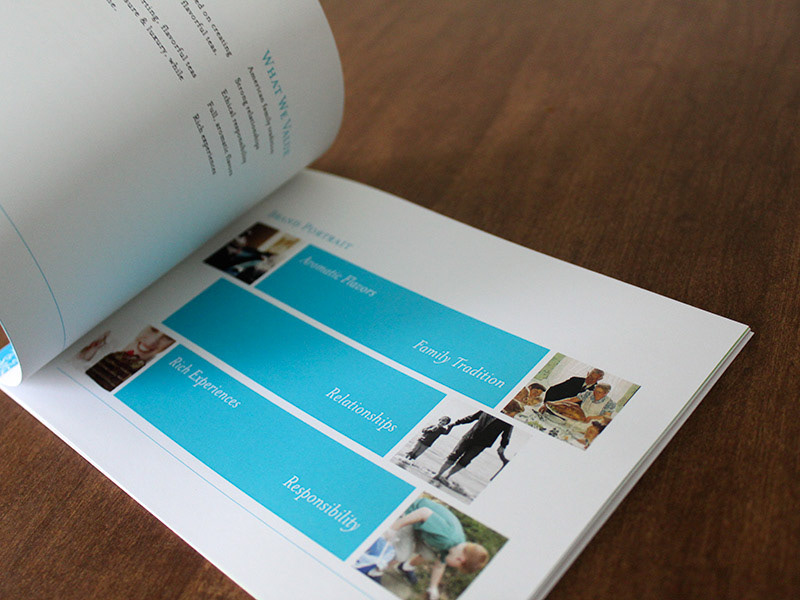
Brand Book
Brand Book