Be Cosmetics
Package Design
Package Design
The fictional BE product line has collections for both men & women. The company is known primarily for producing high-class organic bath & beauty products. The logo, packages and package labels had to appeal to the appropriate gender, while maintaining a cohesive appeal. The logo, while using a slim font which may appeal to women, is held by an imperial floral pattern - signifying power & dominance. The colors for the woman’s packaging are soft & delicBe Cosmetic product line carries both men & women's products.

Male product line.

Female product line.

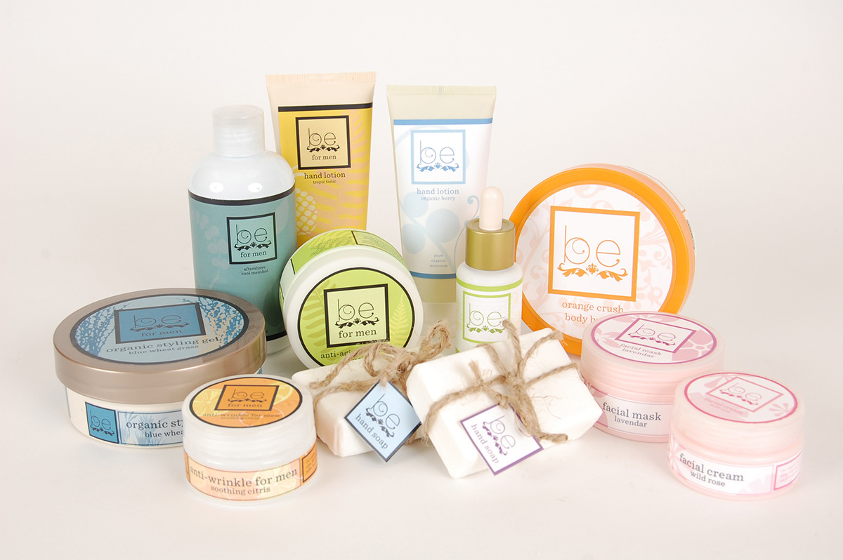
Here's the full collection.

