
Baro Black.otf
An Open Type font designed by Russell McGorman
An Open Type font designed by Russell McGorman
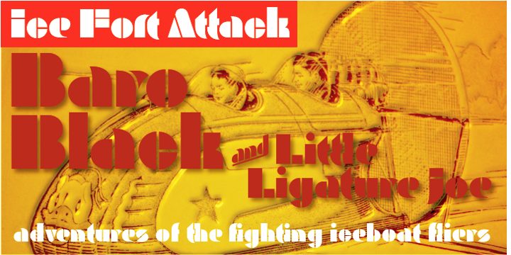
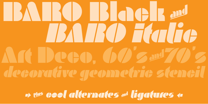
Baro is a powerful, fun and expressive font, great for loud, cheerful and super-fat headlines and packaging for odd novelty toys. With its bold and distinctive stylized geometric forms, it is ideal for logos, heavy machinery and wacky party invites.
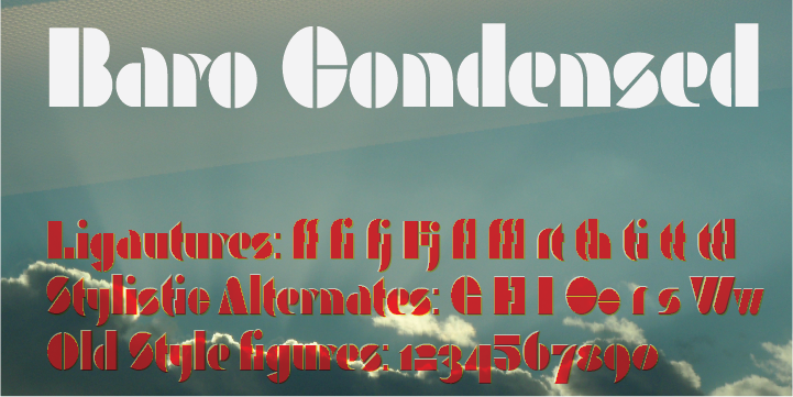
Baro had its beginning in a handful of rigidly geometric uppercase letters from an unidentified 1960s or 70s era press-down lettering font, which in turn was possibly a revival of a 20’s era Art Deco font. The exercise quickly expanded into a complete typeface with 300+ characters including several catch words (word glyphs), stylistic alternates, discretionary ligatures, multilingual support and both lining and old style numerals. Baro maintains much of the characteristic geometric rigidity of the original handful of letters, but with the addition of just a little bit of flare, cheerfulness breaks through, like a wink and a smile on the face of a fat and otherwise stern policeman.
available on Myfonts
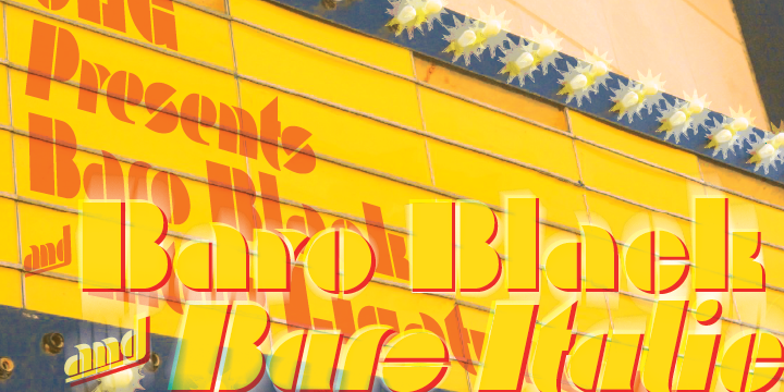
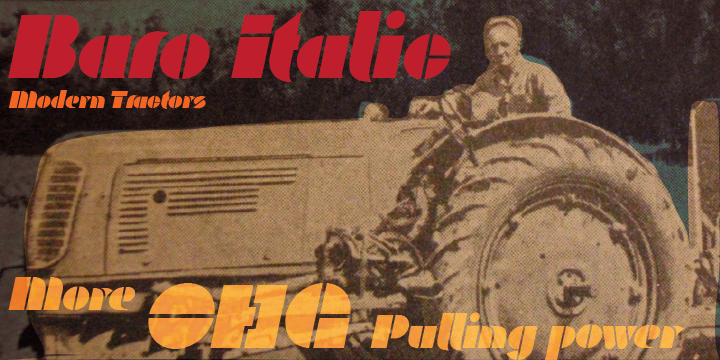
Baro Italic has the same glyph range and all the forceful charm of Baro Black.
Actually It has even more. Honest.
Actually It has even more. Honest.
Baro Black Condensed. Affectionately called Baro narrow it may be condensed, but it's hardly skinny


