BARBRI is the leader is bar exam preparation materials and study aids. Recently, they expanded their offering to include comprehensive study tools for pre-law through each year of law school. The headquarters is in Dallas, TX, with regional offices across the U.S. The audience is prospective and current law students
This extensive re-branding assignment consisted of breathing new life into a 45-year-old brand with 90% market share. The brand persona had become stagnant, detached and aloof. The challenge was to re-imagine and transition the brand by retaining elements of the company’s heritage while creating a brighter, more contemporary and youthful, yet professional, feel. It was also important to give a nod to innovation, acknowledging the introduction of brand new, revolutionary law study technology. Limitations included some initial apathy or resistance by the “old guard” to embrace the new look and change.

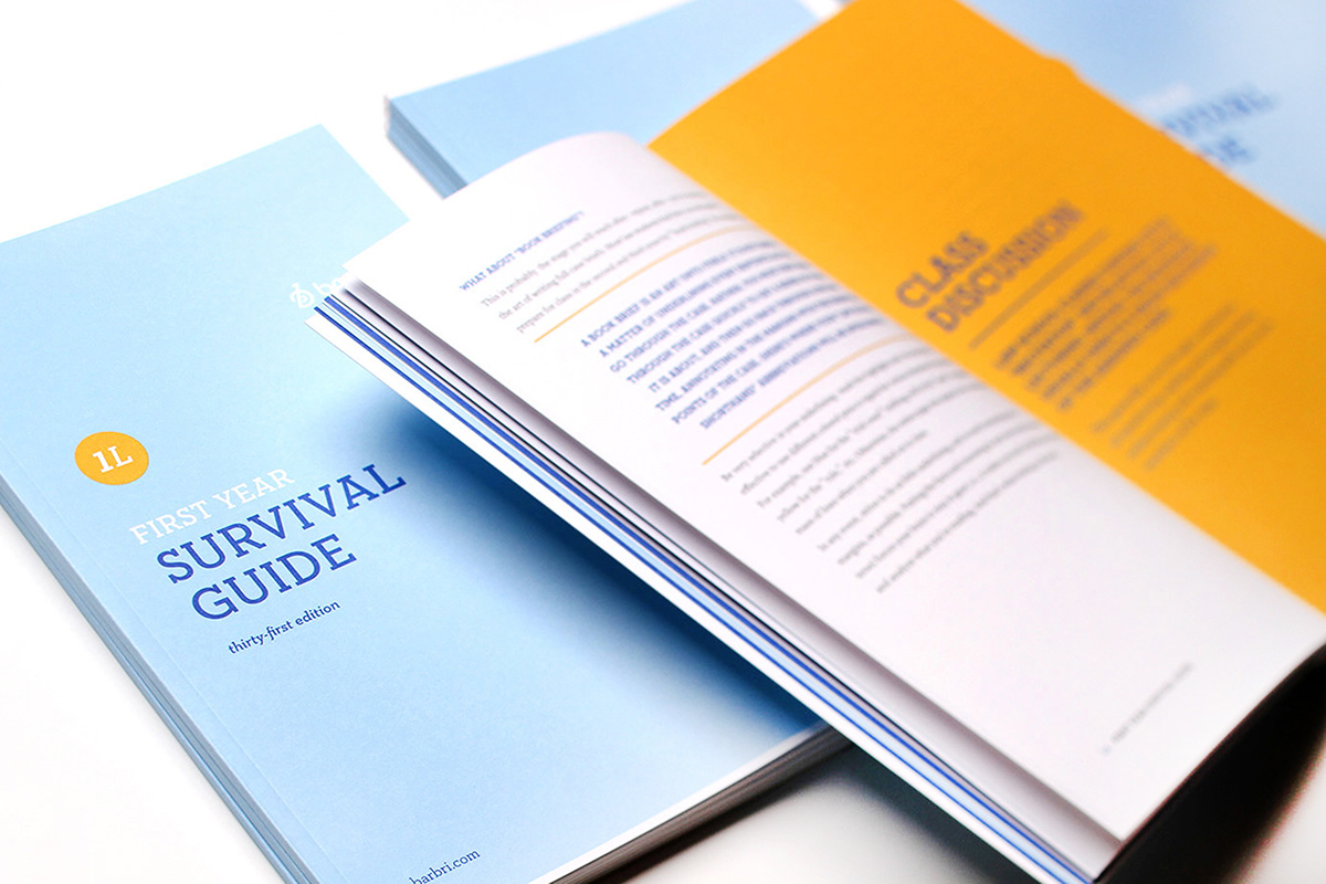
Brand development included extensive research into what BARBRI provides vs. what law students need. Answer? Simplification. The word “simplify” informed the conceptual direction. The goal was to consolidate work that multiple regional offices were executing on their own into a more consistent, easy-to-understand and easy-to-execute format. Where four brochures were developed before, one now exists. Where a letter was deemed appropriate, a brief email took its place. Ease of use for students with little time for anything but study, was critical. Creating a more inviting, approachable feel and empathetic voice was important for increasing student engagement and sales.