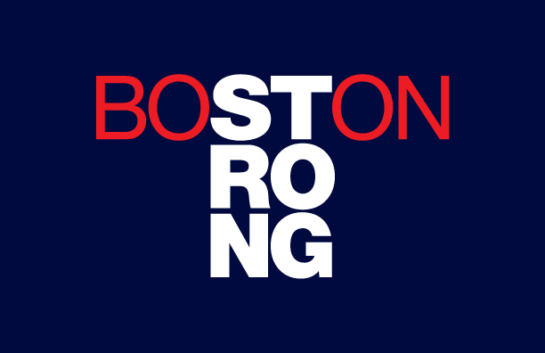
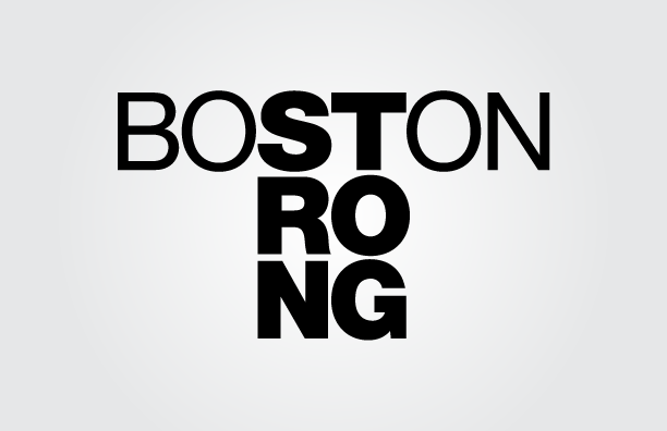
I realized that middle of the word BOSTON contained the first two letters of STRONG, and used the rest of the word as the foundation of this design. I worked with a number of different typefaces, but ultimately Helvetica worked best both in color and black and white. These designs have been applied to a number of products in my store at: http://zazzle.com/capecard/boston. Design copyright © 2013 by Andrew Newman. All rights reserved.

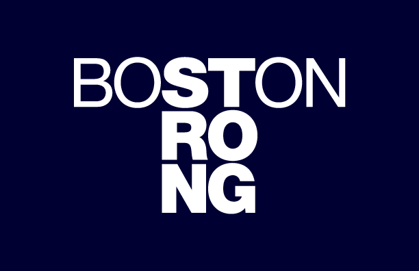

A year after the Boston Marathon bombings, I added a row of stars to the design to commemorate the day.


