Mapping and Visualizing Data
for Alcatel-Lucent
for Alcatel-Lucent
The purpose of the project was to provide creative examples of displaying data received form vehicle sensors. Some on a map, some as interactive infographics.

This visualization was used to show different school bus routes and where they get delayed the most. The thicker the line, the longer the delay.
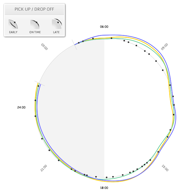
The static circle (in gray) represents a 24‐hour day, and the expected time of a pickup or drop‐off stop. Each line surrounding the circle reveals the actual time of the stop.
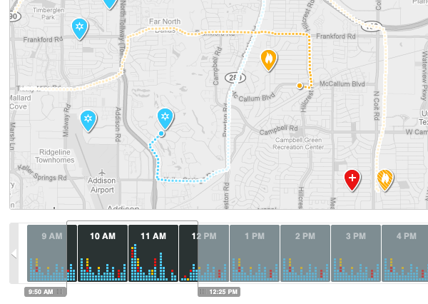
This is a timeline showing the number and different types of emergencies (medical, fire, and other). The map at the top shows the route and location of each dispatched unit.

