

I was tasked with coming up with a brand identity of sorts for an upstart music festival. The type of project that I can really get excited about. They asked me to come up with a logo, a poster, t-shirts, and flyers to attract sponsors. I was given pretty much free reign with regards to design and color, only limited by the text I needed to use.
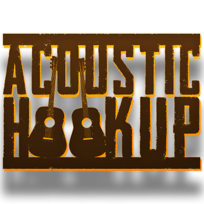
The driving influence for the festival's identity was vintage folk rock concert posters. Given the earthy vibe often associated with acoustic music i went with an earthy color scheme. I focused on brown and orange as a nod to Medina's close proximity to Cleveland and thusly the well loved Cleveland Browns. For the logo design I knew I wanted to use a bold strong and vertically dominate font, I also knew I wanted to work in a tie to the focus of the event. I felt that two propped up acoustic guitars to replace teh Os in Hookup took care of this goal nicely.
for the posters and Tshirts I gave the design a lot of distressing. If printing methods are needed in the future where distressing would be difficult I believe the logo works just as well if solid.

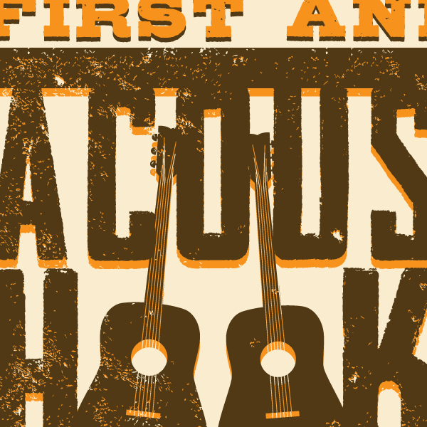
Detail views of the poster design.


This was the flyer I put together to help draw in sponsors for the event.

The Tshirts that I had printed up to sell at the event.


