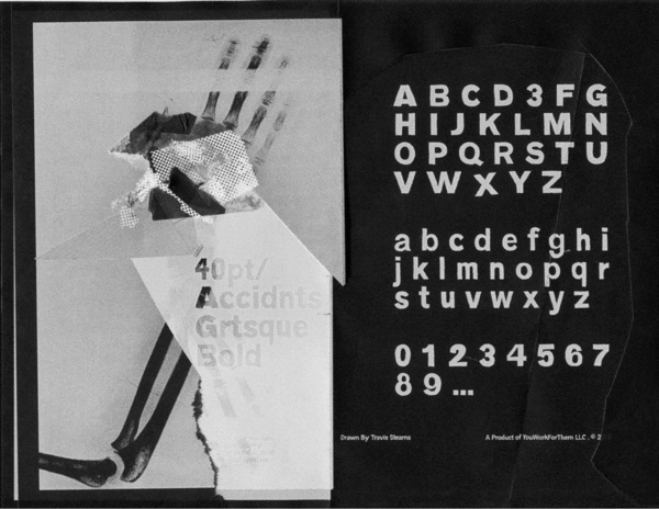
In these over-Photoshopped times, a little imperfection can make your work stand out and excel. YWFT Absent Grotesque was created to be an imperfect typeface, exploring ideas found in Univers and Helvetica without the serious attitude and over-marketing. It was designed in three weights by three different designers, and then tested by three more. The result is a powerful, beautifully flawed opentype masterpiece of alternates and unique type design. YWFT Absent Grotesque has been in the Top Five sellers on YWFT since 2008, and has been used by numerous American magazines.