AOD – An Opened Door
The briefing (In brief): “We want simple logo, where the subdivisions of company can be incorporated. All the subdivision logo designs should be connected with base of mother brand.
The target audience: Customers with respect of quality services
The design: AOD is a mother company, having lots of subdivisions, at initial stage only three sections are been started. They are named as:
AOD Talent Hunt
AOD Sign & Graphics
AOD Kitchen Galleria
AOD Sign & Graphics
AOD Kitchen Galleria
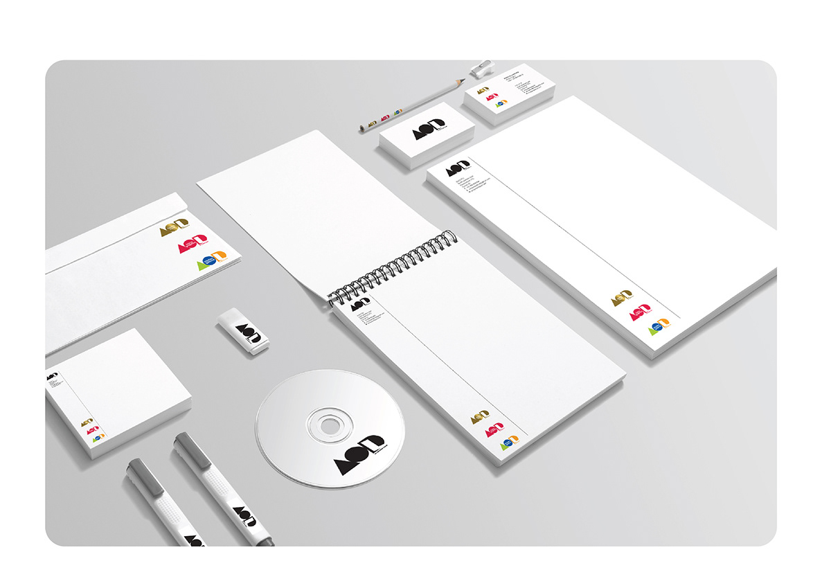
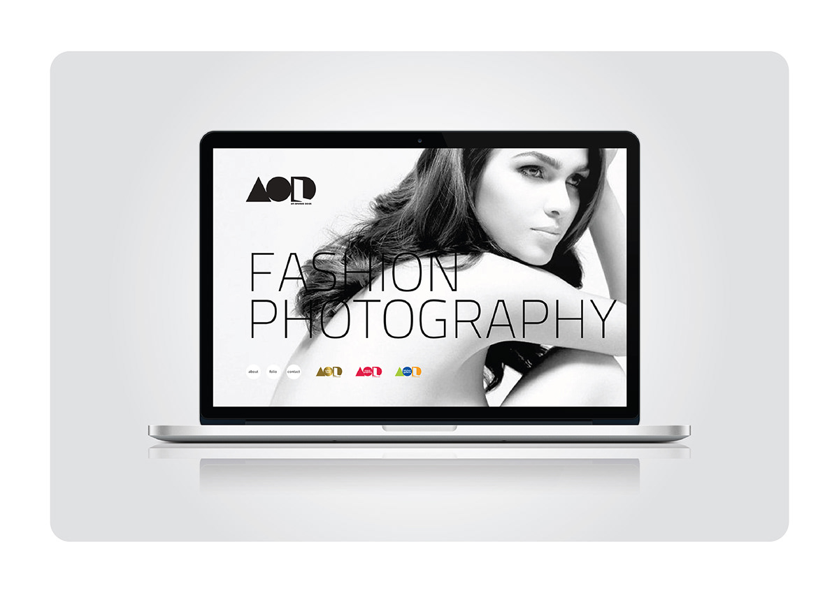
As per client request, each subdivision was given their own suitable colors.
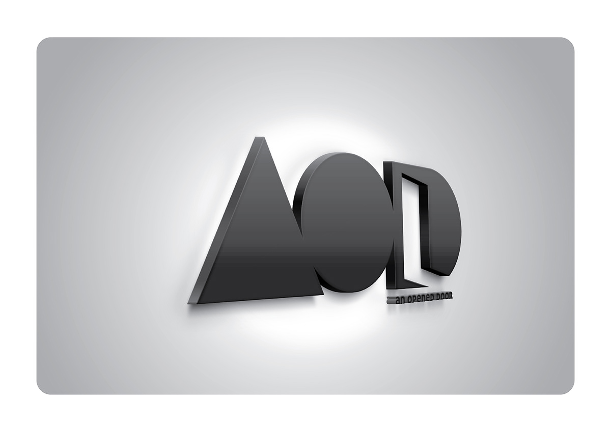
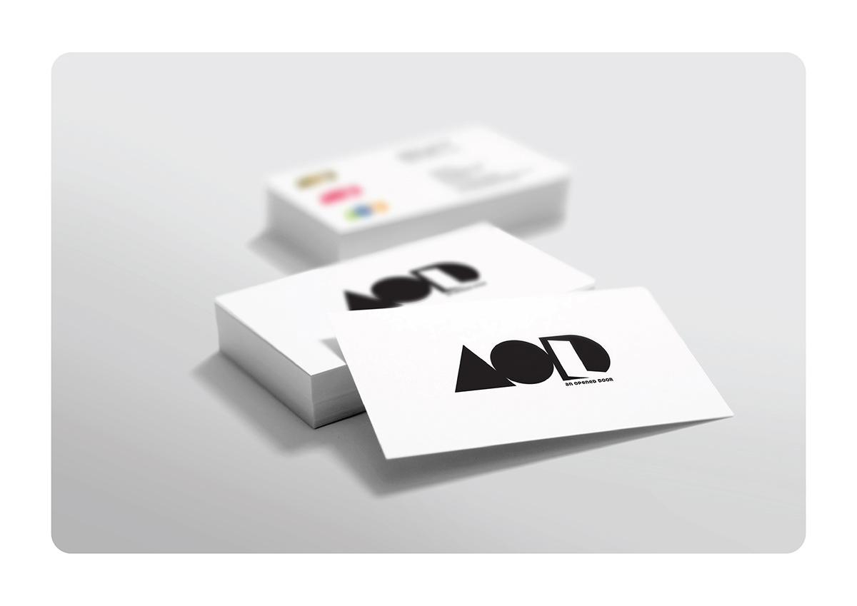
On Making: In order to avoid mistakes and also as per the request of client we followed only one color “black”, for the mother company, because in subdivisions, there will be a chance of arising other various colors. The word An Opened Door is shorted to AOD. Here different types of shapes are being used such as Round, Rectangular, Triangle, and Square and those are used to create a very thick style of typography, and the logo shows an opened door which represents AOD.
This project is done for GDH (Garlic design House)