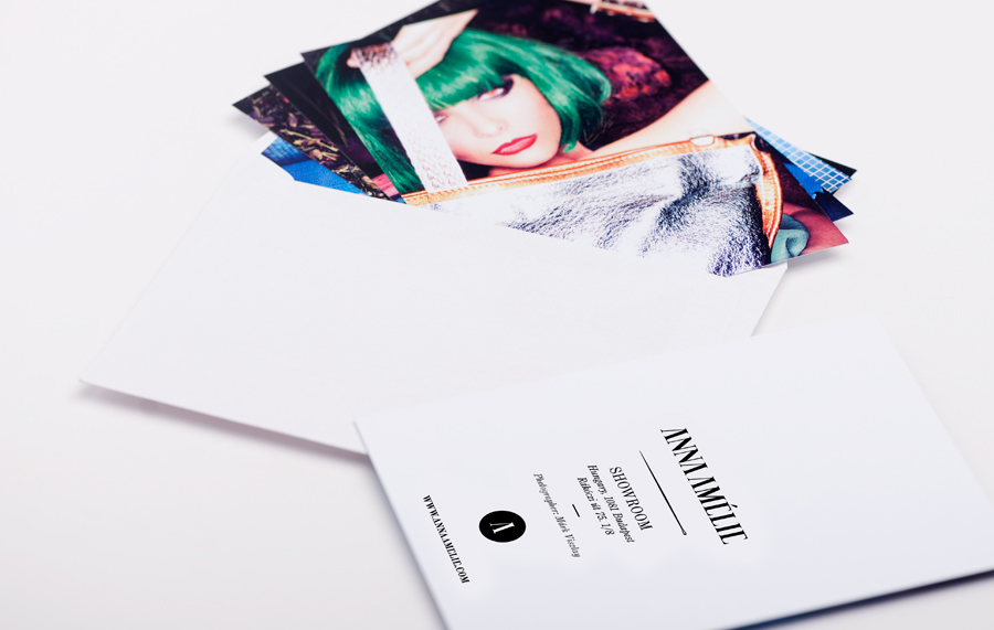
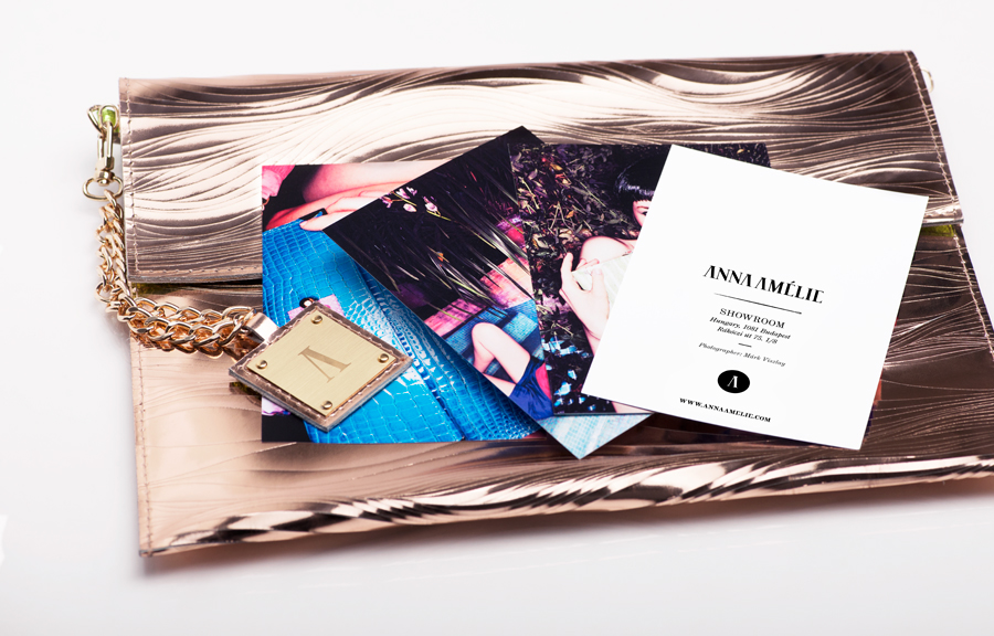
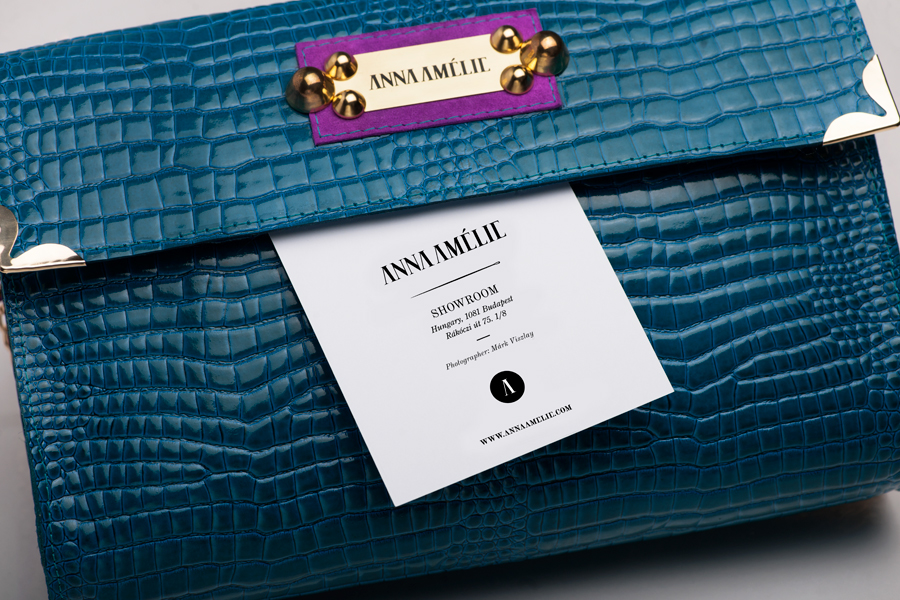
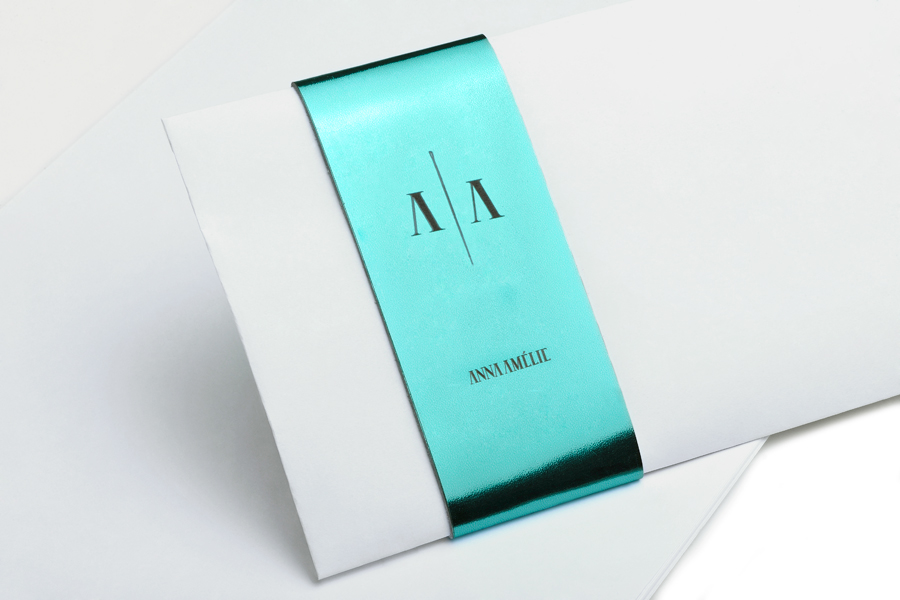
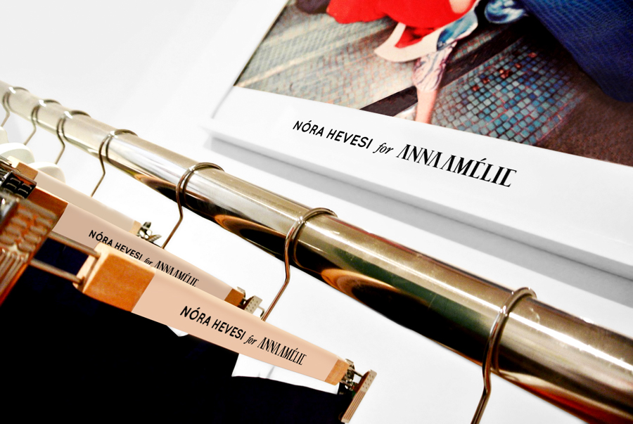
ANNAAMÉLIEidentity and package design
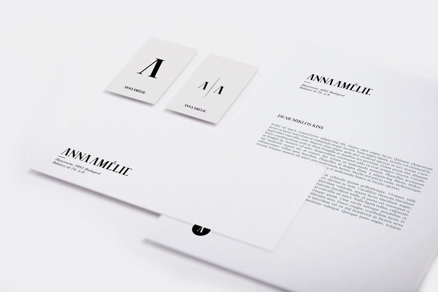
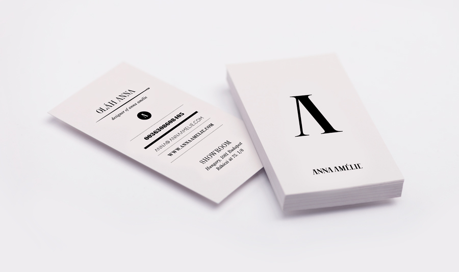
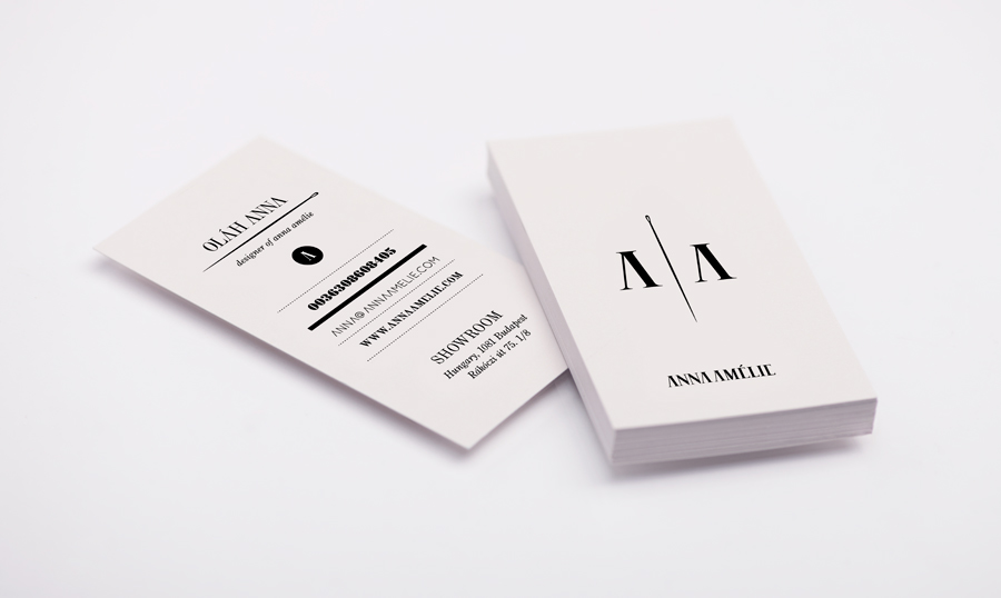
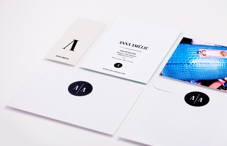
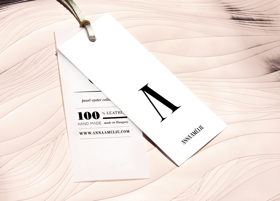
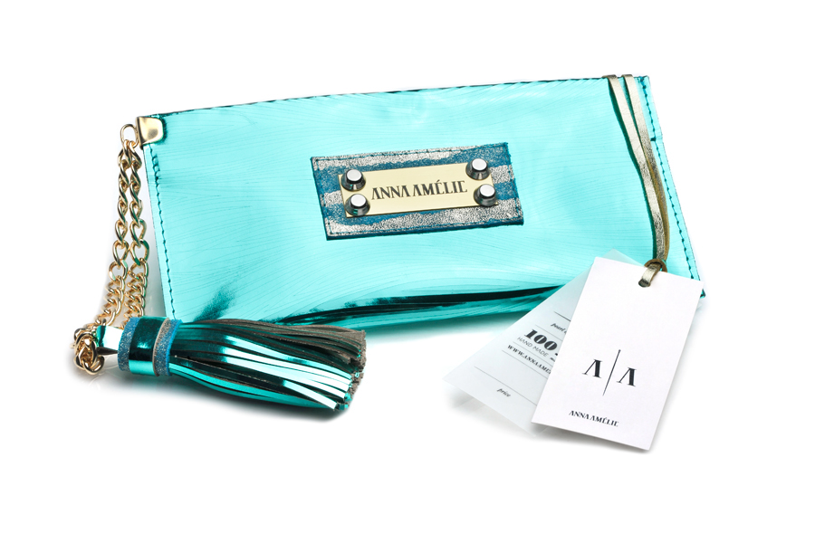
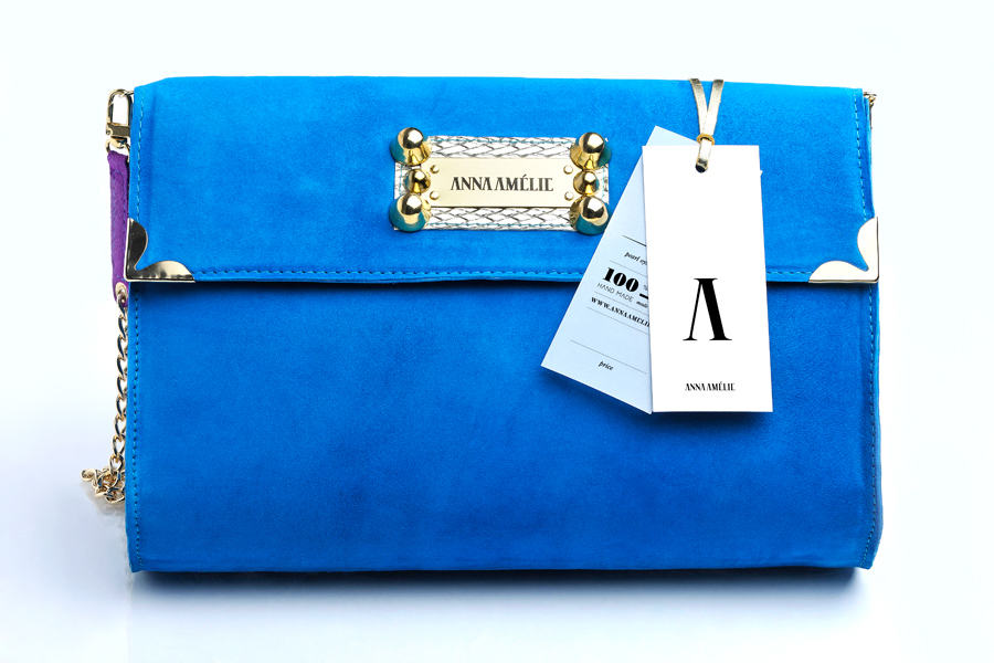
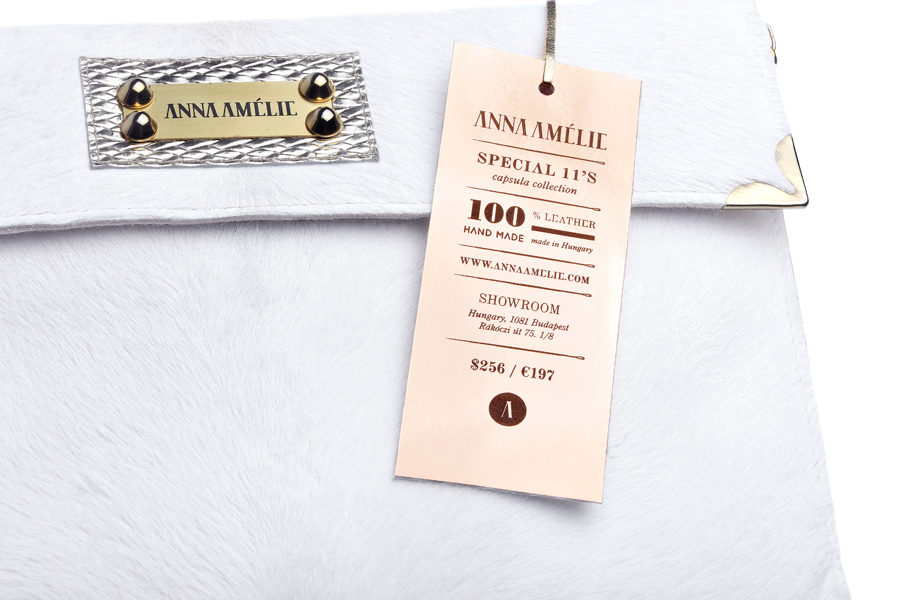
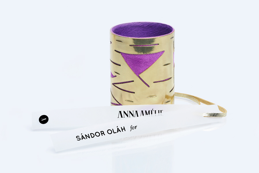
When I created the identity of Anna Amélie my purpose was to design a logo which is more exciting and playful than just reminds of the biggest brands. I figured up the image should not be update, but rather to indicate the stability and the guarantee of the presence of this brand after years. Many elements of the image have priority so it has several way of appearance which provides wider scope for the designer. The basic logo is the main element of the identity. It is a classical antiquites designed by me, the letters of A and E are incomplete. My idea is to use this style also in the important inscriptions which means these incomplete letters style continue in the typography. Therefore the brand will be recognisable without the logo. The letter of A or the motif of needl are also own elements of the brand image which have many form of appearance. On the one hand they help to consolidate of the masculine line and they can substitute the basic logo if it is impossible to use it or it would become boring because of the repeated use on certain surface. The classic style and progressivity also appear in the image. They complement each other which is not intrusive, even so they push the awarding of the brand to the direction of luxury through the visual identities.
Thank you for AnnaAmélie and Nóra Hevesi, that gives scope for my abilities.
Identity photos: Várfi István
Thank you for AnnaAmélie and Nóra Hevesi, that gives scope for my abilities.
Identity photos: Várfi István


Thank you very much!
Please, check on my facebook too.
Please, check on my facebook too.


