Re Branding |The Reason
AIS has transitioned from being a glass manufacturing company to the integrated solutions company. However the logo does not reflect the scale or potential of the company thus limiting the parent brand AIS.
Furthermore, there is a need for standardization of all other offerings of the parent brand with a logo that does not constrain the brands or make any offering seem disjointed. Thus an all encompassing logo that can serve as an umbrella for all the offerings is an immediate requirement.
Furthermore, there is a need for standardization of all other offerings of the parent brand with a logo that does not constrain the brands or make any offering seem disjointed. Thus an all encompassing logo that can serve as an umbrella for all the offerings is an immediate requirement.
The idea | Inspiration
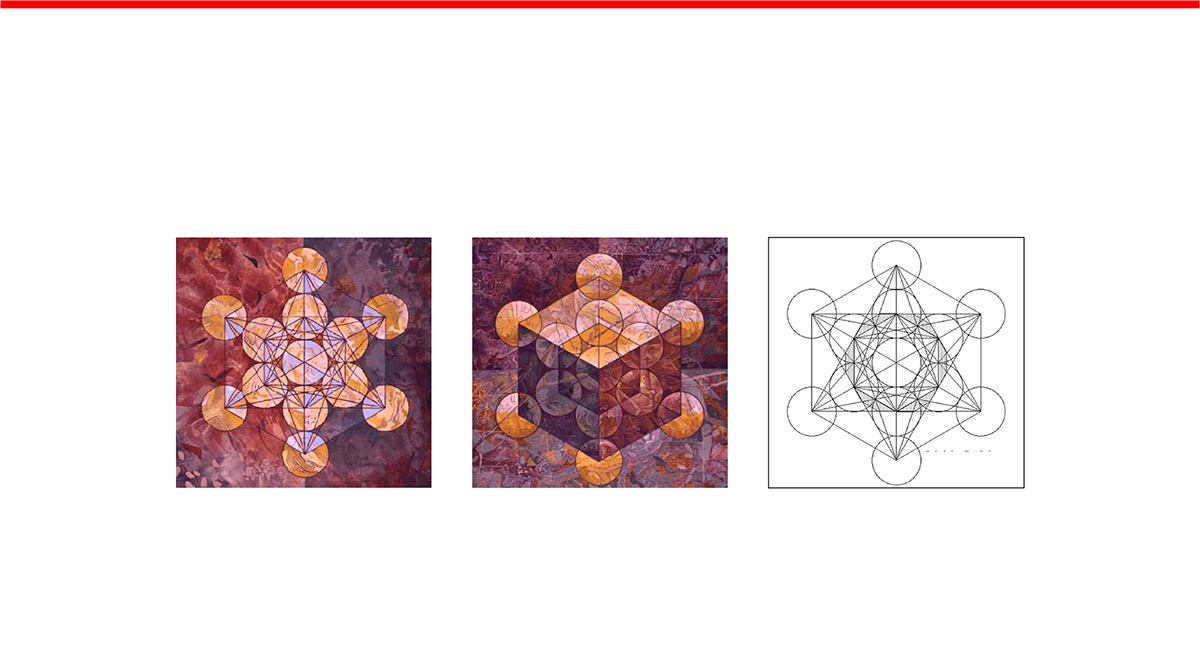
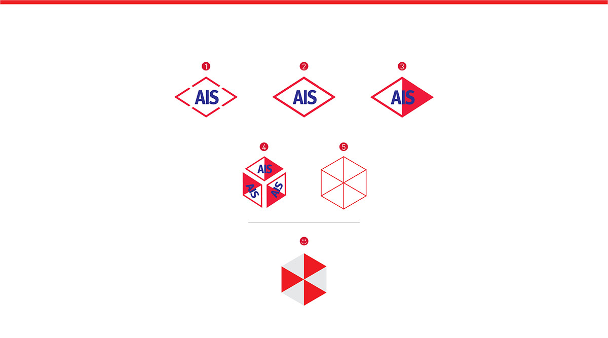
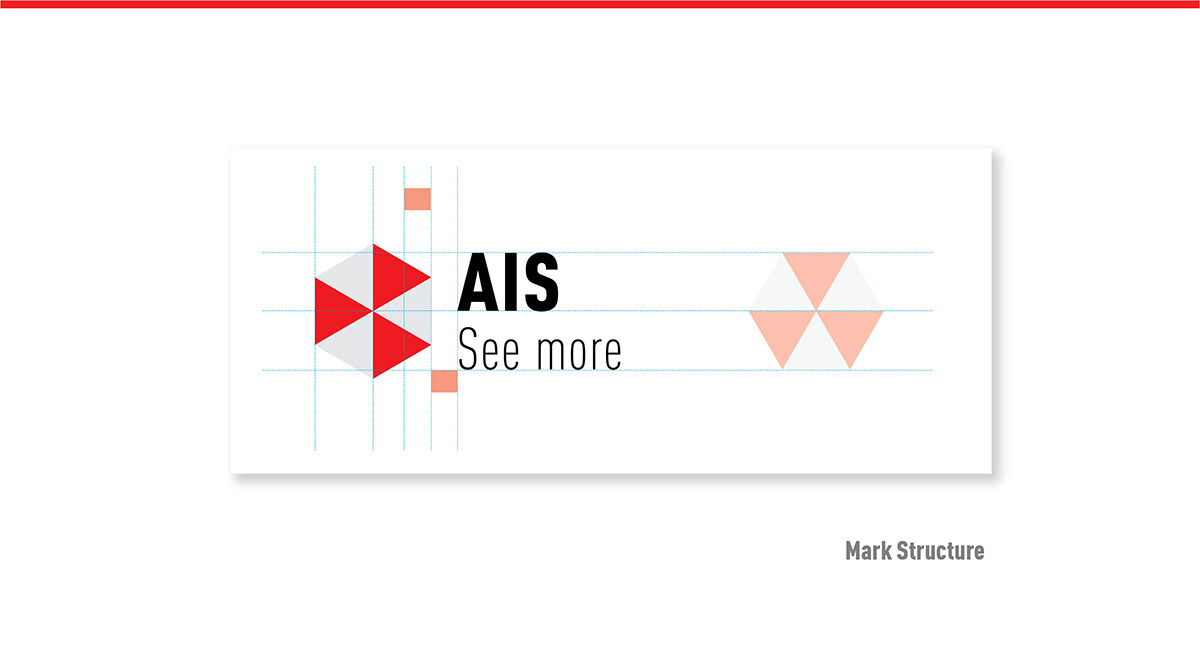
The new AIS logo is based on an archetype form. The core element of the old logo ‘the diamond’ is used to reconstruct the new logo. Inspired by Metatron’s Cube and Sacred Geometry, the new logo goes beyond 2D elucidating and leveraging the line ‘see more’.
The cube contains 3 forward pointing arrows to depict constant Growth, Evolution and Innovation. The logo also assumes the shape of a 3D box although it is a 2D design, further strengthening the strap line ‘see more’.
Clearly symbolic of the transition to an integrated solutions provider, AIS now has a logo that ties in all other offerings with a standardized thought. Moreover, the logo is symbolic of the X, Y and Z axis, the three dimensions that everything on earth is created on.