At first it was a simple joke. A flick on the hipster people.
But after some letters designed, I found it more and more interesting.
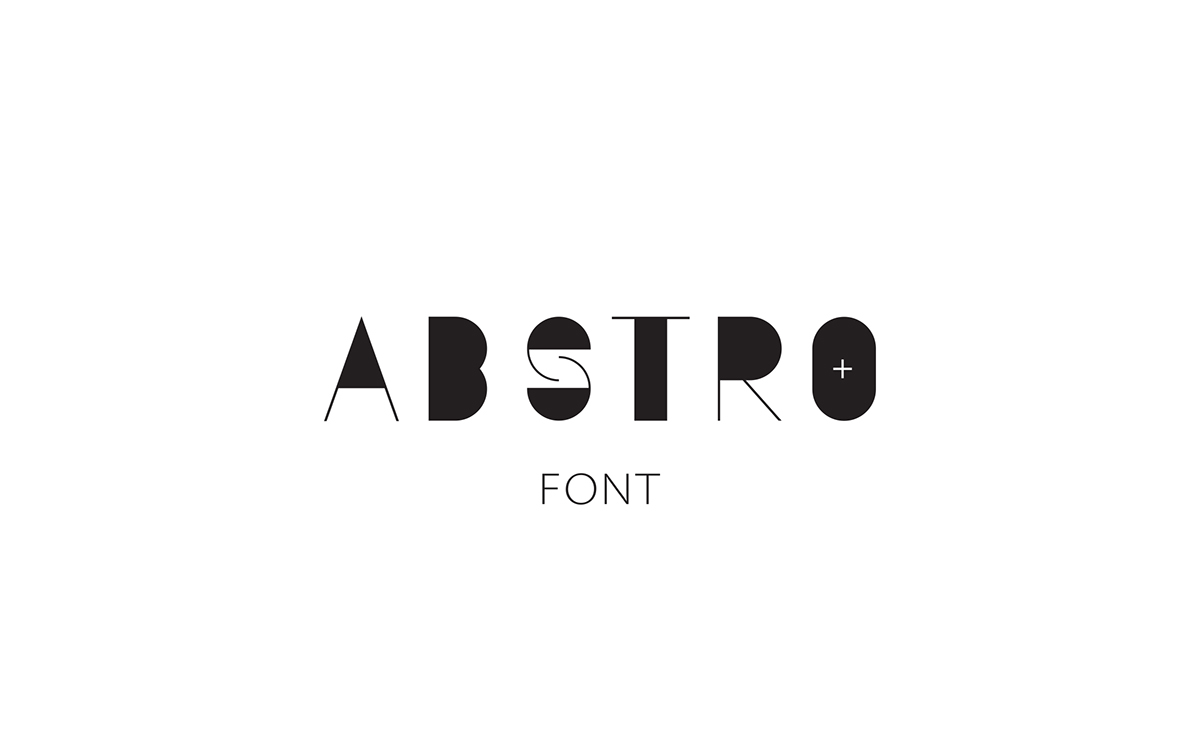
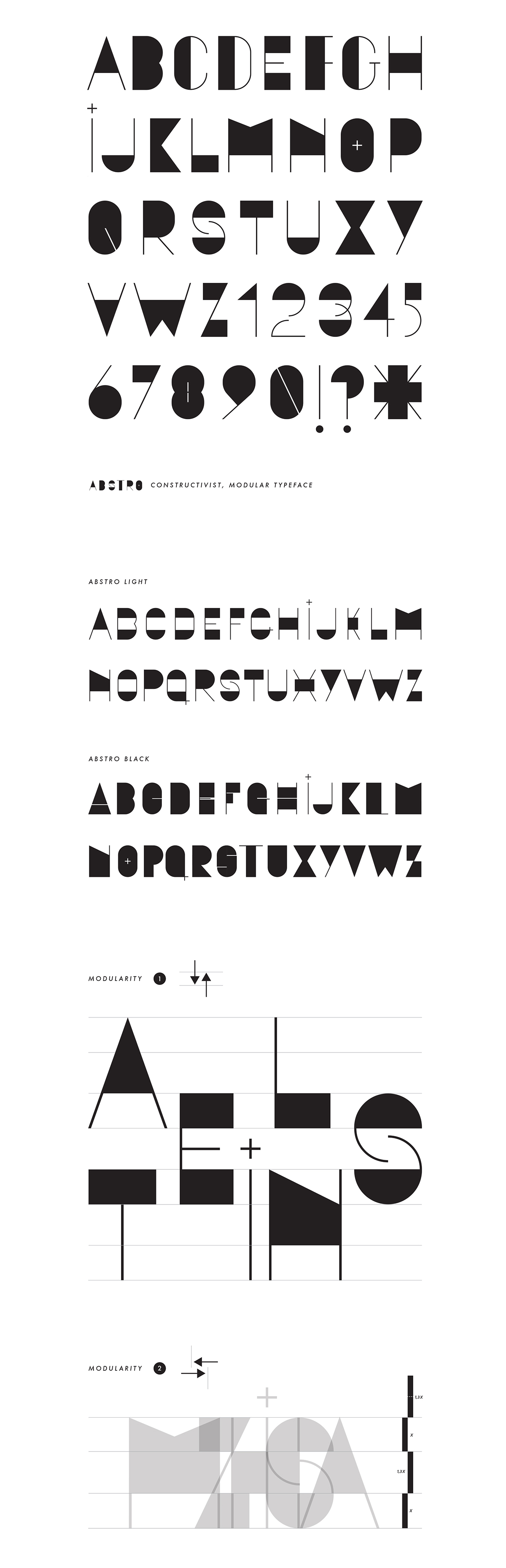
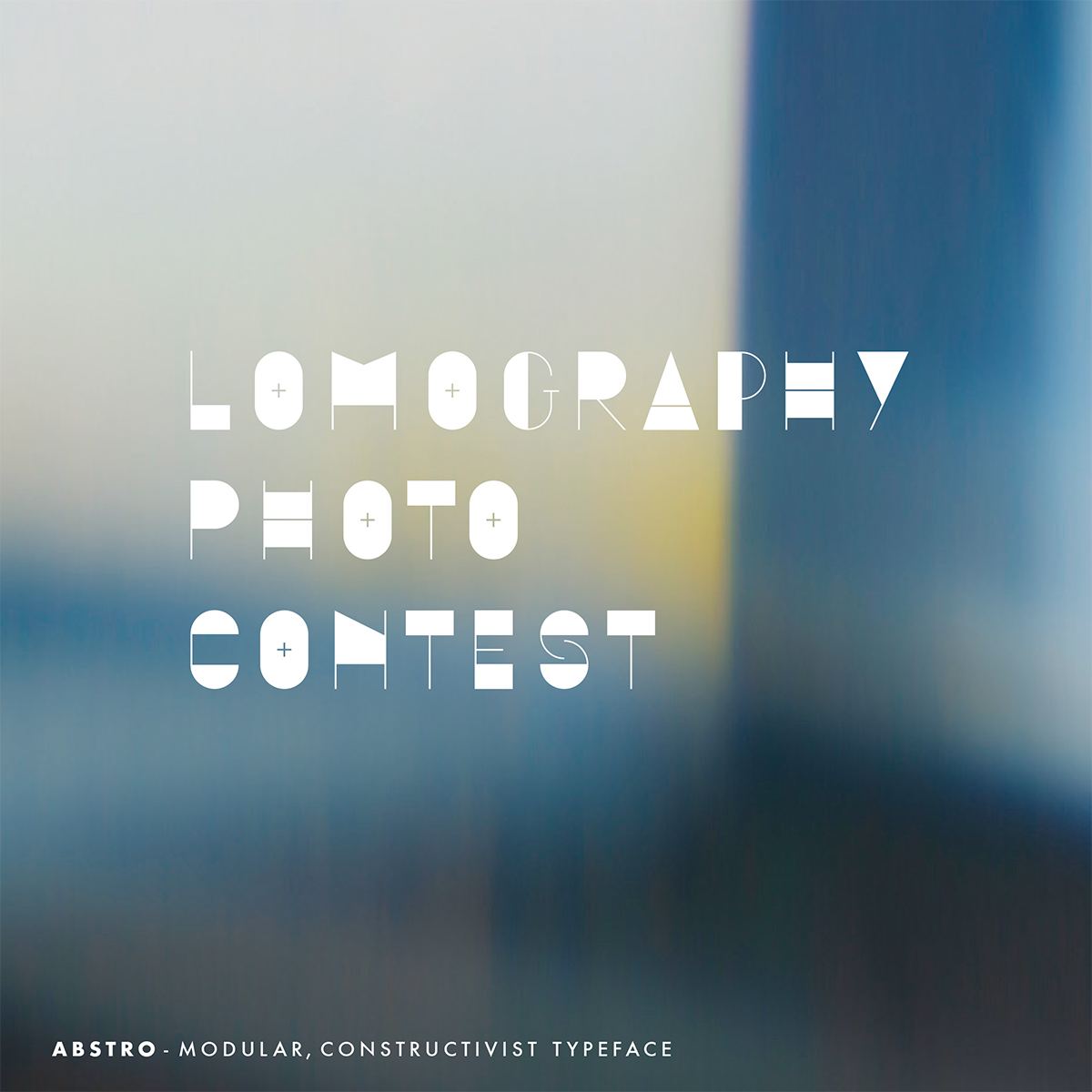
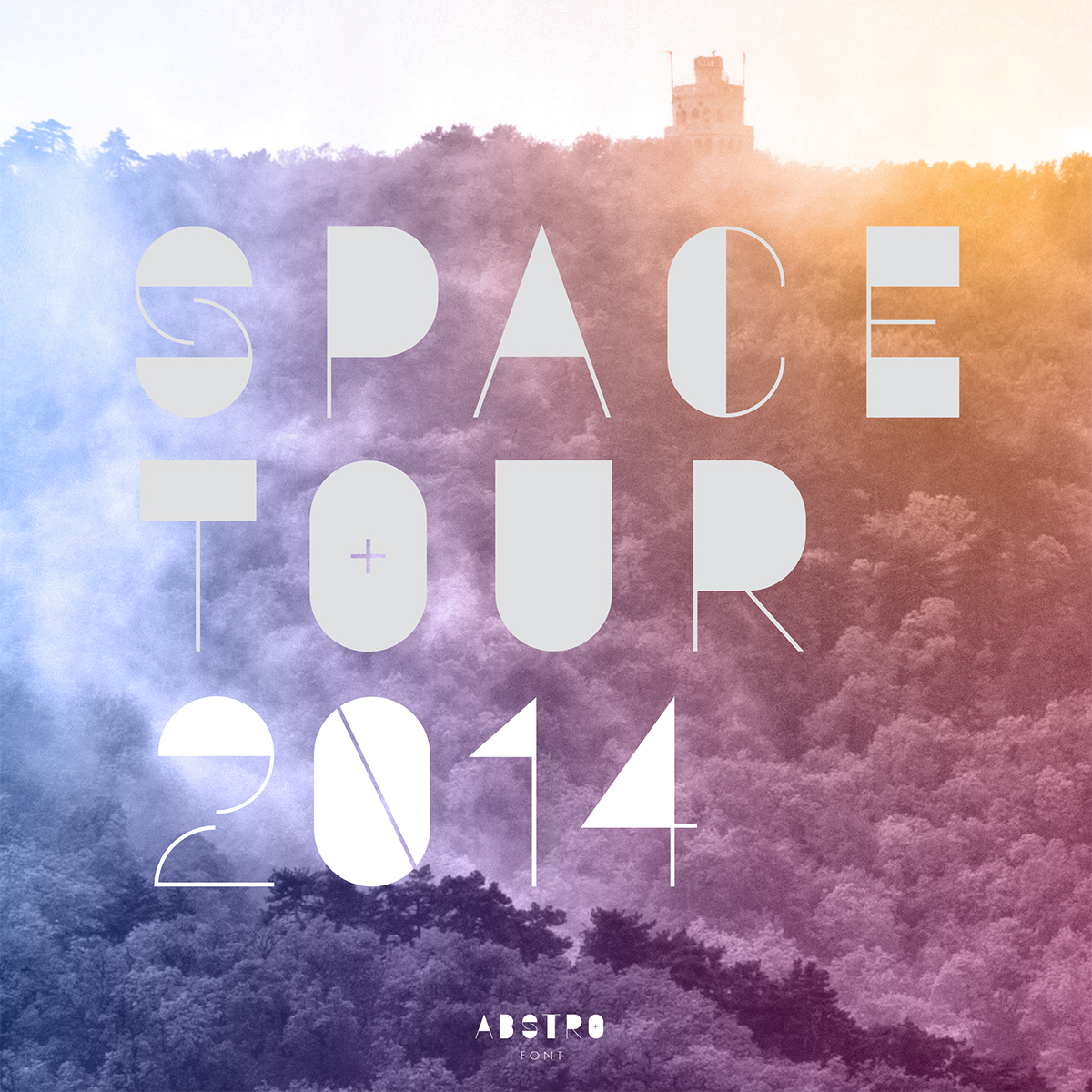
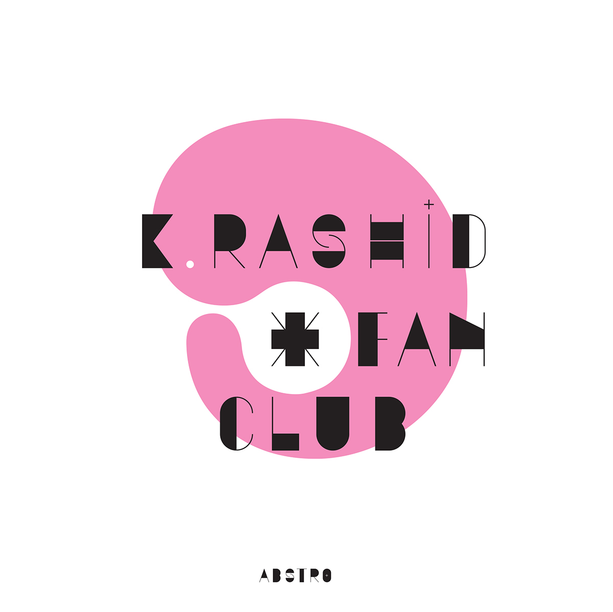
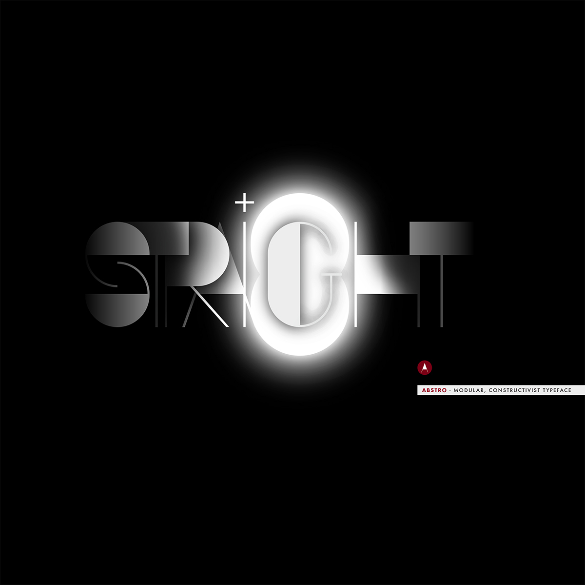
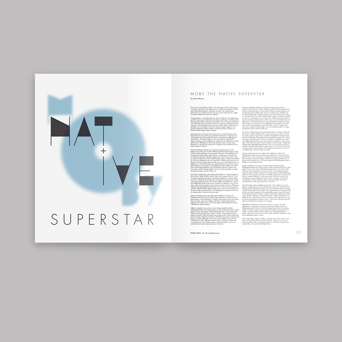
It is a pure CONSTRUCTIVIST typeface, an ABSTRACT font with a pinch of hype inside.
I know many other similar (purely geometric font) can be found, but this font has a unique ability,
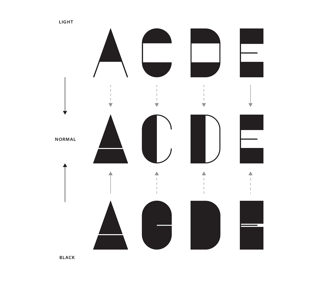
the MODULARITY. Upper and lower horizontal lines has the same (over thickened) line width,
wich allows the horizontal and vertical compression of the letters. In that case you should
watch out for readability, if not, it will result an interesting type-surface...
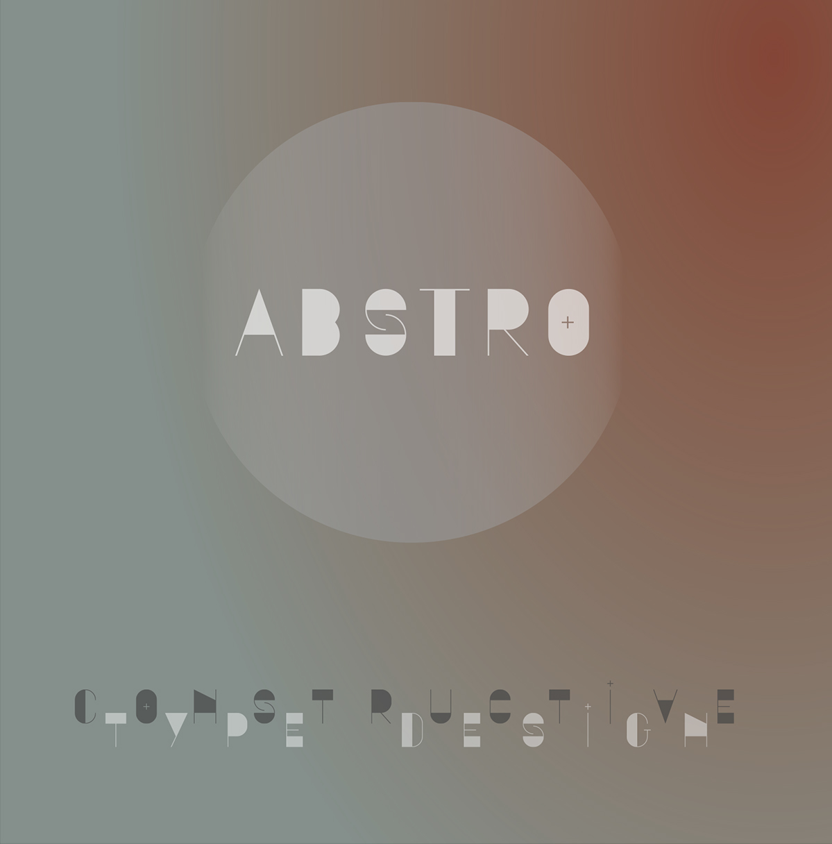
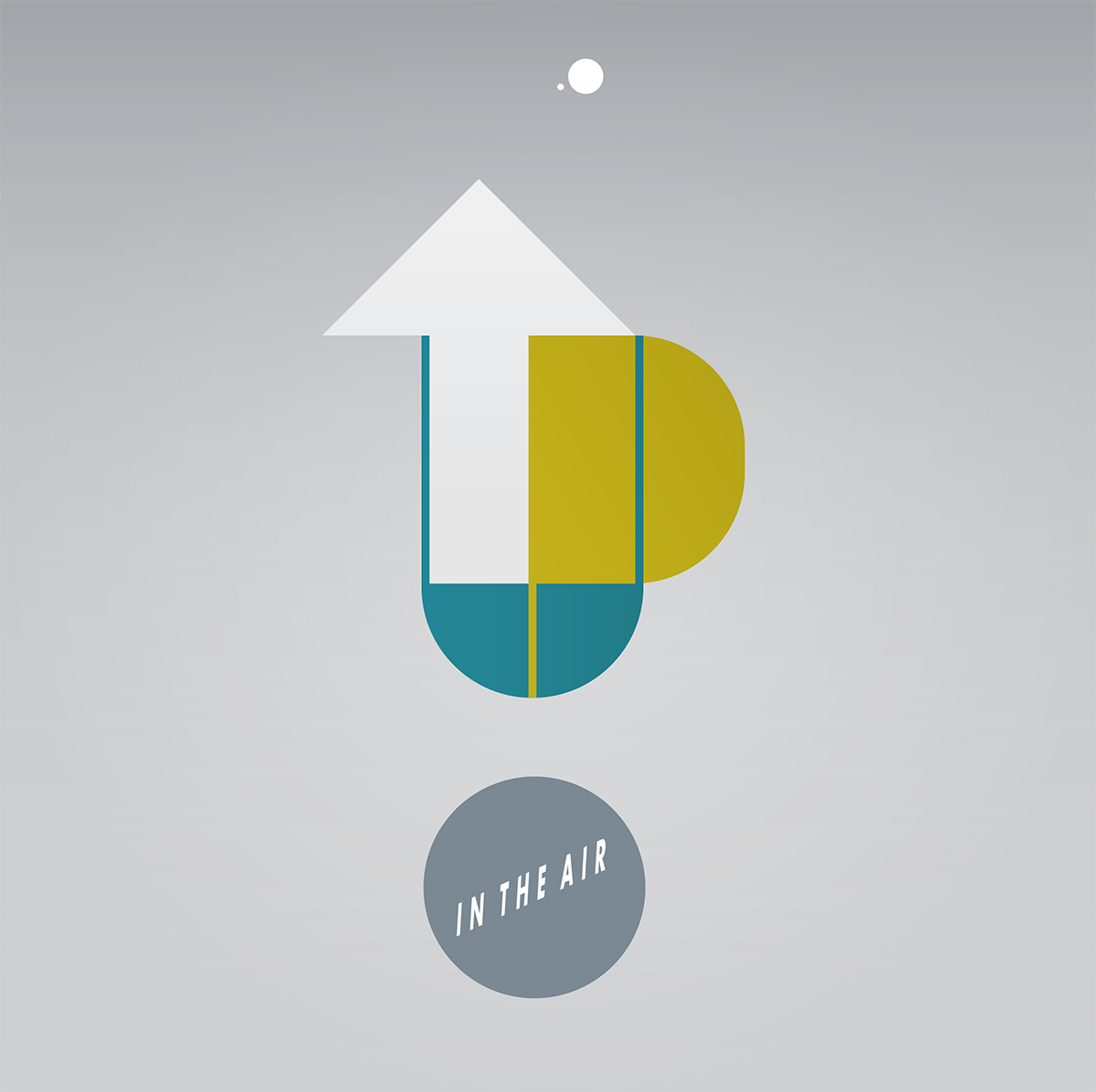
In written text, the fluctuation of the heavy and light tones makes a special vibration, looks like
some kind of code or structure. This is what makes the font's characteristic interesting.