
I was approached by Jon Greiner of Basin Safety Consulting to rebrand his company with a new look. The design had to be flexible in both vertical and horizontal formats and stand out from the competition.

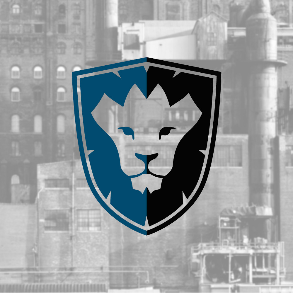
These are the two primary logos for Basin Safety Consulting each to be used for the format they fit most comfortably within. The Lionshield mark itself is also acceptable to be used without accompanying text.

The horizontal mark is the primary mark and should be used whenever possible.

The letterhead at BSC is printed in house and was designed to accommodate printers of any type. There are no bleeds except on the business cards which are printed elsewhere.

The business card presented a new challenge in that it needed to work as a promotional item as well. The back has a large amount of text highlighting the many roles that Basin Safety Consulting performs and is invaluable for clients met at conventions or other large social situations where remembering exactly who was who makes a difference.

The Lionshield Mark is used for a variety of purposes at Basin Safety and the use of "shiny" logos is often employed for BSC's educational services.

On darker backgrounds, white is filled into the negative space of the Lionshield Mark to maintain the appearance of the lion. Without this feature the inverted colors make the lion form less apparent and more abstract.
On lighter backgrounds, the white behind the Lionshield may be excluded.


