Andriotis | Greek Olive Oil
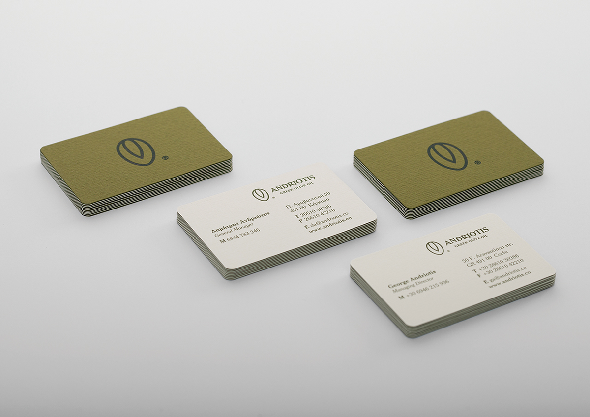
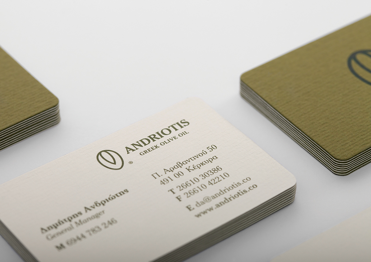
Η Ανδριώτης Α.Ε. είναι μια οικογενειακή επιχείρηση, που δραστηριοποιείται στην εμπορία και επεξεργασία ελαιολάδου τα τελευταία 55 χρόνια. Το λογότυπο σχεδιάστηκε με στόχο να αντικατοπτρίζει την κλασική και διαχρονική αξία του ονόματος, ανανεώνοντας ταυτόχρονα την επικοινωνιακή του εικόνα.
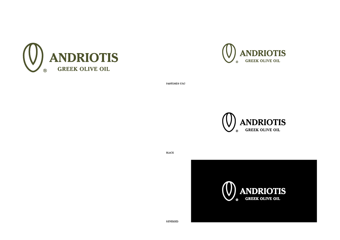
Το σύμβολο του λογοτύπου οπτικοποιεί μια ελιά με το κουκούτσι της, σε τομή, ενώ η τυπογραφία που επιλέχθηκε, με πατούρες και κεφαλαία γράμματα, αποπνέει το κύρος και την αξιοπιστία που χαρακτηρίζουν την συγκεκριμένη επιχείρηση.
Andriotis S.A. is a family business that specialises in the trade and processing of olive oil, for the last 55 years. The logo was designed in order reflect the classic and timeless values of the brand name, while at the same time updating the communication image.
The symbol of the logo presents an olive with its pit, in section∙ the typography chosen, with serifs and capital letters, expresses the validity and reliability that characterise the Andriotis business.

Symbol


Color Palette

Color Palette
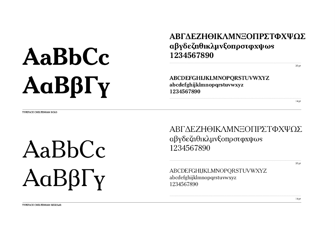
Typography | PF Cheltenham

Color Palette


Logotype

Logotype Black Reversed

Logotype Pantone® Reversed

Scale


Before/After

Envelope 11x22cm
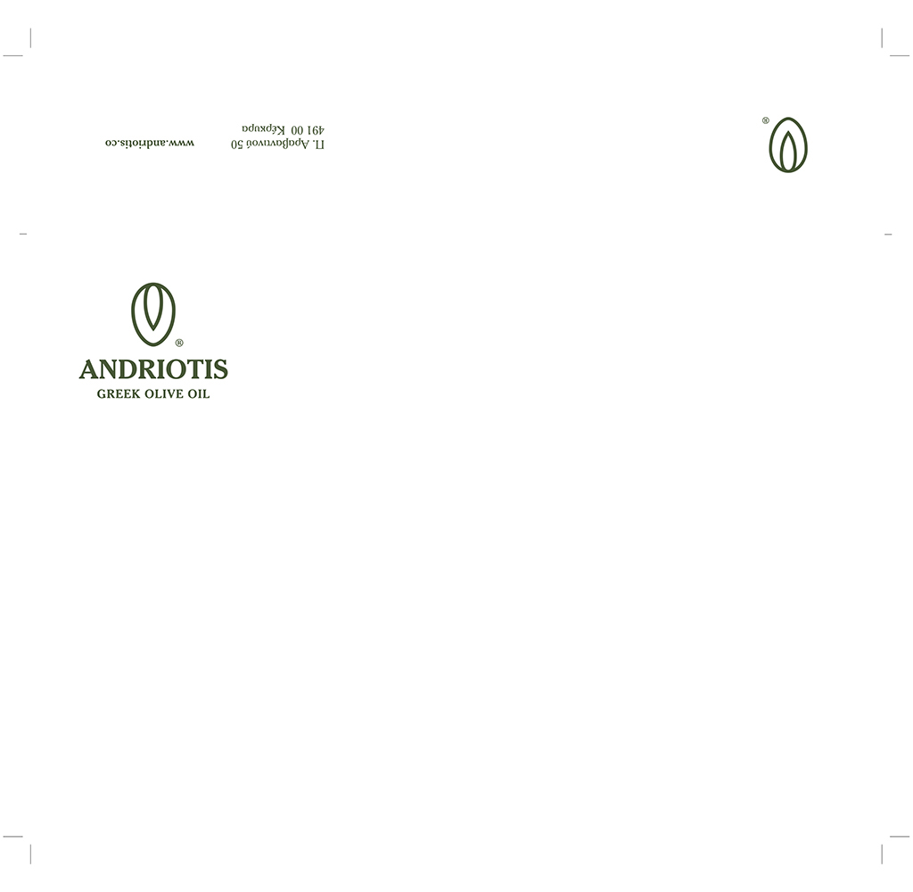
Envelope 16,2x22,9cm

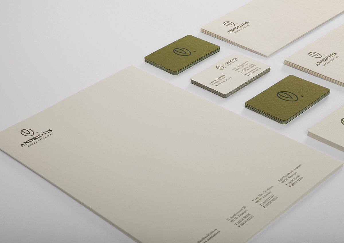
Letterhead A4


CONCEPT & DESIGN Chris Trivizas
TYPEFACE Parachute® Typefoundry
PAPER Rifpa, Perrakis Papers
PHOTOGRAPHY Math Studio
©2013

