11.09.2001
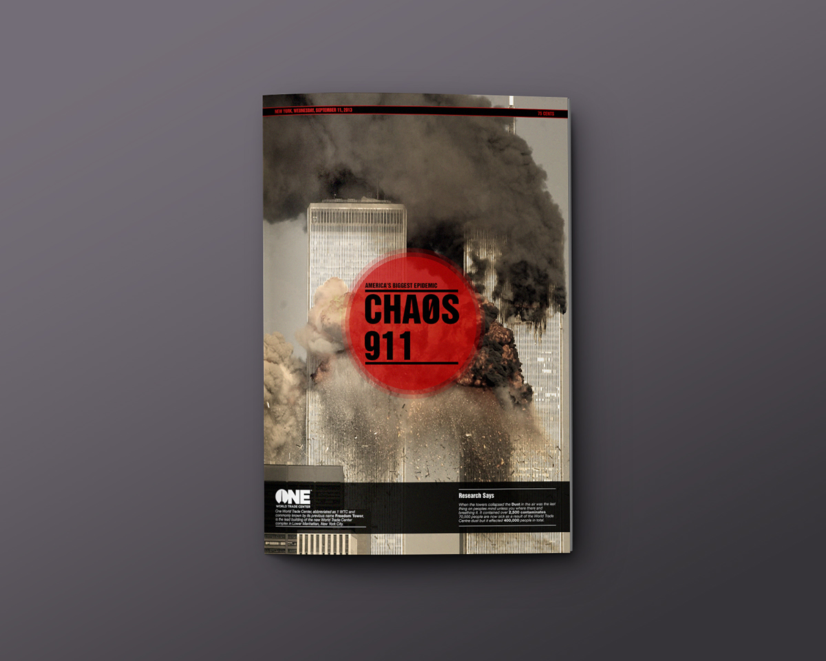
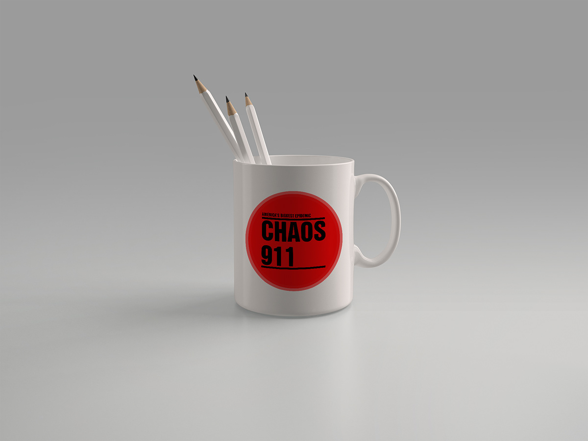
Chaos 911
is a special edition tabloid newsletter.
Exposed Journalim is what you can call it!
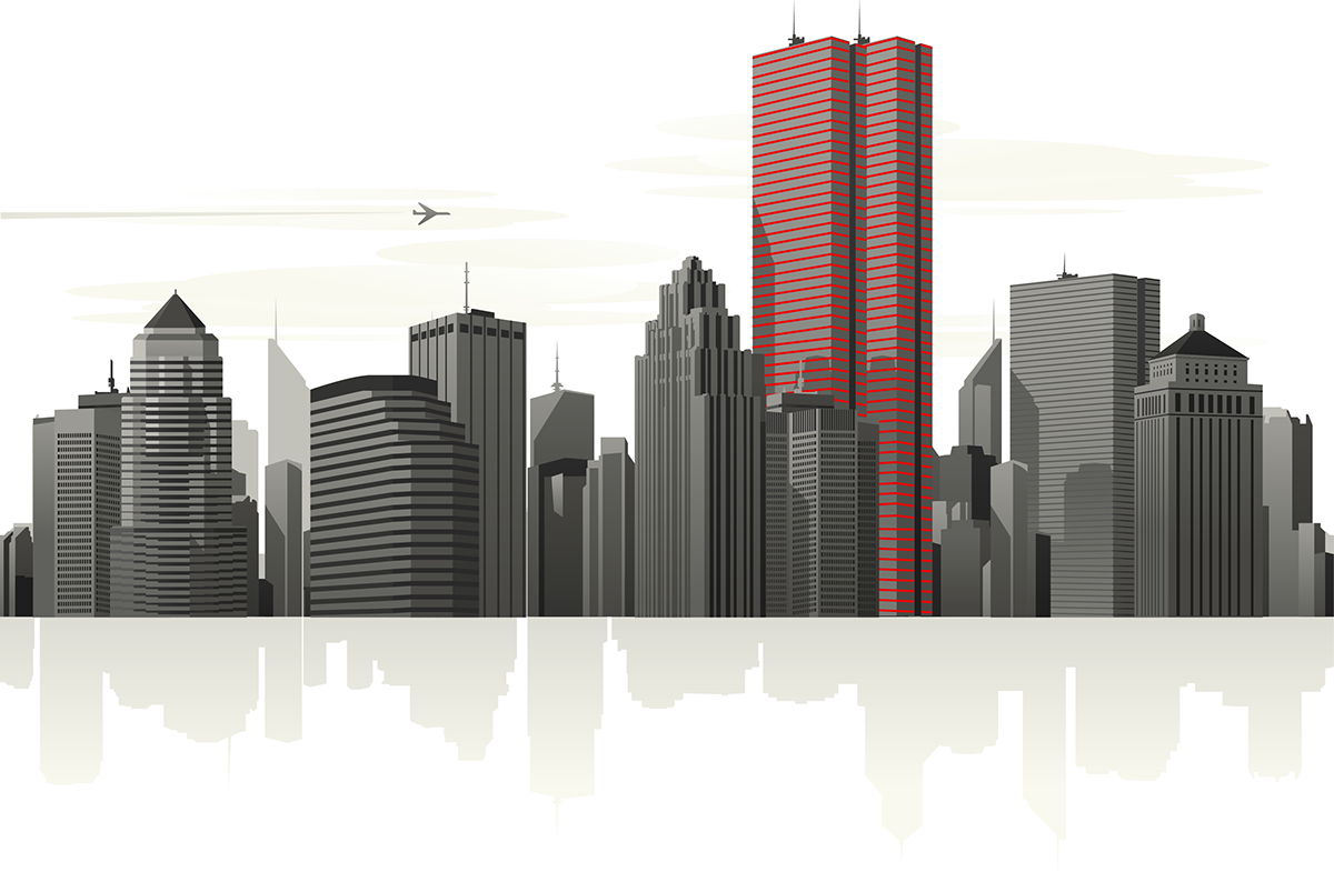
Everybody remembers where they were that day as the whole world stopped and watched the events of 9/11 unfold.
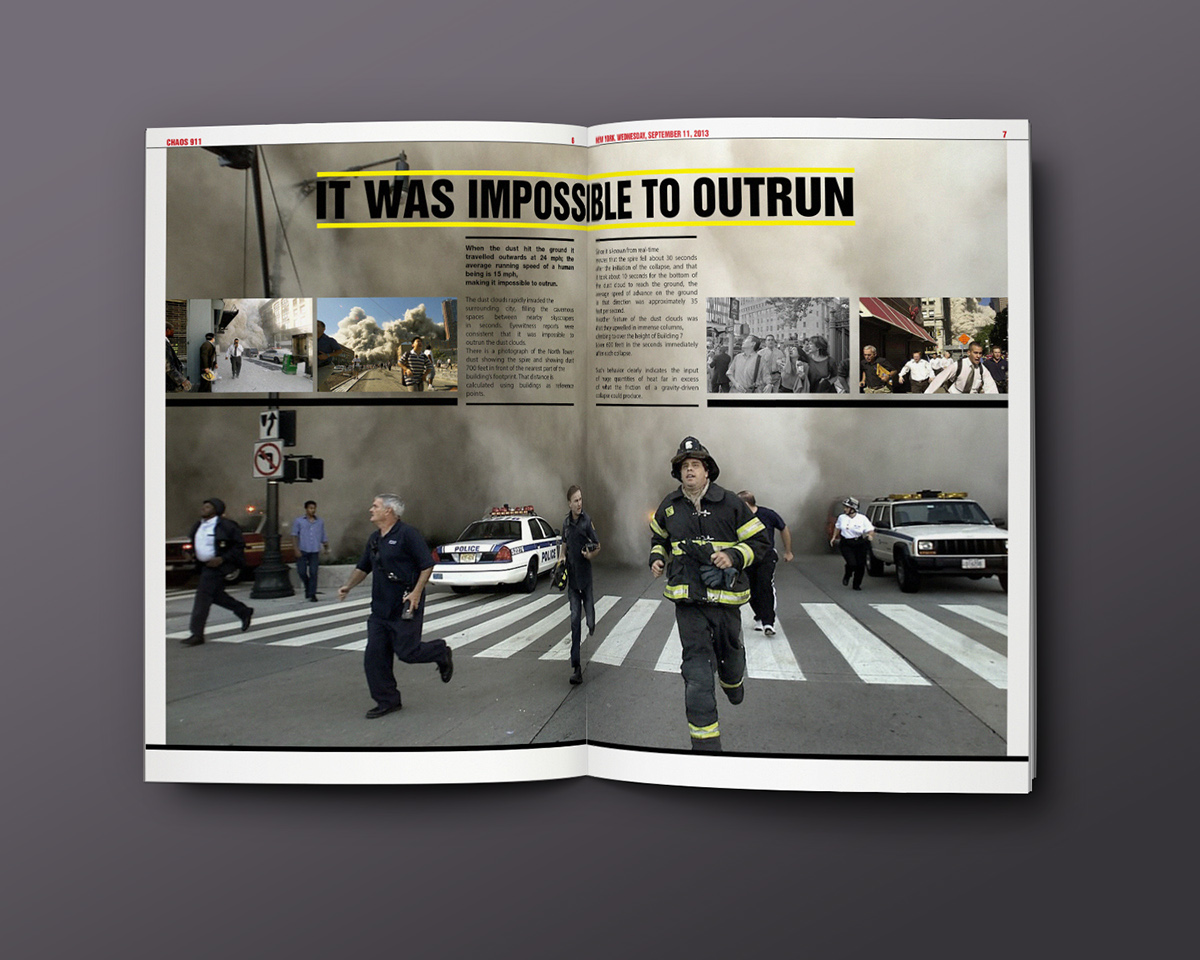
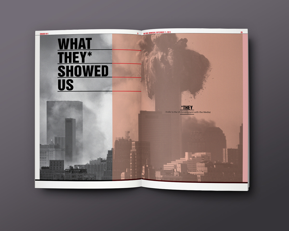
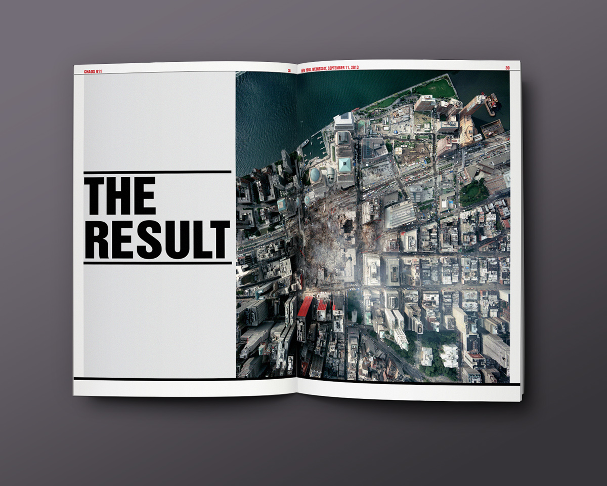
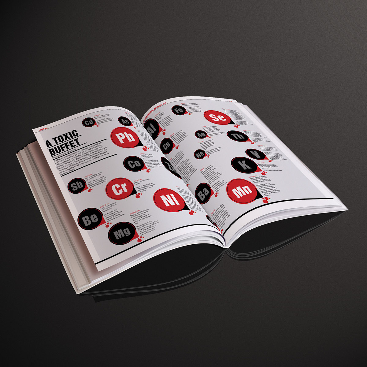
When the towers collapsed, the dust in the air was the last thing on peoples mind unless you were there breathing it. It contained over 2,500 contaminates.
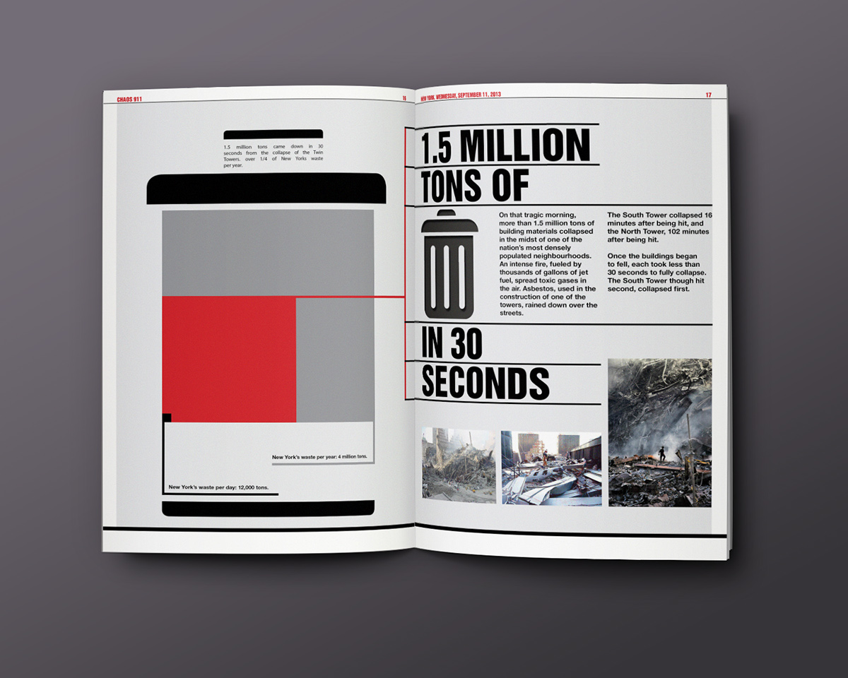
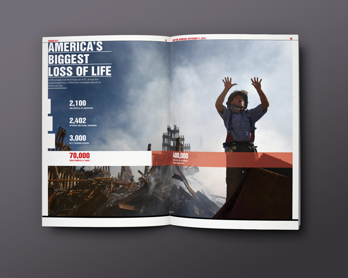
Sadly 3,000 people died on 9/11, it was the biggest attack on American soil by a foreign
attacker.
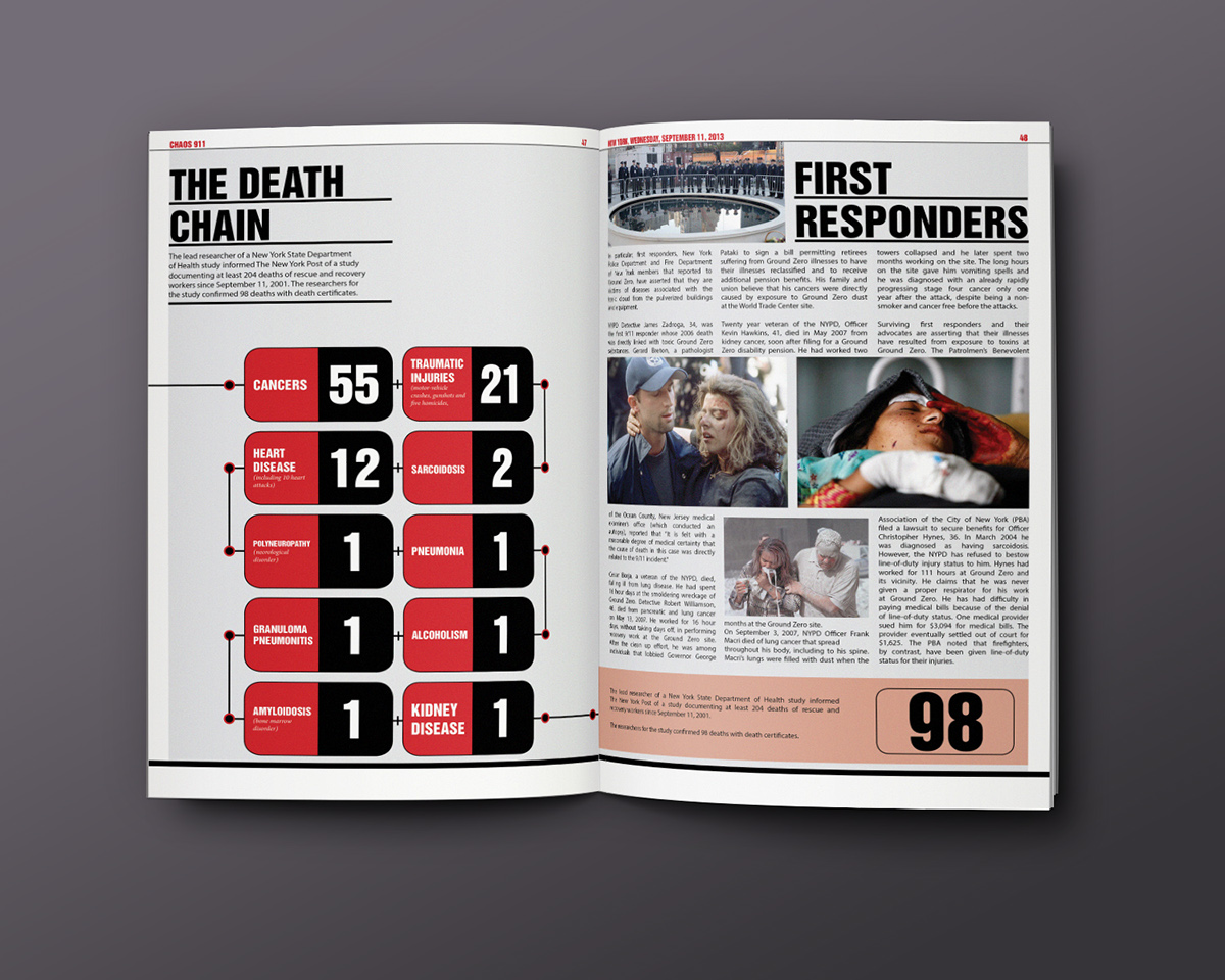
70,000 people are now sick as a result of the World Trade Centre dust but it affected
400,000 people in total.
It is already America’s biggest epidemic.
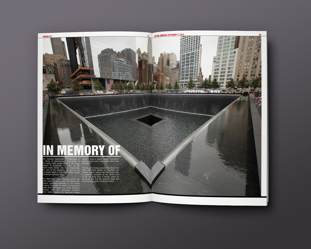
People have forgotten about the attacks. 9/11 just has a memorial at its position which people pay respect to once every year, that is on 9th September.
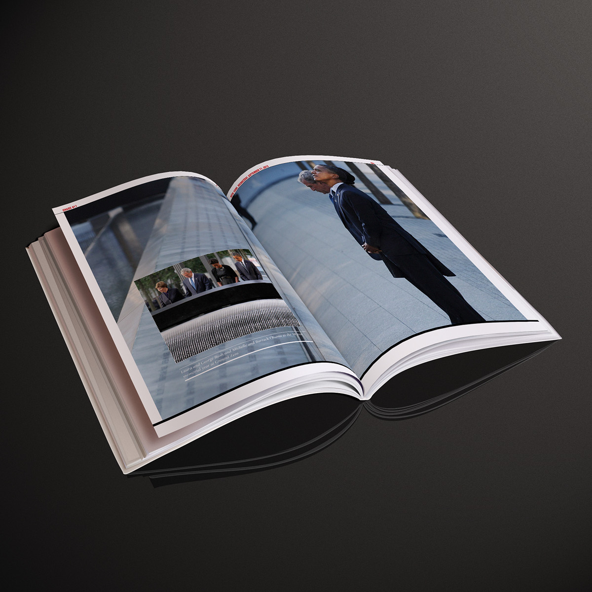
But the first responders of the mishap, are dying, till today!
The entire conspiracy behind this needs to be exposed to the general public.


Research & Development
I read articles from old newspapers, magazines, specific books written to discuss the hidden spams behind the 911 story. I watched 2 documentary films on the 911 conspiracy which gave me a lot of knowledge about the actual technicalities that were involved in the act of the mishap or the so called conspiracy.

Design Brief
The design of it is very interactive with a lot of hard hitting information.
The layout will have a lot of room to take in the information and give the viewer a chance to breathe a bit and spend time with one element on a page. Like a picture or just simply type that allows them to better consider their responses and emotion towards the information being
conveyed to them.
There will be lots of hidden ideas in CHAOS 911 that will invite the viewer to meet the
design of the information half way instead of forces feeding the information to them, this makes for a more effective and memorable user experience.
Typeface Choices
TYPE Selection
Helvetica was an obvious choice, not just because its everywhere in New York, but also the fact that New Yorkers trust the typeface to instruct them on how to get from A to B safely and on time on the underground every day and the information in CHAOS 911 can
defiantly trusted.
Headings :
I then choose to use Helvetica Inserat for the headlines as Helvetica looks very similar to it. Helvetica Inserat was based on the typeface “Helvetica”.
This made Helvetica Inserat very appropriate to use as metaphor for the American government lying through the media about the air being safe to breath in such a way that they and the
Government both look and act like a figure you know and trust (Helvetica), but in a sad reality you can not at all.
Body text :
Helvetica Neue is the most clear and legible of all other sans serif fonts in this font family.
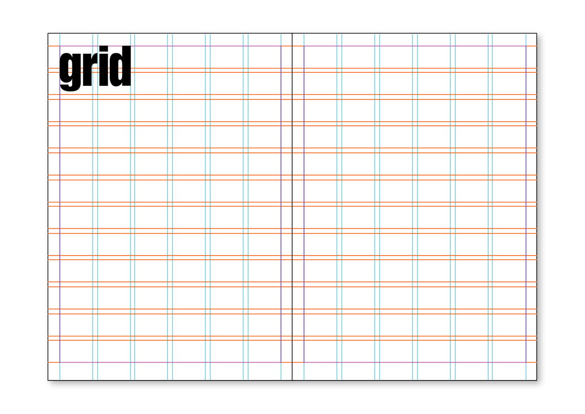
LCM Grid : 6 columns x 12 rows
Margins :
Top - 10mm
Right - 10mm
Botttom - 15mm
Left - 10mm
Who is your anger mounting towards now?

