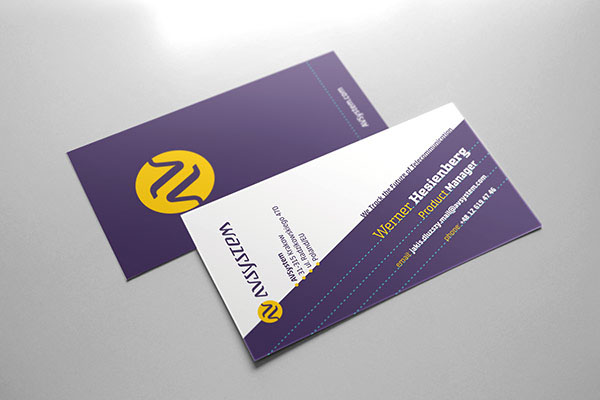
AVSystem - case study.

I was approached by AVSystem - a Polish software house strongly devoted to Research & Development in cutting-edge telecommunication solutions - with the job of refreshing their branding. They are a group of young, yet already experienced and highly trained technology experts. AVSystem's clients include major players from all around the world, the company is expanding rapidly, but their old logo (above) was still telling a story of a small start-up, so it was about time to replace it with something more up to date.
Initial concepts.
Client requested focusing on a typographic solution, possibly with some visual element that could be isolated and used as a standalone symbol. We wanted to stress their dedication to novel and unique solutions, as well as flexibility and client-first approach. AVSystem deals with advanced technology, so we also wanted to include some “techy” flavor in the logotype, although definitely not along the lines of inhuman, cliché letterforms from the 70's sci-fi movies. It had to be warmer and more approachable to reflect the team's attitude.
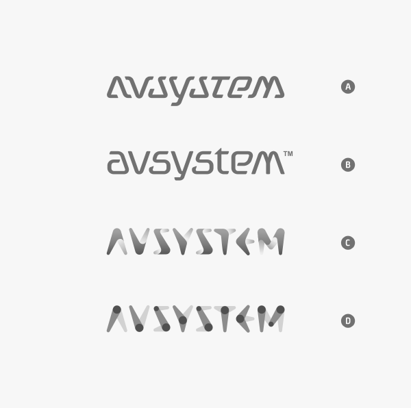
Few hundred sketches later I presented my client with four rough wordmark ideas. “A”, with its letterforms based on a triangle, is probably the most unique. I also like how each character fills the space created by its neighbors, so that the whole wordmark is very coherent and exhibits a distinct visual rhythm - almost like a wave. Second idea is clearly the most conservative and classic one. No risky moves, just an elegant and efficient solution to the task of creating a wordmark for a software company. C and D are, of course, based on one concept, but carried out in two different ways. Both of them give a strong impression of adaptability. D appears so flexible, that its base elements might start turning around at any time. Meanwhile, C is the more plastic and friendly of the two.
Development.
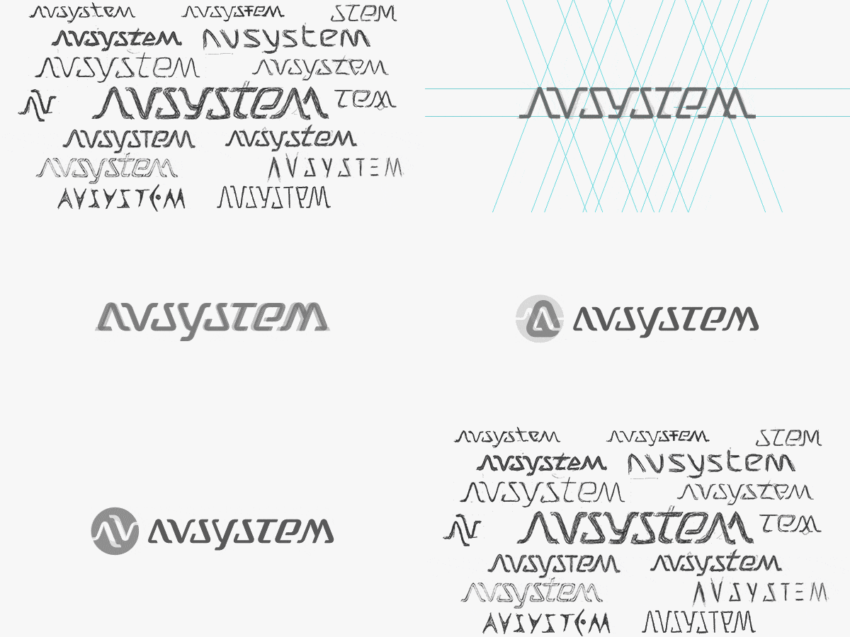
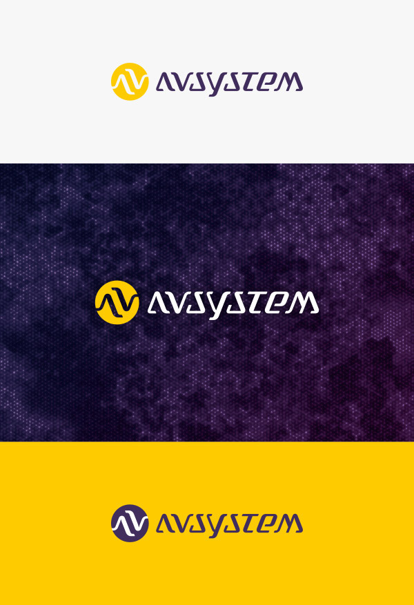
The AVSystem team decided that they are most interested in options A and B, so we started testing out various options of modifying those two concepts. B got abandoned pretty quickly, as it was impossible to change it in a way my client desired, while preserving its sleek look. From now on we have focused our attention on project A. Each letter got redrawn, we introduced varying line widths to make the wordmark lighter and more pleasing to the eye. Also, we have tried out a variety of accompanying symbols based on the lettering, finally settling on a “AV” combination enclosed within a circle, as a metaphor of connection between two entities. We have also decided to make it a permanent element of the logo, not an optional addition.
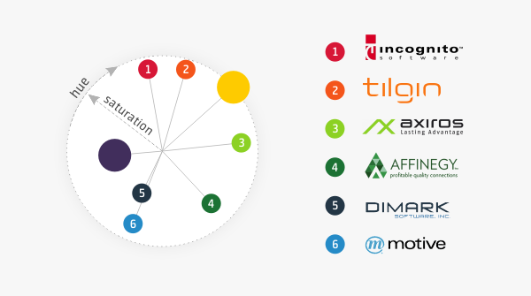
Next step was finding a suitable color scheme for AVSystem. It was important to them to make it differ from the themes already in use by their competition, but at the same time to convey the spirit of energy and technology that is the foundation of their company. To present my color idea to the client I have devised a simple diagram comparing it to the logos of rival companies.
Finalization.
At this point we were ready to complete the design process and expand it into a wider branding system.

A few excerpts from the brand guidelines document:
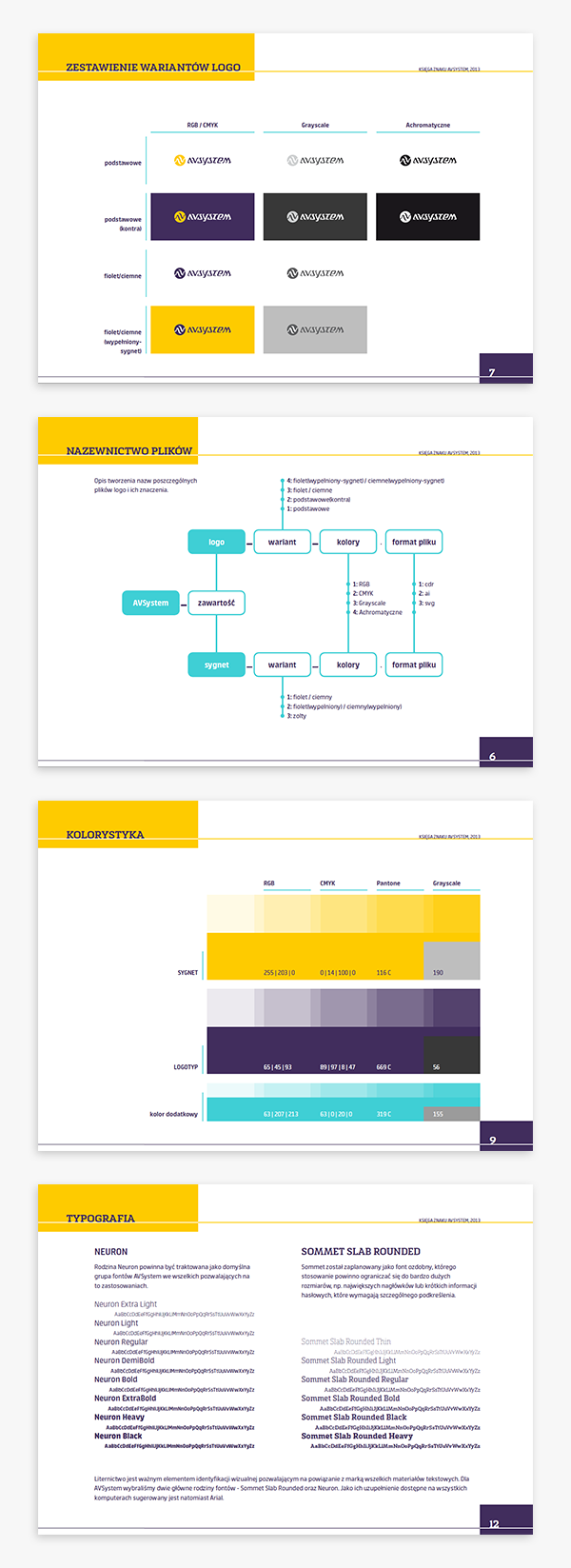
We have also prepared some tips on using company's visual style in presentations:

