▲
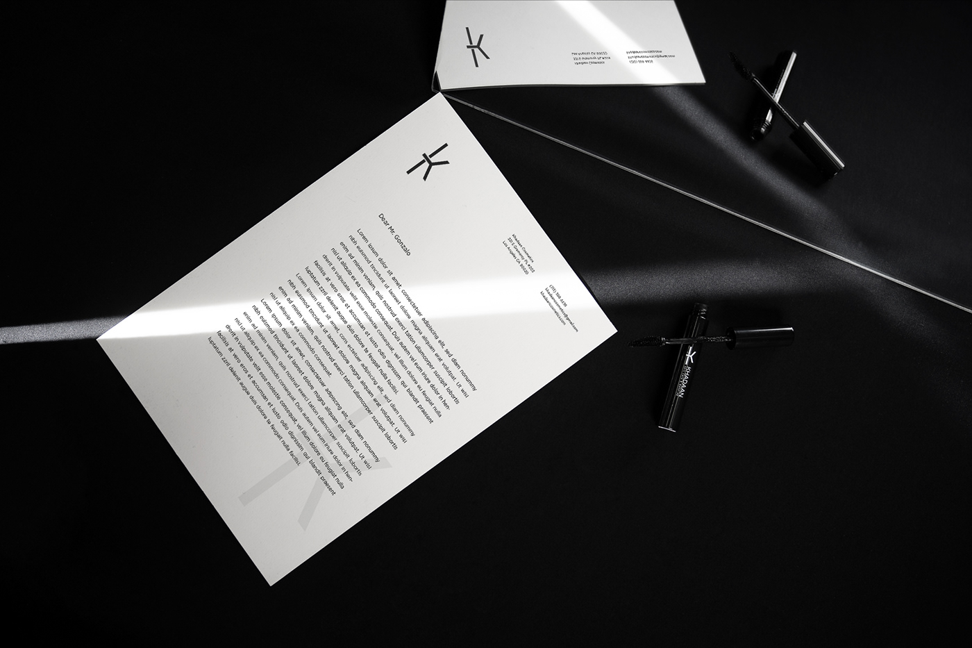
We would like to briefly introduce the logo and package designing work of KHADAAN cosmetics, one of the first Mongolian cosmetics brands that are produced in the foreign market.
We used simple font, black & white color combination and focused on just one core symbol “K” to define brand personality more minimal and valuable. The simplicity makes the design bolder and eye-catching.
More minimal
More clear
More valuable
More clear
More valuable
▼