


LogoArchive Issue 1 was conceived, designed and sent to the printers for quotation within a day. It was inspired by a panel discussion that took place the day before at Somerset House as part of the exhibition Print! Tearing It Up. In the momentum of its design LogoArchive seeks a closer connection between the passion of its author and material object.
LogoArchive is founded on an enthusiasm for a well-crafted symbol; a convivial metaphor, a communicative immediacy and smart use of form language. However, in print, it was never conceived as a document with a singular intention; the simple documentation of symbols, rather a delivery mode in which to build a story and share thoughts.
LogoArchive is founded on an enthusiasm for a well-crafted symbol; a convivial metaphor, a communicative immediacy and smart use of form language. However, in print, it was never conceived as a document with a singular intention; the simple documentation of symbols, rather a delivery mode in which to build a story and share thoughts.
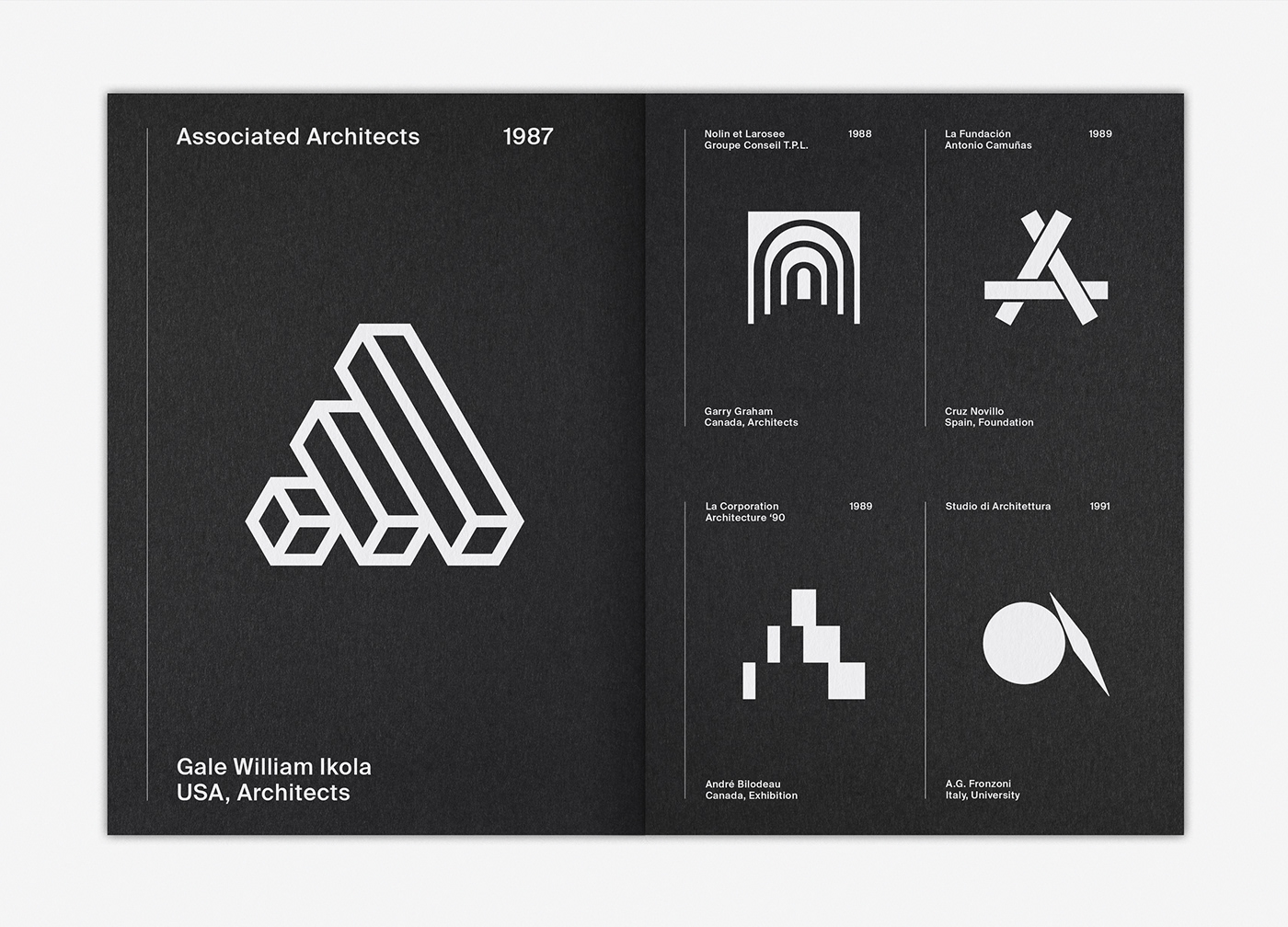
LogoArchive Issue 4 explores the liminal space created by architecture and graphic design, firstly, in the documentation of symbols created for architects, architect magazines, events and unions, and secondly, by employing the architectural notion of nesting; placing one narrative inside another. This manifests itself in the form of a “zine within a zine” which also carries with it the spirit (and convivial subtext) of the Yo Dawg meme.


Designer / Editor: Richard Baird
Publisher: BP&O
Publication: 2019
Size: 148x210mm
Booklet:
Pages: 10pp + Cover
Paper: Colorplan Ebony 135gsm
Finish: HP Indigo White (x5)
Pages: 10pp + Cover
Paper: Colorplan Ebony 135gsm
Finish: HP Indigo White (x5)
Insert:
Pages: 8pp
Paper: Colorplan 135gsm. (Colours May Vary)
Finish: Black
Pages: 8pp
Paper: Colorplan 135gsm. (Colours May Vary)
Finish: Black


