ONE ART EVERYDAY /Logo Mark
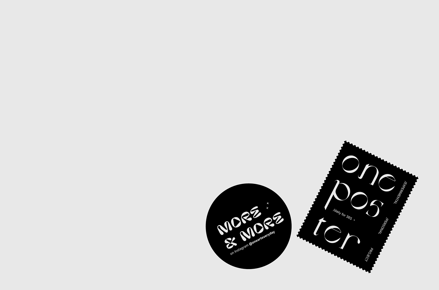
During the One Art Everyday, as trying to explore the most of my ability, doing experimental things, I make 3 identities for this 365-days poster project.
The first one / I meant to describe that One Art Everyday was the named of a daily design project, that's all.
The second one / I wanted make a new logo that look contemporary, typography based. The two-side angle brackets were marked as a experimental, modern and also a "mark" for my first 100 days doing the project.
The third one / The Daisy - or "Day's Eyes" in Old English was exactly the description of One Art Everyday - long lasting, innocent, purity, daily. I had included this image (Daisy) to the project's identity, for the rest of the project.
A Cover Page of One Art Everyday
Music: Wh0 That - AyTee
/