


The context
Sakai is a Japanese restaurant in London that specializes in authentic, and classic Japanese cuisine. They are a dedicated group of people that not only want to bring the original flavour from Japan, but they also want to expand the Japanese culture in Europe.
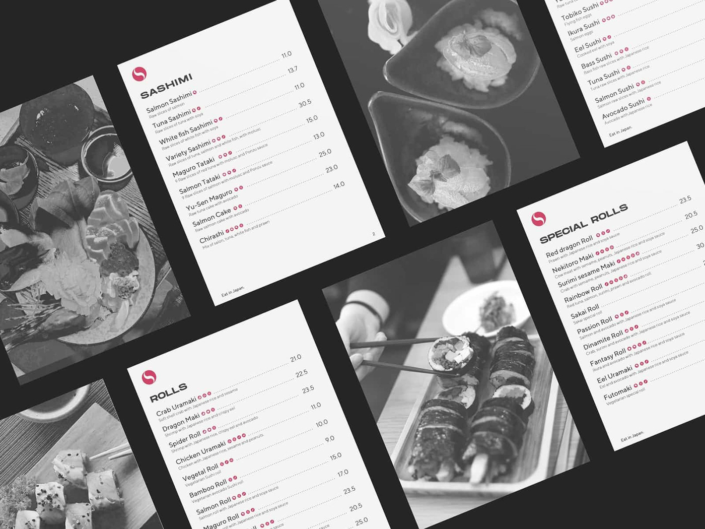
We have created a whole brand identity from start to finish, covering design collaterals like restaurant menu, napkings, bags, and other branding elements such as advertising design, and copywriting.
We have created a whole brand identity from start to finish, covering design collaterals like restaurant menu, napkings, bags, and other branding elements such as advertising design, and copywriting.

Culture
Communicating culture was one of the most important aspects of the entire process. The name "Sakai" comes from an unpopular city from Japan, and it is chosen for its easy pronounciation and for its oriental-sounding characteristic.
Art and perfection are the other two core values in Sakai. It is meant to emulate the respectful environment from Japan, as well as its artistic side. In terms of design, we have implemented the Golden Ratio in every key aspect, such as the logo and iconography.
Art and perfection are the other two core values in Sakai. It is meant to emulate the respectful environment from Japan, as well as its artistic side. In terms of design, we have implemented the Golden Ratio in every key aspect, such as the logo and iconography.


Inspiration & Result
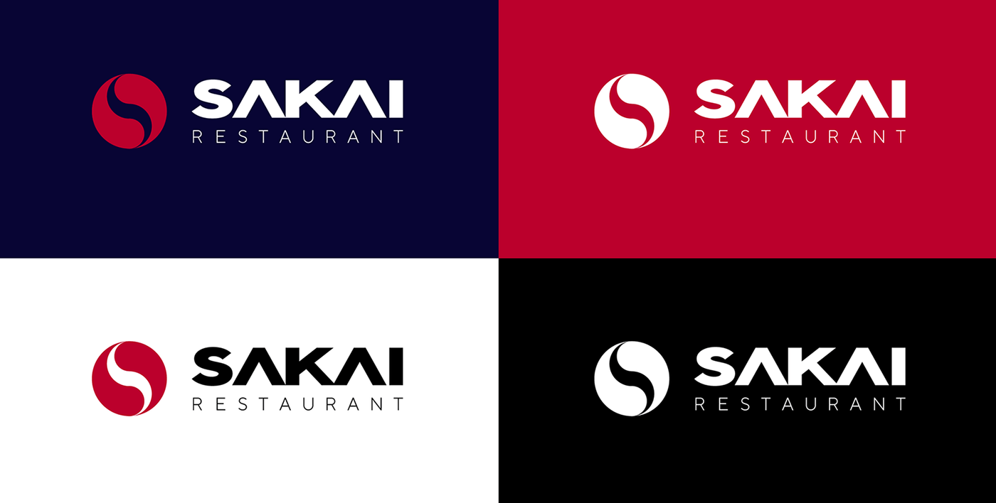
Our logo mark is inspired on the Chinese Yin Yang symbol, as it uses a similar geometrical construction. The result is a call back to the asian pacific and perfection-based culture.
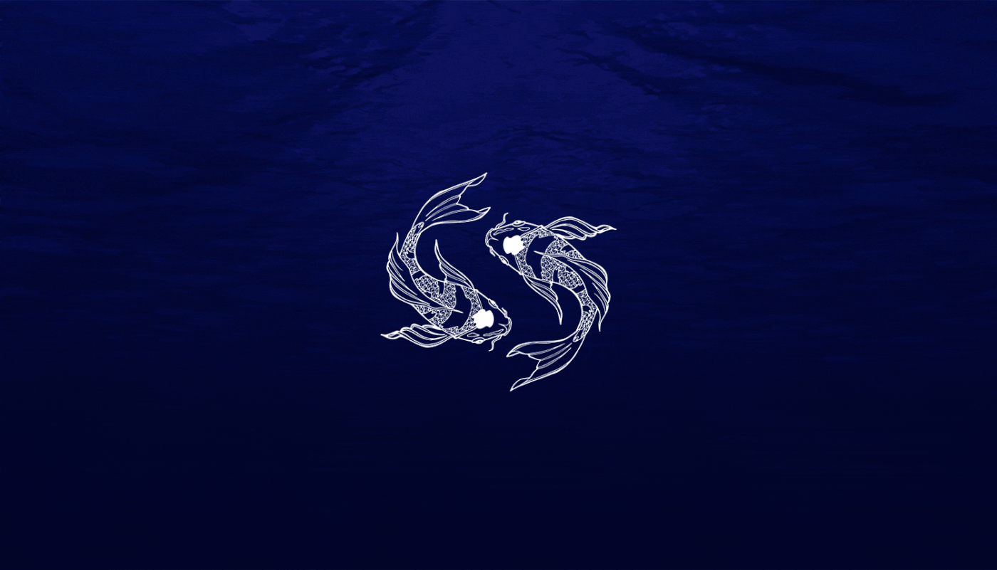
Sakai's symbol is a simplified representation of two fishes swimming in a clockwise direction, that creates the letter S, the brand's initial. We have dived into the fish concept, and have developed an extented brand version that can be used in more scenarios.
Sakai's symbol is a simplified representation of two fishes swimming in a clockwise direction, that creates the letter S, the brand's initial. We have dived into the fish concept, and have developed an extented brand version that can be used in more scenarios.


A flexible identity
Apart from the simplified version and the artistic version of the logo, we've come up with one that helps customers differentiate the staff (people and restricted areas).
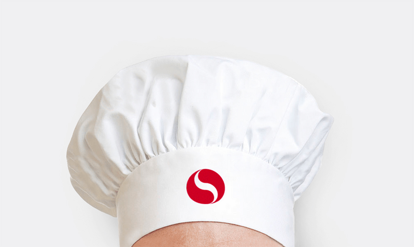
This new version is still recognisable as part of Sakai's identity, but the new concept is strongly related to the meaning behind. It is an abstract representation of a person raising his hand onto an object, just like a chef who is about to make a move with his knife.
This new version is still recognisable as part of Sakai's identity, but the new concept is strongly related to the meaning behind. It is an abstract representation of a person raising his hand onto an object, just like a chef who is about to make a move with his knife.


A coherent identity
As the continuous search for perfection is one of the core values, we have continued to use the Golden Ratio to construct the smallest elements of a brand, the icons.
The unified identity system allows the customer feel, and be participant of a strong pressence of the brand, and helps the restaurant stand among the competition, positioning itself as a culture-creator.
The unified identity system allows the customer feel, and be participant of a strong pressence of the brand, and helps the restaurant stand among the competition, positioning itself as a culture-creator.


Steps further
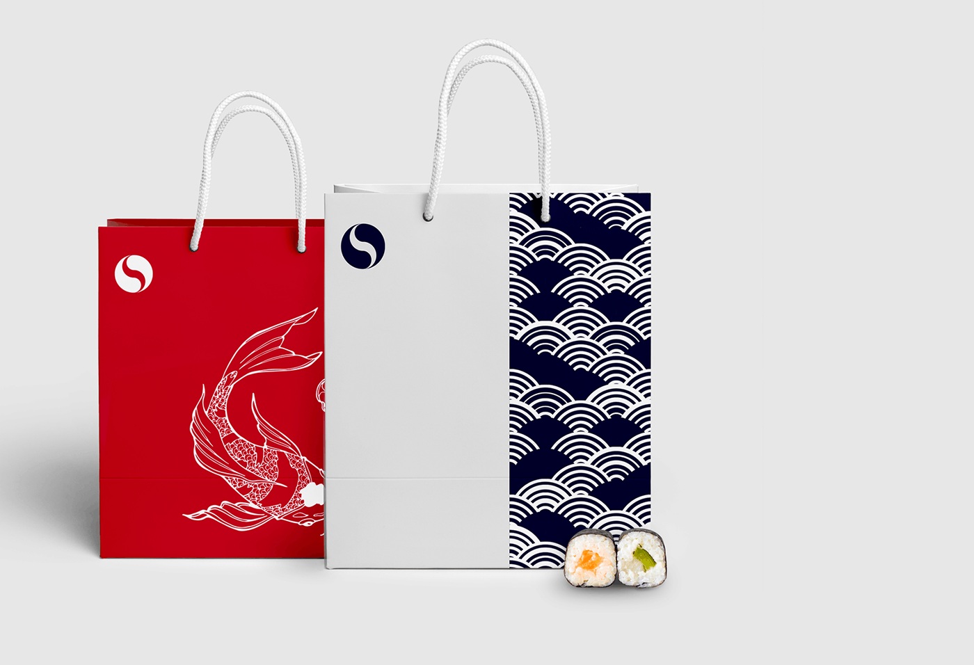
Three variations of brand patterns are created to enhance the oriental environment of the design ecosystem. These will be used alternatively through all the brand extentions and objects.
Artistic was the value we've prioritized, expressing the beauty and elegance of Japanese culture. We wanted to transform something as common as a take-away bag or a napkin into a souvenir by focusing on their aesthetic.
Artistic was the value we've prioritized, expressing the beauty and elegance of Japanese culture. We wanted to transform something as common as a take-away bag or a napkin into a souvenir by focusing on their aesthetic.


Communicating the culture
In the messaging, we have taken a small bet. Instead of refering us to a Japanese restaurant, we call ourselves Japan. Playing with the brand colour scheme, and utilizing the bold symbol to make it ressemble as Japan's national flag, we try to attract the viewer's attention.
From there, we can extrapolate the idea and start a flexible wordplay like: come to Japan, eat in Japan, meet in Japan, welcome to japan, etc.
From there, we can extrapolate the idea and start a flexible wordplay like: come to Japan, eat in Japan, meet in Japan, welcome to japan, etc.


