Dehonians – The Priests of the Sacred Heart of Jesus (also known as as SCJs, the initials that stand for Sacerdotum Cordis Jesu, the congregation's name in Latin) – is a Roman Catholic religious congregation of priests and brothers founded in 1878 in Saint-Quentin by Léon Dehon.


During the work on organising their communication, Dehonians decided to develop a professional and uniform Corporate Identity for their congregation. "Corporate" is exactly the right word here, as Dehonians are a large congregation, actively engaged in international missionary work, with over 41 chapters around the world.
One of the reasons for rebranding was the unification of the official name (the congregation is known by different names around the world e.g. "Reparadores" in Spain, "Sercanie" in Poland). Design work was required with both official symbols and everyday promotional communication. Except for the Coat of Arms, Dehonians widely use a non-official but very popular symbol – the Dehonian Cross.
One of the reasons for rebranding was the unification of the official name (the congregation is known by different names around the world e.g. "Reparadores" in Spain, "Sercanie" in Poland). Design work was required with both official symbols and everyday promotional communication. Except for the Coat of Arms, Dehonians widely use a non-official but very popular symbol – the Dehonian Cross.

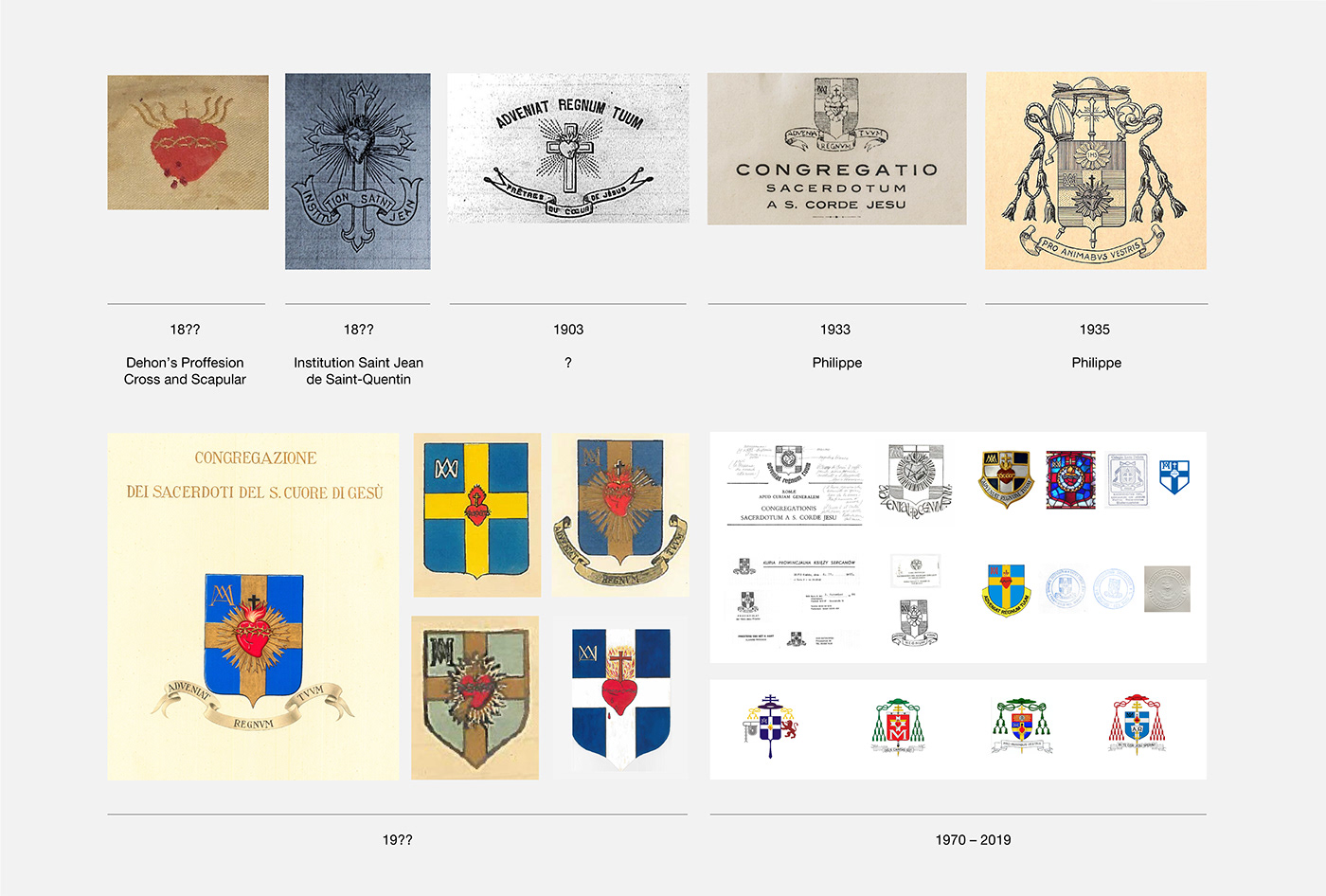
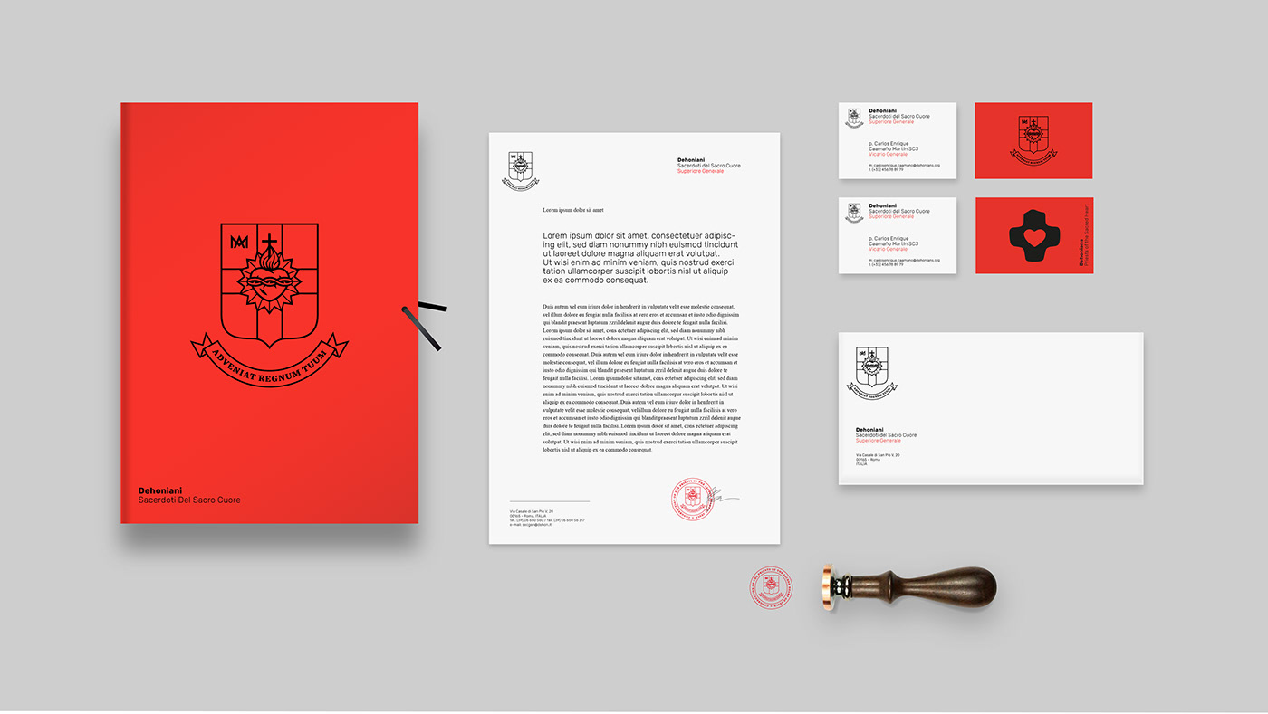
There were several versions of Congregation's Coat of Arms used at the same time, some of them very interesting. What was missing, however, was a single official version based on historically correct symbols. In cooperation with a historian Fr. Józef Marecki, PhD and Centro Studi Dehoniani in Rome we studied the history and genesis of this symbol very closely. We took our inspiration for the contemporary styling of the Coat of Arms from a stained glass in a religious house in Austria. Taking it as a basis and including necessary heraldic corrections we created the final official version to be used commonly by the whole congregation.


Branding work included complex key visual and graphic design of materials, for both official and daily communication, colour scheme, typography and layout constants based on the unified grid.


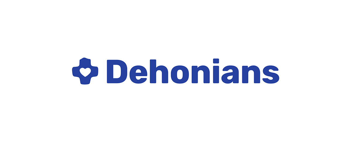


The Dehonian Cross has been in use as a popular non-official symbol for years in a number of various forms. It was a natural decision to treat it as a logo and develop a single "canonical" version. We also developed a unified system for combining the symbol with typography, which makes it easy to create dedicated logos for provinces in different languages and alphabets.
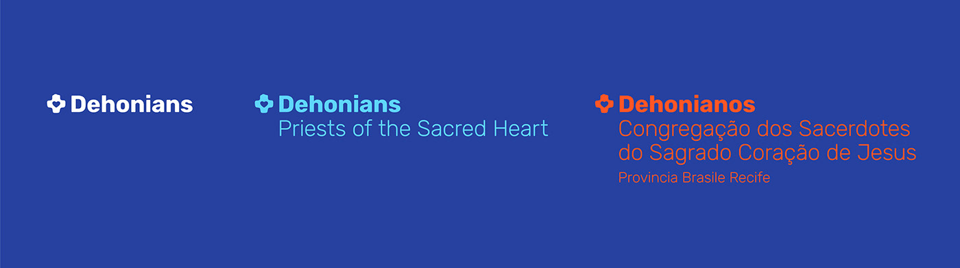


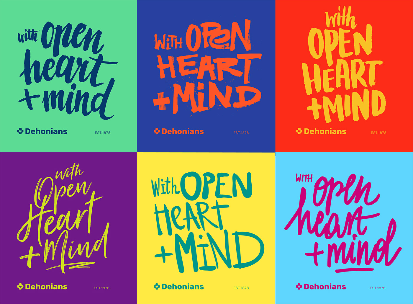
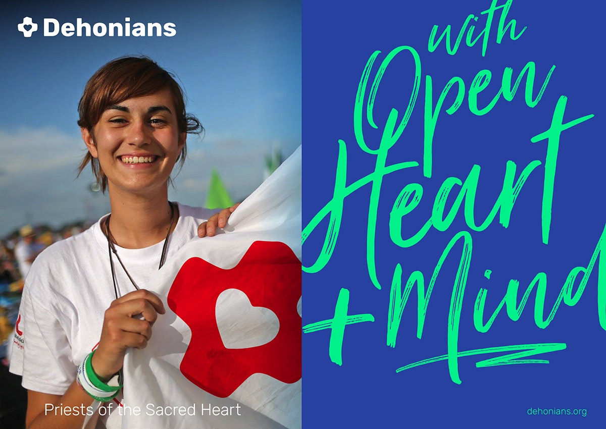
An important aspect of the project was leaving space for manifestation of each province's own identity. Both flexible grid and vivid colour scheme make it possible to create unique layouts, moreover there is room for typographic variation as the Dehonian Mission Statement “With Open Heart + Mind” is handwritten in a different way for each province.


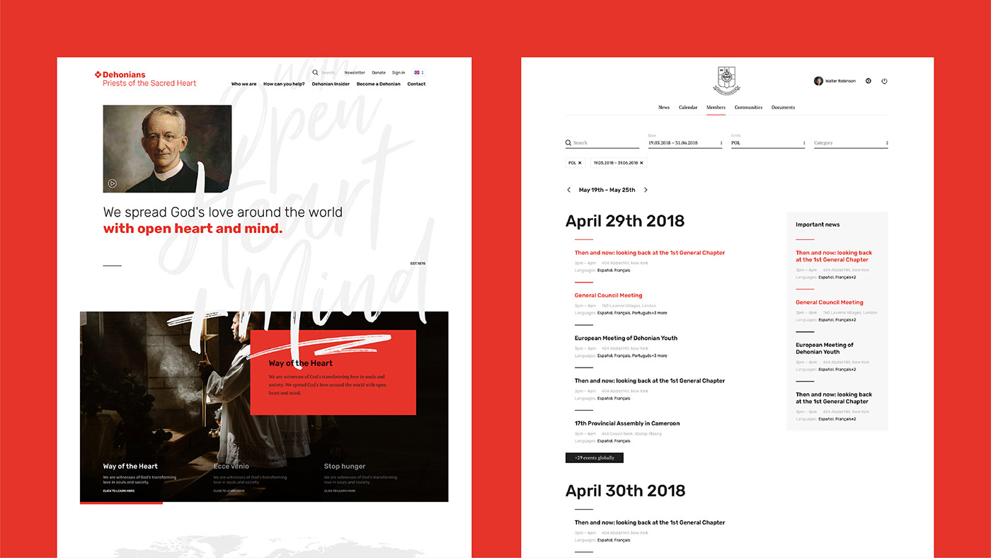
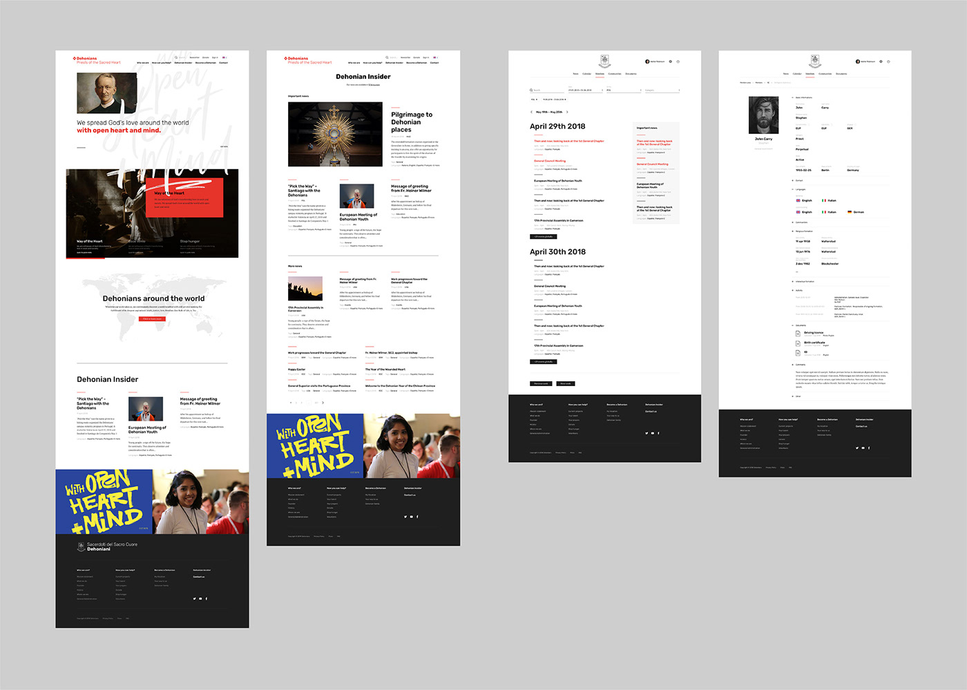
The project also featured development of an extensive website, or rather two different web pages: for external and internal communication.
The first one, addressed to priests, brothers, the faithful and anyone interested in the life of the religious community, is an official unified medium of the congregation and provides a base for development of websites dedicated to single provinces.
The second one is a major forum for communication within the congregation, including various functions within different levels of access.
The second one is a major forum for communication within the congregation, including various functions within different levels of access.