The following are graphic explorations of branding strategies for architects who are well known to the public as top practitioners of architecture and design. Each architect was researched to uncover their approach to design, working methods and aesthetics in an effort to develop a sense of their respective brands. The architects observed here were chosen based on their impact in the field of architecture and the differences associated with their styles in an effort to investigate a wide breadth of branding strategies. The branding strategy for each architect is imagined as it would be today rather than the era which the architect completed their works. The purpose of this is to highlight the ways in which brands can be expressed through branding rather than a historical survey of the methods in which these architects marketed themselves.
Careful attention to icon generation, typography, colour palettes, digital and print promotional material was given to each practitioner. The methods and materials in the deployment of the brand were also carefully chosen to best reflect the architects aesthetics and work ethic.
The development of a graphic identity and branding strategy for Louis Kahn was based on his favoritism for the materiality and performance of concrete. Kahn used concrete and brick to form large imposing structures that emphasized their place in the surroundings. He emphasized that architecture should allow materials should speak of their materiality and not force them to be something they are not. The materials in his work were often paired with strict geometric forms to produce modern symbols that were reminiscent of a past architecture.
The logo for Kahn shows the outline of a cube drawn with a heavy lineweight to suggest a permanence in its form. The cube is broken at one point to allow the header to be framed within the geometry. The result is a logo that feels singular and dominant while also encapsulating spatial qualities of inhabitance.
The branding is deployed on a series of stationary items each with strong geometric forms. The colour palette that was developed uses black, white grey and a dark wood grain drawing from the appearance of Kahn’s work.


The development of a graphic identity and branding strategy for Buckminster Fuller is heavily focused on the geodesic dome. Fuller was a revolutionary thinker and often looked for ways to market his inventions. He focused on the naming of each design and often grouped them together in families. Fuller’s work includes the dymaxion car, the dymaxion map, the dymaxion chronofile and the geodesic dome.
The logo for Fuller shows the linework of a faceted sphere. The idea for the logo is not to fetishize the geodesic dome but to rather use it as an emblem for Fuller’s great mind. An alternate logo is also presented showing a header line alongside the sphere.
The branding is deployed on a series of stationary items including graph paper and a folder. Fuller was an apt sketcher as well as a obsessive documentarian. This package is meant to assist Fuller while out in the field. The colour pallette that was developed uses black, white, blue and silver foil. The black and white are used as background colours while the blue and silver are used to symbolize the metal used to construct Fuller’s domes.


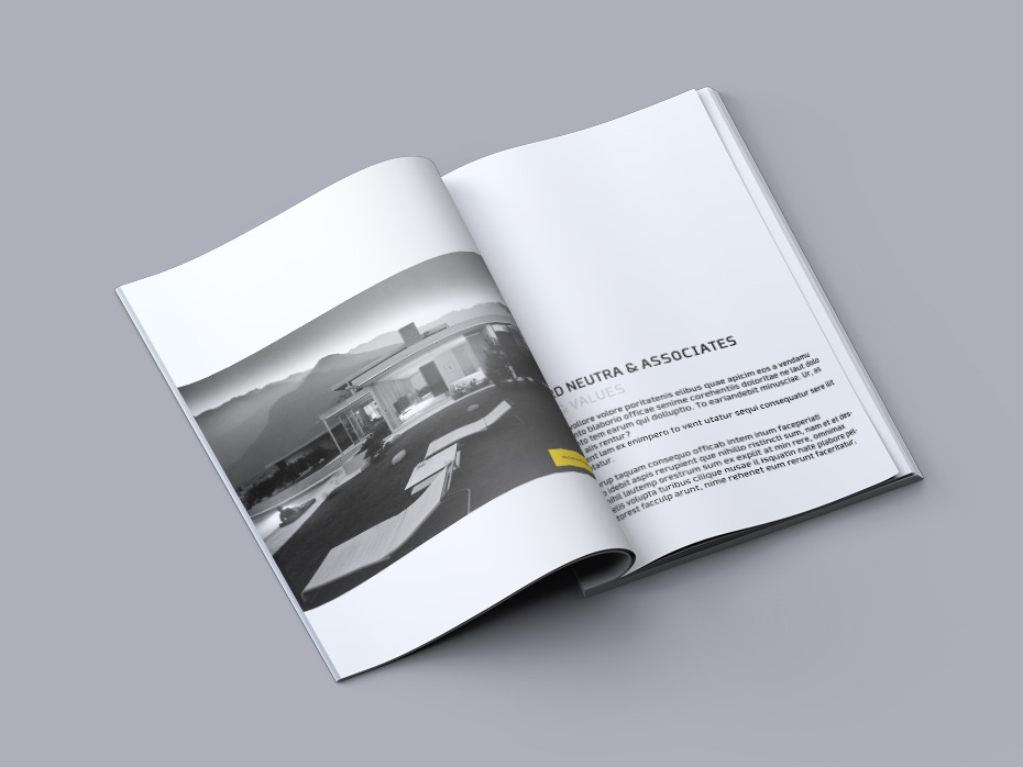
For Richard Neutra the development of a branding stategy was based on his enormous contribution to the field of mid-centrury modern design. Neutra’s involvement with the Case Study program showcases his affinity for simple residential architecture that utilized low single storey slab forms. His houses utilized large expanses of glazing that allowed the sun of the south western states to pour into his homes during the day and the lights to glow out of the houses during the evening.
The logo for Neutra shows a simple header line enclosed in a bright yellow rectangle. The colours are bold and eye catching while also draw from the visual language of Neutra’s architecture. The header can be used in both white and black type.
The branding is deployed on a number of standard stationary materials as well as a marketing book. Neutra’s work was frequently photographed and published making the vehicle of a marketing book a likely one for Neutra to distribute his catalogue of work to potential clients.


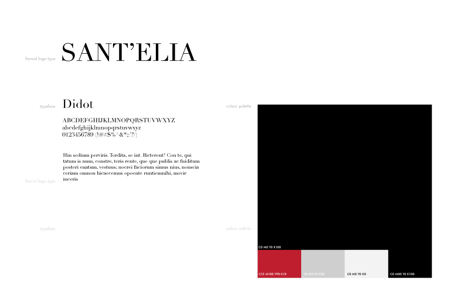
The development of a graphic identity and branding strategy for Antonio Sant’Elia was based on his innovation and development of the futurist movement. Sant’Elia developed a series of sketches that reflected his ideal vision of the future city. He thought the urban landscape should evolve to be something industrial and all encompassing. Individual buildings would stitch together with urban infrastructure and surrounding structures forming a dense urban fabric. Although Sant’Elia’s sketches were never realized their detail and cohesiveness in describing a new way of life make them important players in architectural history.
The logo for Sant’Elia is a simple wordmark that uses a modified Didot Regular as its typeface. The arms of the T, E and L are broken to suggest a departure from tradition. The letters are slender and strong each contributing equally to the logo as a whole, similar to Sant’Elia’s buildings in the greater urban fabric. The deployment of Sant’Elia’s work is kept entirely in the digital realm. As a young designer with ideas of connectivity it seems likely that he would be leading the profession in ways to utilize the internet and other digital platforms.