

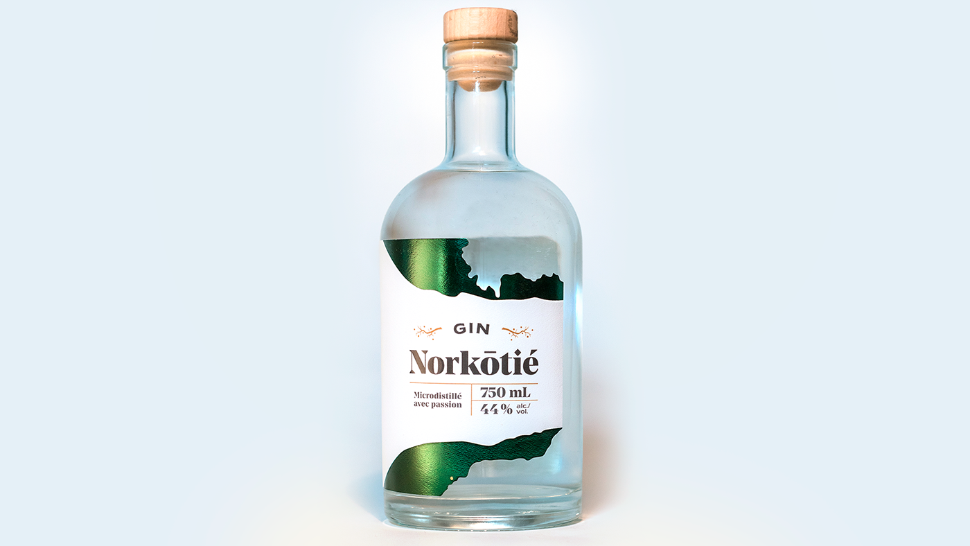
For this gin design, we had to showcase the Côte-Nord region where the gin is made and create a unique design that stands out.
Pour le design de ce gin artisanal, le mandat était de mettre en valeur la région de la Côte-Nord et de créer un design unique qui se démarque.


To showcase the Côte-Nord, the label shape recreate the shape of the region on a map. Because the label is in one piece, we start with the map which makes us enter a land to discover. The simple design with green and ocre remind us of the northern Quebec forests.
The name of the gin is inspired by the phonetic spelling of the name of locals from Côte-Nord: nɔʁ.ko.tje.
Afin de valoriser la Côte-Nord, la forme de l’étiquette reprend les contours géographiques de la région. En créant l'étiquette en un seul morceau qui commence par la carte, on nous fait rentrer dans un territoire à découvrir. Le design simple aux accents verts et ocres rappellent les couleurs des forêts du nord québécois.
Le nom du gin est inspiré du mot nord-côtier et de son écriture phonétique : nɔʁ.ko.tje.
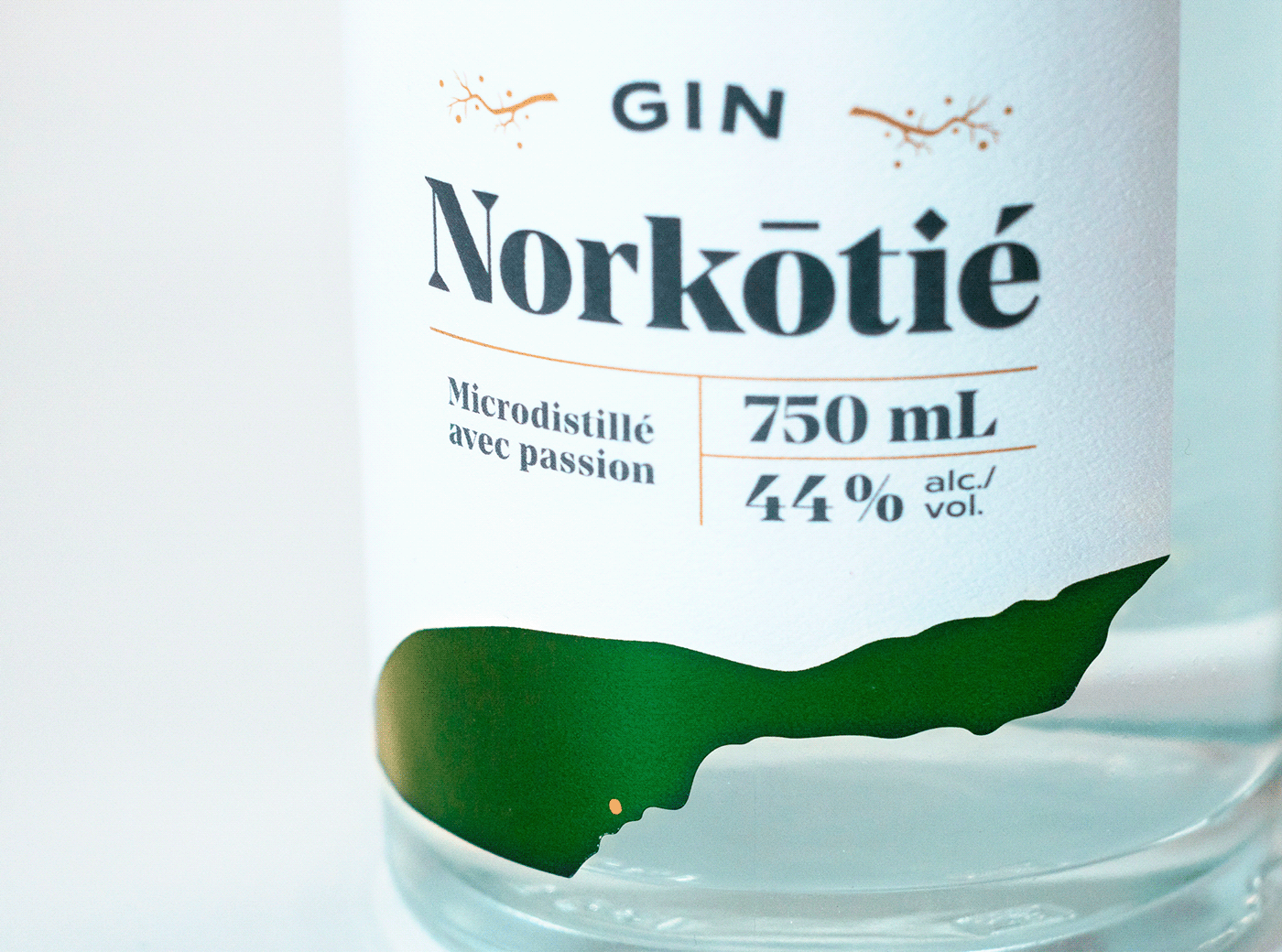
In the bottom, we find a dot for Baie-Comeau, where the distillery is based.
On retrouve dans le bas un petit point ocre pour identifier la ville de Baie-Comeau où la distillerie est basée.


For the aged version of the gin, we used a gold stamping and a darker green to add more sophistication.
Pour la version vieillie du gin, un estampage doré et une nuance de vert plus foncé ajoutent une touche de raffinement supplémentaire.


