Gutsy Go
Visual identity for a city intervention program that prevents polarization and tensions within the city’s own communities.
The font used in the identity is Gutsy Sans, a sans serif font created for the brand.


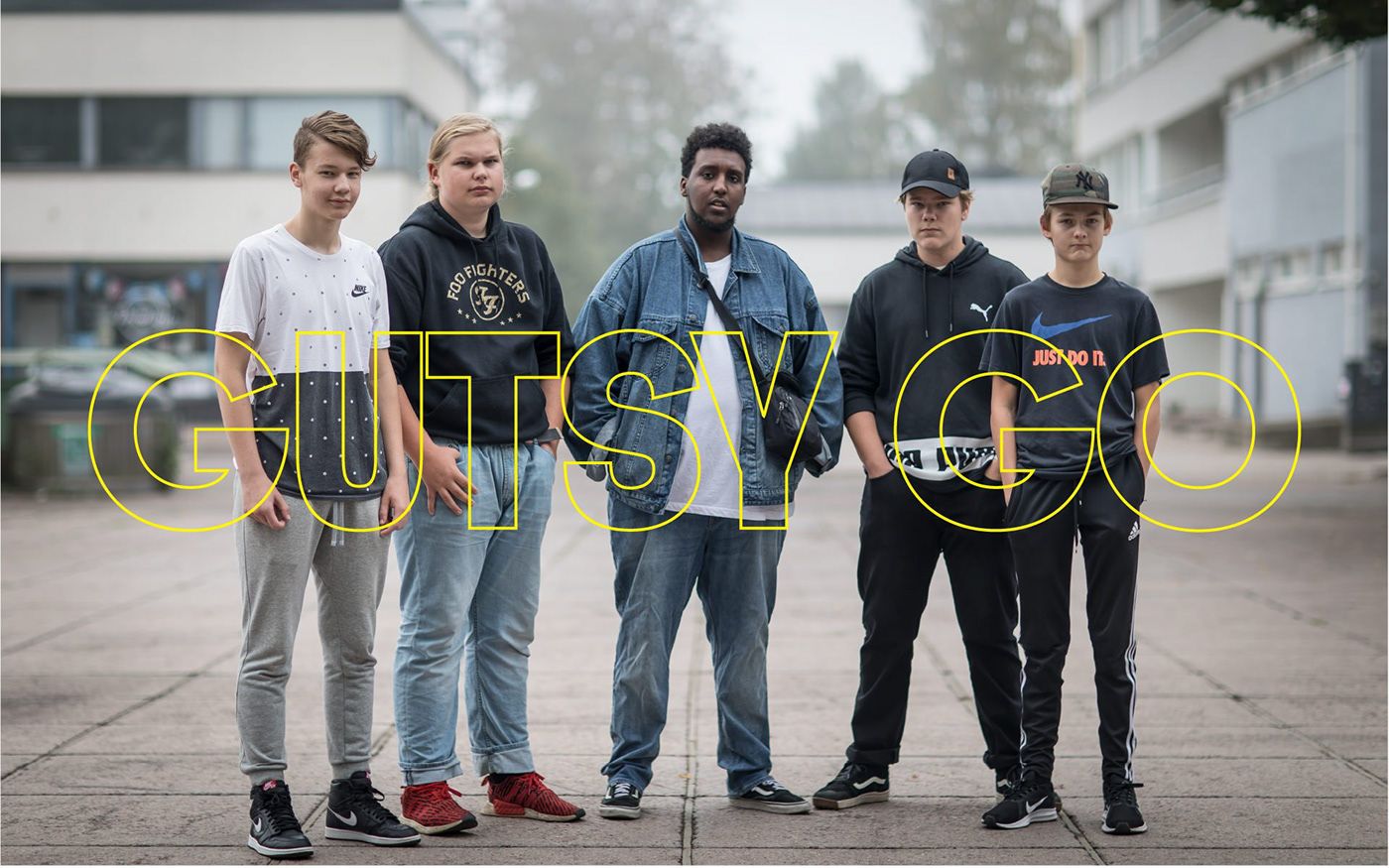
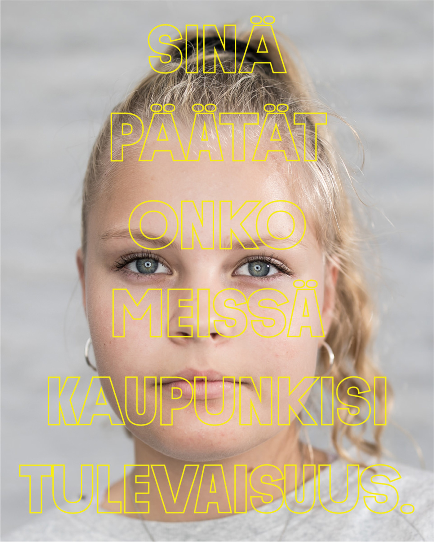
The identity uses a bold and alarming black/yellow colour palette.


The identity uses multiple motion design styles to bring alive the constant movement and change of the city intervention.


Organized into task forces, students identify critical problems facing their communities and come up with dozens of dynamic solutions.


Motion design templates were created for the brand and the students to use in the videos created during the intervention.


Videos are premiered at events, on social media, and across traditional news outlets.


Gutsy Go – the recipient of Finland’s highest innovation prize – is a method that combines key elements of pedagogy, media strategy, and peacebuilding.
Gutsy Go City Interventions shake up the school week by presenting a challenge to the entire age class of 14 year-olds. In collaboration with teachers, legal officials, and community leaders students design and implement unique solutions to promote solidarity and “social peace,” thus preventing polarization and tensions within their own communities.
Bold Ideas
Organized into task forces, students identify critical problems facing their communities and come up with dozens of dynamic solutions.
Organized into task forces, students identify critical problems facing their communities and come up with dozens of dynamic solutions.
Immediate Action
Students provoke support from local partners, execute their solutions with urgency, and film the process using their own mobile devices – aided by Gutsy production crews.
Students provoke support from local partners, execute their solutions with urgency, and film the process using their own mobile devices – aided by Gutsy production crews.
Visibility
Videos are premiered at events, on social media, and across traditional news outlets.
Videos are premiered at events, on social media, and across traditional news outlets.
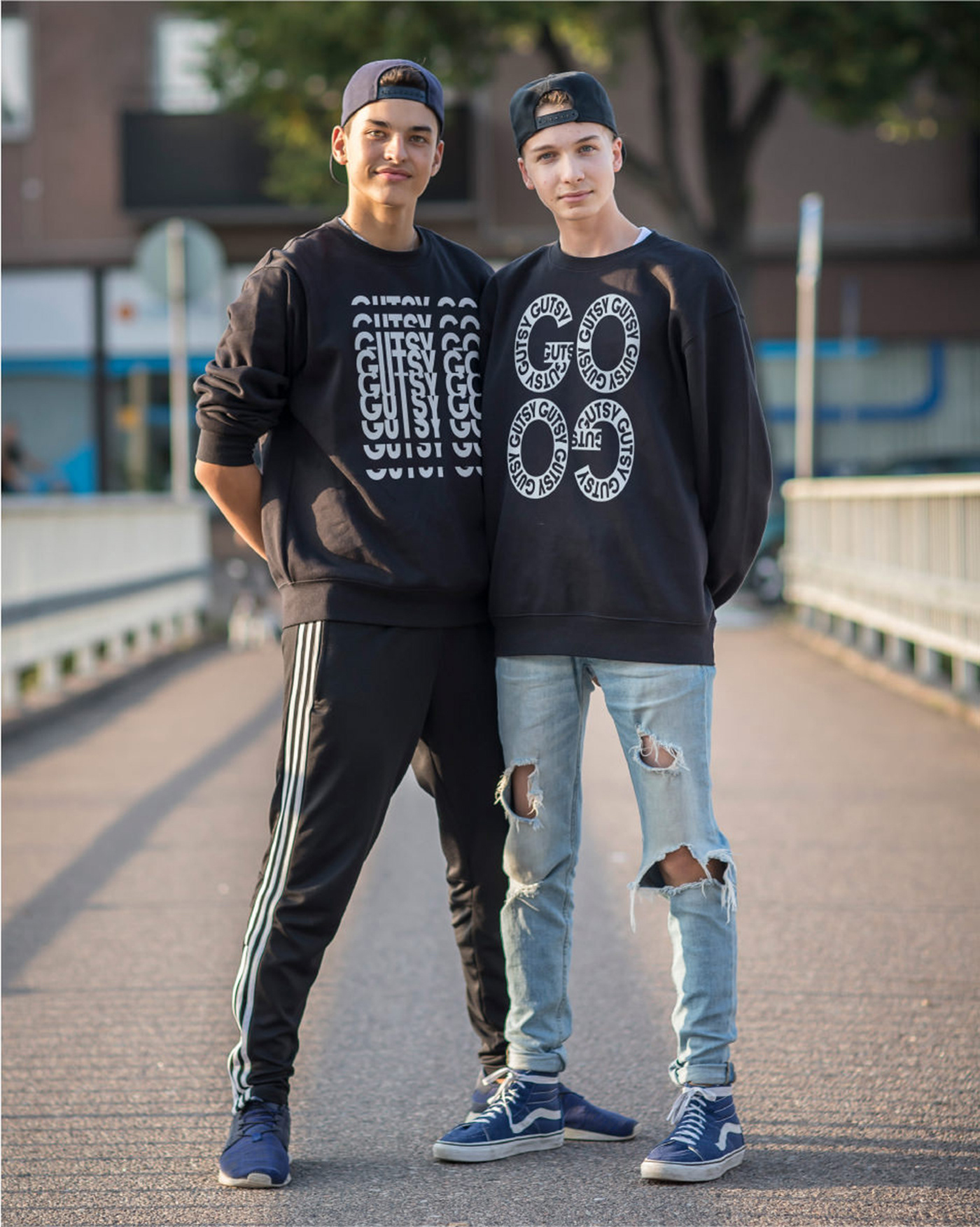
The branding is powerful, versatile, and establishes a cohesive identity for the intervention program. The visual identity translates the attributes of the teens into a visual language that is bold, layered, personal, awkward, a bit clumsy and gutsy.
The logotype is set in Gutsy Sans, a sans serif font created for the brand to be in the logotype and as a main visual element in the identity. The font plays on the awkwardness of the teens within the Gutsy Go intervention projects. Gutsy Sans comes in regular and extended variations that randomly interchange when implementing the font. The variation in the font creates a sense of randomness and uniqueness throughout the applications.
Client: Gutsy Go
Sector: Civic and Public
Font design: Jaakko Suomalainen
Type of work: Brand identity, Visual Identity, Type design, Motion design, Digital design
Photography: Joel Nieminen
Sector: Civic and Public
Font design: Jaakko Suomalainen
Type of work: Brand identity, Visual Identity, Type design, Motion design, Digital design
Photography: Joel Nieminen


