
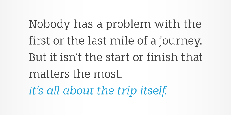
The focus while designing Stajn Pro was based upon a main goal of using this typeface to set larger amount
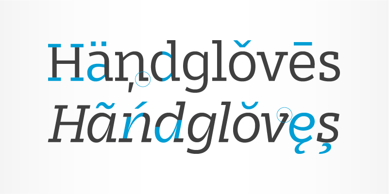
of text. The slightly condensed proportion allows for more content per page while large x height with its larger counters improves legibility and readability while used on smaller sizes. Larger amount of white space for positioning of diacritical marks is achieved by ascender size that is higher than Cap size.
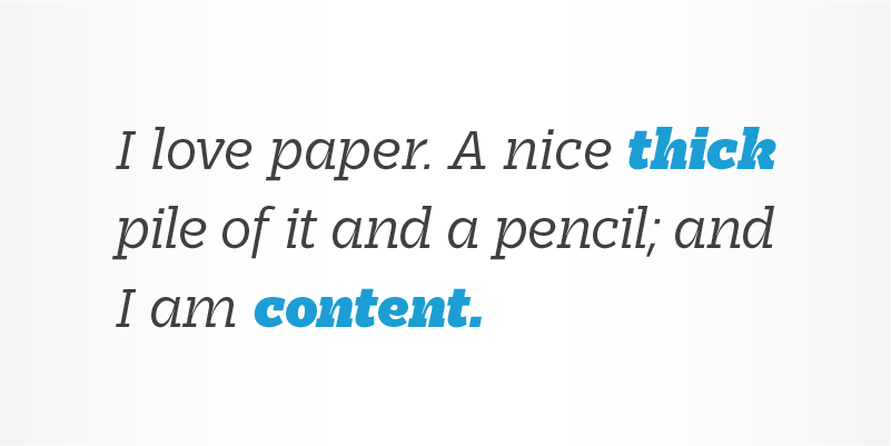
Despite the fact that Stajn Pro was designed as a body text Type Family, it works as well as a display too.
Wide variety of weights as well as interesting, strong and at the same time beautiful character along with
some stylistic alternate makes Stajn Pro a useful typeface in a field of editorial, magazine and promotional materials design.
Stajn Pro belongs to a slab serif type classification,which is perfect if you want to stand out. Type Families
in this classification are known by their distinct personality and their dominant approach on areas where
they appear. The Stajn Pro character includes some humanistic typeface characteristics, which add some softness and elegance in its strong and stable presence.
Stajn Pro Type Family's development was done in relation with Stajn Visual Identity project
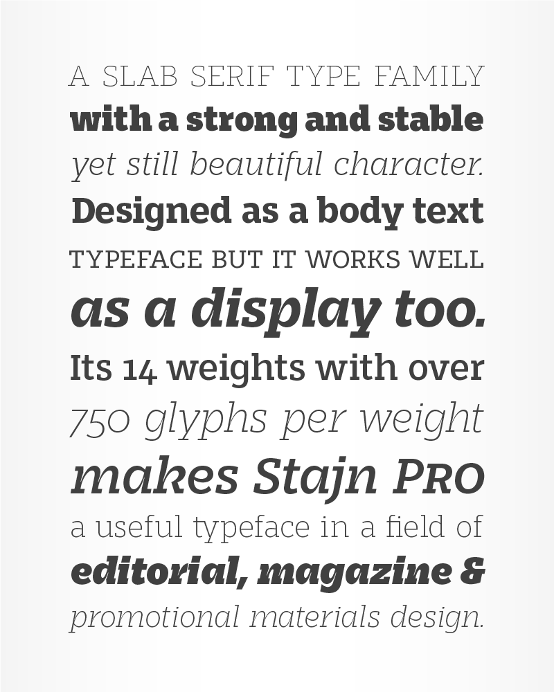


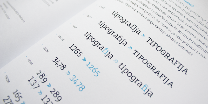
With 782 glyphs per weight Stajn Pro Type Family can be used in different design ways. Character set includes uppercase, lowercase and small caps with language support, different sets of figures (lining, old style, tabular, small caps ... ), punctuation, currencies, mathemathical operators, fractures, arrows ...

Stajn Pro can be used as a body text Type Family as well as a display Type Family. Upright weights are strong and stable, while its italic are more elegant and poetical. The angle of Italic weights is 11°, which achieve sufficient shape contrast in comparison to uprights, while using Stajn Pro to set larger ammount of text.
Stajn Pro upright weights have a distinctive monoline look with strong square serifs. Low contrast design works well with large amount of text so that the eye moves evenly between content. Italics follow the upright weights look while also having distinctive ink traps that reach deep into vertical stems.
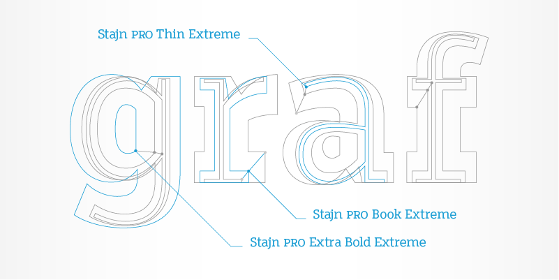
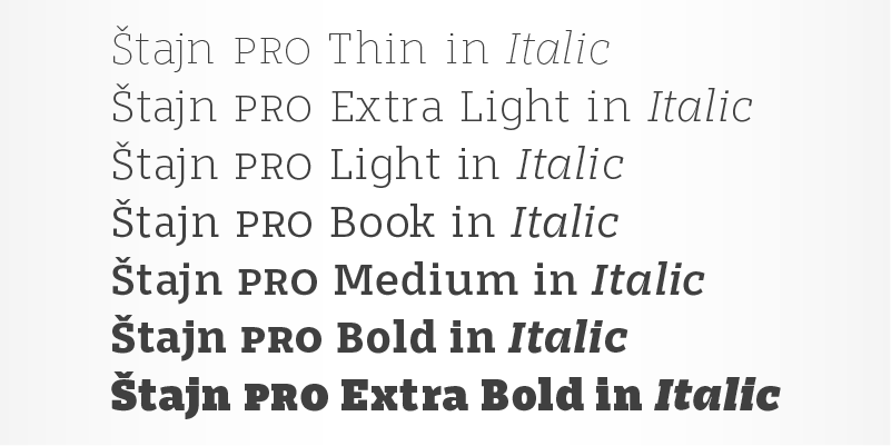
Final stages of designing Stajn Pro also included the adjustment of proportional growth of thicknesses between Thin and Extra Bold weight. This provides total count of the seven weights in upright and seven in italic set.

More about Type Family at Stajn Pro Type Family website
Please download and try Stajn Book Demo version for free
You can buy Stajn Pro Type Family at Myfonts

