


Méndez Artesanos is a family business that was born in the 60s as a local bakery. Through the years it was growing and evolving towards an industrial company dedicated to the production of pastries, muffins, biscuits and dry bakery (spikes, hills and scolding).

Product architecture
Currently, Méndez Artesanos offers a very wide range of products that grew over the years in an organic and disorderly way. The problem was that their packaging had not been designed considering the complete line of products, but that different packages had been created for each type of product resulting in improvised and inconsistent solutions.
Due to this, the initial commission in our first contact with Méndez Artesanos revolved around the definition and clarification of the product architecture through the packaging design.

We begin our work with an in-depth analysis of the current range of brand products. We discovered lines and characteristics that would serve as the basis for the design of the present products and that could also be extrapolated to future ones.
Packaging as an expression of identity
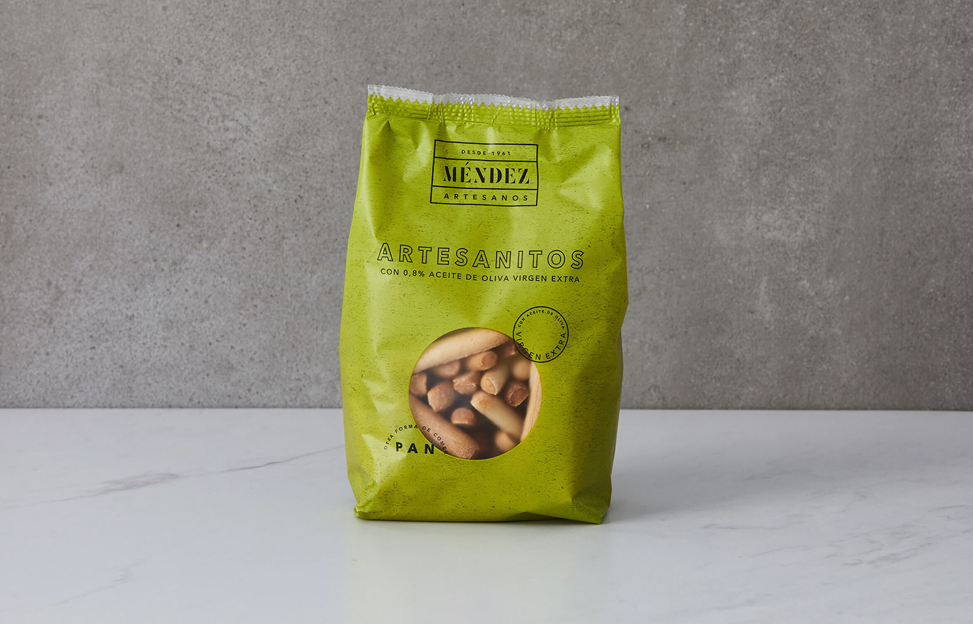
Behind the design of the packaging are concepts expressed in a resounding way: tradition and artisanal elaboration understood from a contemporary perspective. To express these ideas we turn to three basic ingredients: color, typography and the creation of a flexible system.
In terms of color, we create a color spectrum that could be associated with the different product lines and their attributes. Basic, integral products, with extra virgin olive oil, biscuits, muffins, etc. Each typology had its own color.
On the other hand, based on the Avenir typography by Adrian Frutiger, a family of geometric character, we developed an “outline” version. Our idea was to provide it with a more traditional air but without breaking the simplicity and cleanliness we were looking for.

To complete the identity expressed by Méndez Artesanos packaging, we designed a flexible system that would allow us to communicate different messages about the products, their characteristics and ingredients. Our goal was for each product to express itself with its own personality without losing coherence.


We work with the client in the search of materials that were aligned with the vision we had of the product and that could work without difficulties in the production system of your factory.


We look for a more contemporary look that contrasts with the traditional and handmade elements of the design. We chose a matte finish film as a base and created a circular window that allowed us to see each product without using photographs or illustrations, thus becoming another graphic element of the package.


