
In my first year of studies in VisualCommunication we were required to design a typeface. My response to this brief was Professor Whiskers, a name chosen for both its sophistication and playfulness. I drew influences from Early Advertising Typography, intending to revive this old style of American Woodtype, and combine it with a sense of modernity, thus allowing it to retain its own classical poise.
Inspired initially by a deck of old playing cards, the idea developed into addressing a larger conceptual body. I decided to research Texan fonts, Casino fonts and Carnival fonts, with all these having their own subtle influences, whether it be the quirkiness of certain features or the rigidness of basic structural components.

This idea of simplified sophistication stems from the notion of developing a solid base, then whether it be ornamentally or quantatively building a form or forms, manipulating them for both, your own, and a wider audiences benefit.
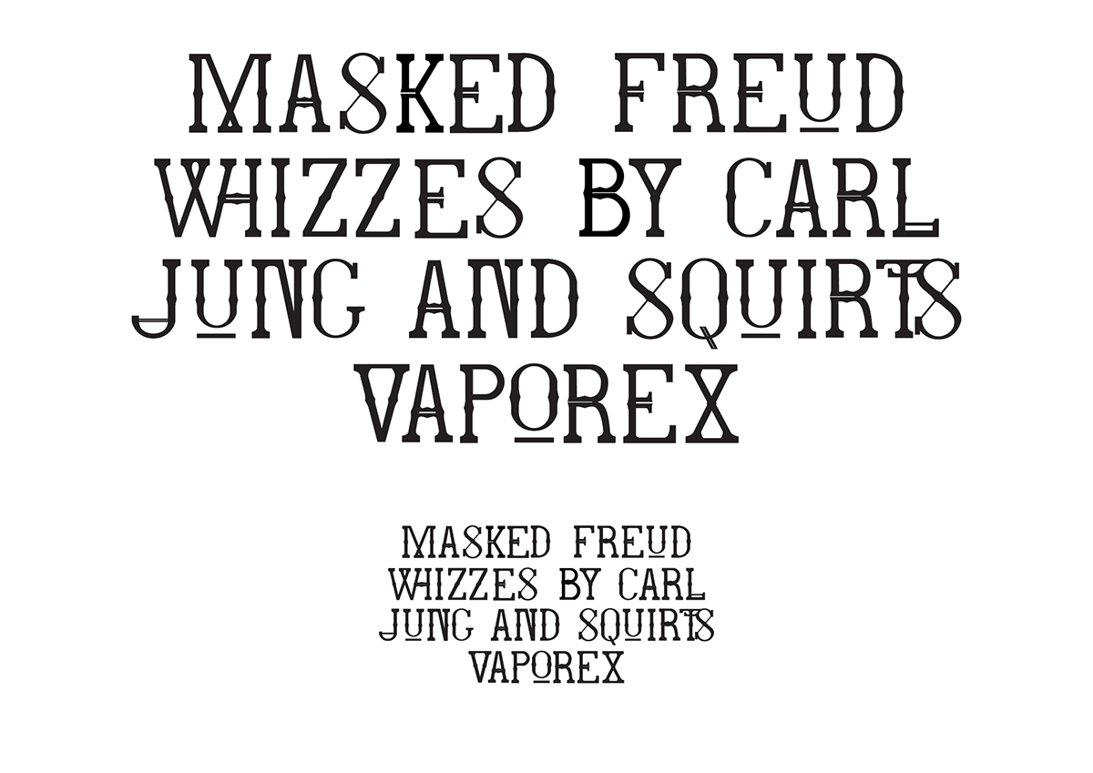
The use of double strokes is uncommon amonsgt old woodtype fonts, which were renowned for their eye-catching readability, suiting their purpose of advertising. Prof. Whiskers plays with this notion, but does not ignore its cultural and historical significance, rather it celebrates it.
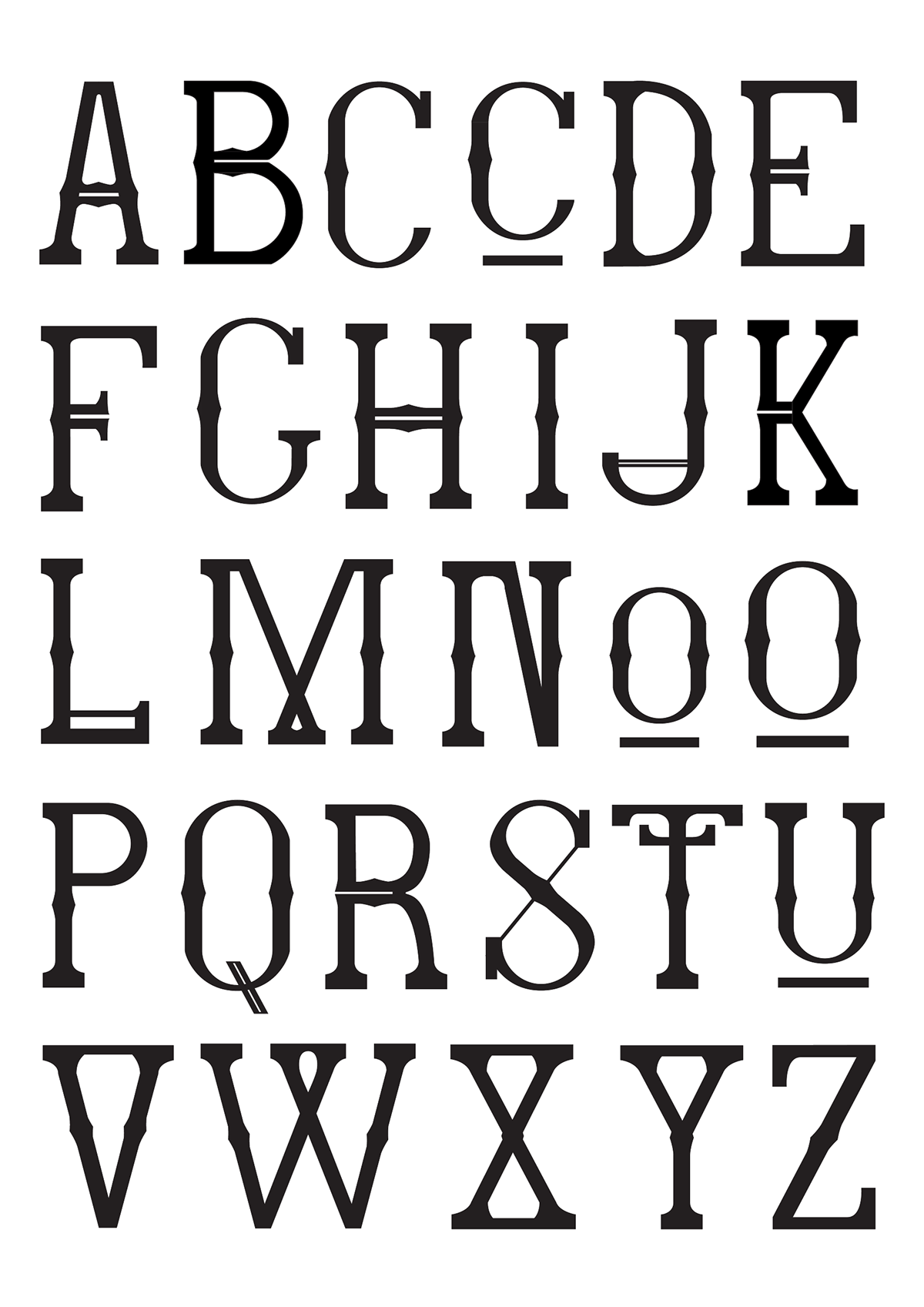

One pivotal aspect of Prof. Whiskers are the ligatures. They provide a physical, rather than conceptual representation of this modern touch. With many of them being somewhat complicated, in essence they aid the readers line of reading. With ligatures starting or ending within the words, such as ‘WH’, ‘ST’ or ‘TS’, either helping the reader into the word/sentence or easing them out.


