In 2008 TypeTogether released the Bree typeface, a sleek sans serif that quickly became a favorite among brand and editorial designers.
Bree Serif follows the same theme as its predecessor. It is a young and energetic upright italic that approaches readers with hip and somewhat elegant charm. It has a range of styles that can perform as counterparts to the original Bree fonts. At the same time though they bring a whole range of new and individual features that make Bree Serif a separate type family in its own right.
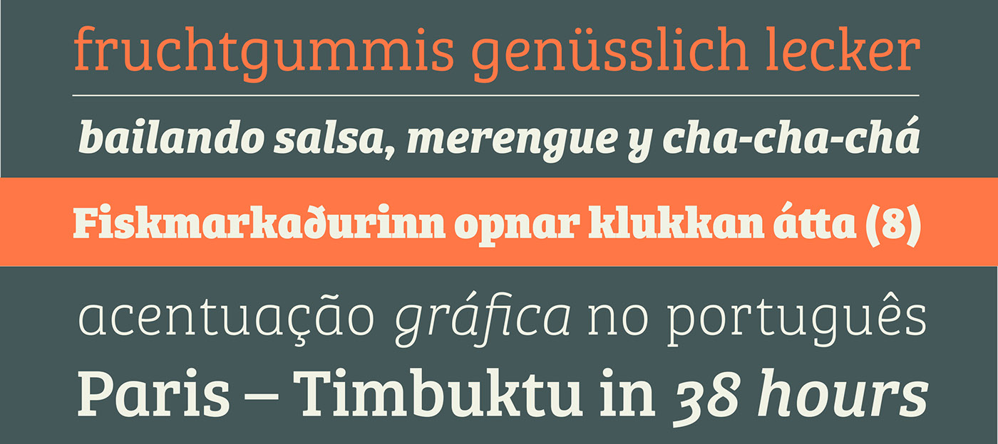
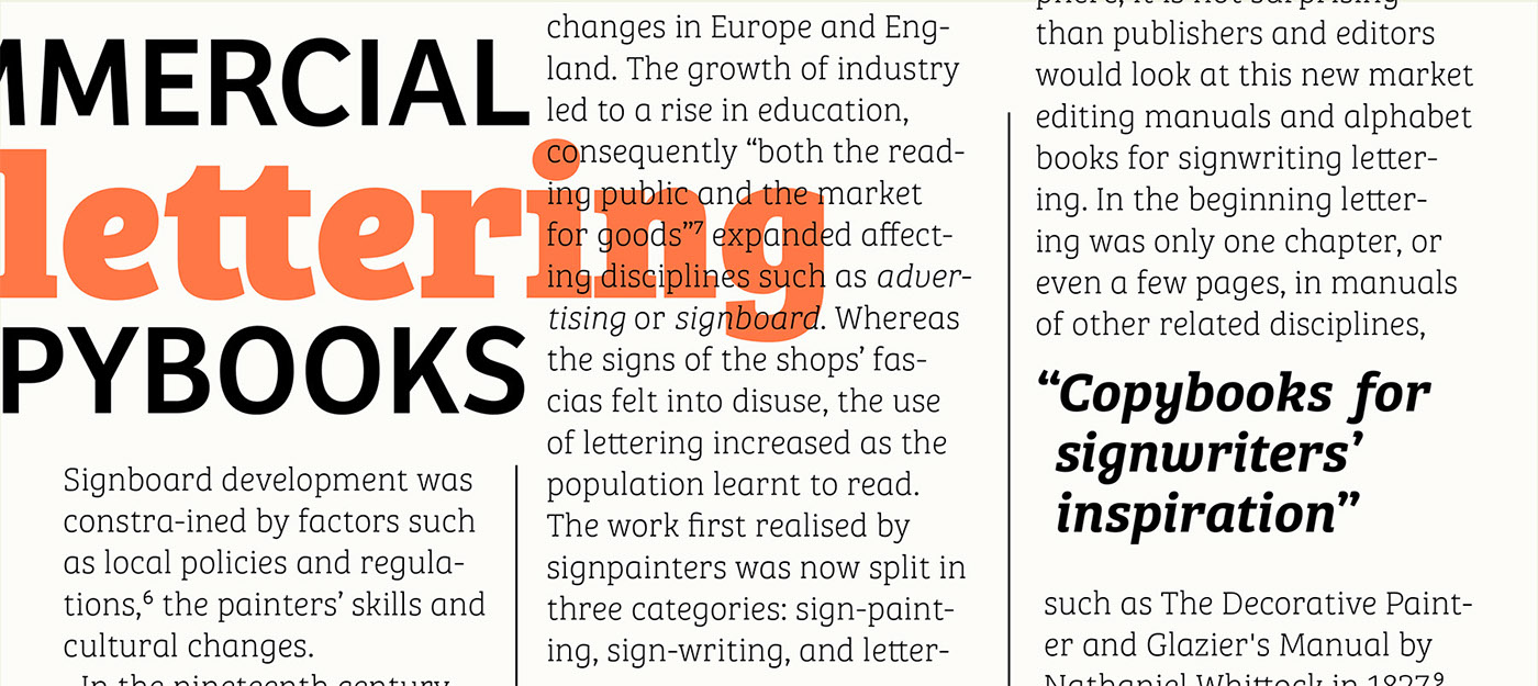
The characters in Bree Serif maintain the original flavour of handwriting, but have a more subtle appearance to support optimal editorial usage. The slabby nature of its shapes, particularly in the heavier weights, makes for a strong impression.
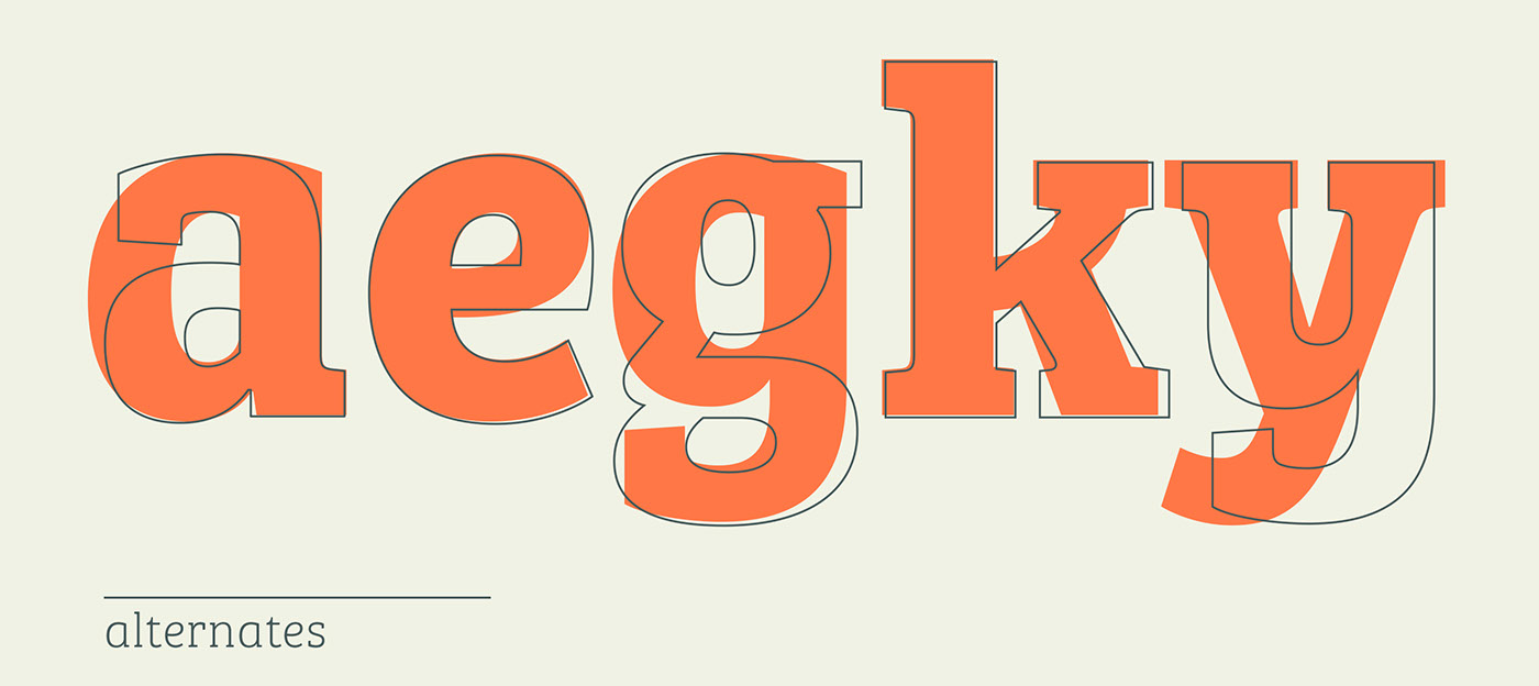
Some of the characteristic features of its sans serif cousin are present in Bree Serif too, such as the single-story ‘a’, the cursive ‘e’ and the rhythmical ‘k’ and ‘y’. Alternate letters of these are also available when a more neutral look is desired.
Bree Serif offers a mixture of fluid and attractive forms that convey a contemporary and vivid aspect. If you loved the multi- award wining Bree, you will surely love its seriffed cousin!
Bree Serif follows the same theme as its predecessor. It is a young and energetic upright italic that approaches readers with hip and somewhat elegant charm. It has a range of styles that can perform as counterparts to the original Bree fonts. At the same time though they bring a whole range of new and individual features that make Bree Serif a separate type family in its own right.
The characters in Bree Serif maintain the original flavour of handwriting, but have a more subtle appearance to support optimal editorial usage. The slabby nature of its shapes, particularly in the heavier weights, makes for a strong impression.
Some of the characteristic features of its sans serif cousin are present in Bree Serif too, such as the single-story ‘a’, the cursive ‘e’ and the rhythmical ‘k’ and ‘y’. Alternate letters of these are also available when a more neutral look is desired.
Bree Serif offers a mixture of fluid and attractive forms that convey a contemporary and vivid aspect. If you loved the multi- award wining Bree, you will surely love its seriffed cousin!
Designed by José Scaglione and Veronika Burian.

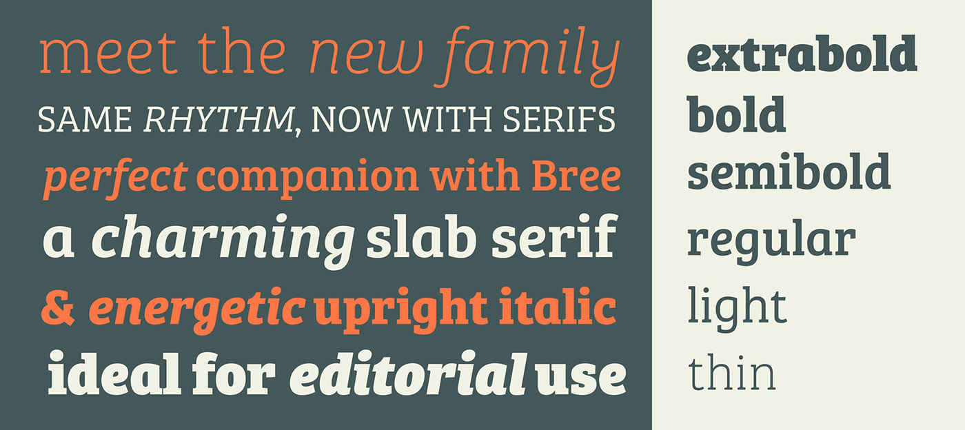
Bree Serif Thin
Bree Serif Thin Italic
Bree Serif Light
Bree Serif Light Italic
Bree Serif Regular
Bree Serif Italic
Bree Serif Thin Italic
Bree Serif Light
Bree Serif Light Italic
Bree Serif Regular
Bree Serif Italic
Bree Serif Semibold
Bree Serif Semibold Italic
Bree Serif Bold
Bree Serif Bold Italic
Bree Serif Extrabold
Bree Serif Extrabold Italic
Bree Serif Semibold Italic
Bree Serif Bold
Bree Serif Bold Italic
Bree Serif Extrabold
Bree Serif Extrabold Italic
