In the world of the information design, where do the graphist and his point of view takes place ?
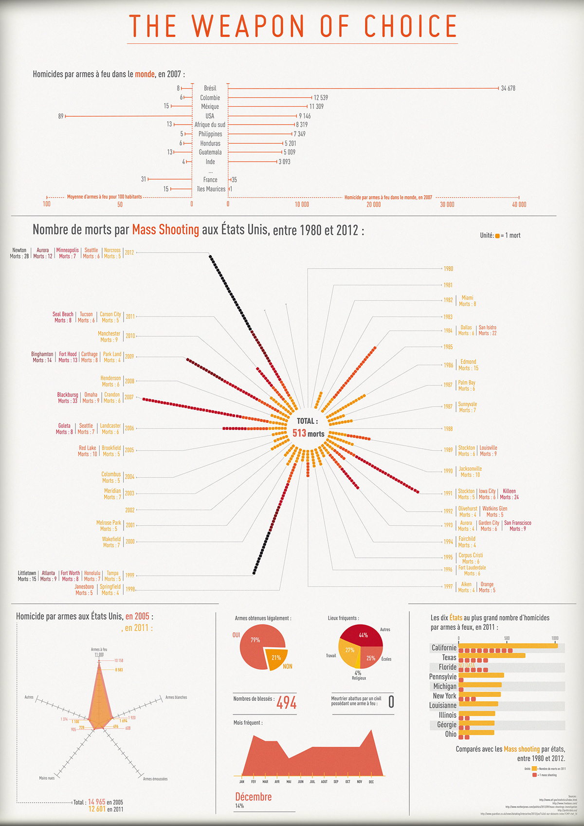
Here are some works about a same data set : the guns in the US and in the world.
(I have to specify that I aint taking sides in the following posters, it's all about subjectivity and show how some graphiscs could be used.)
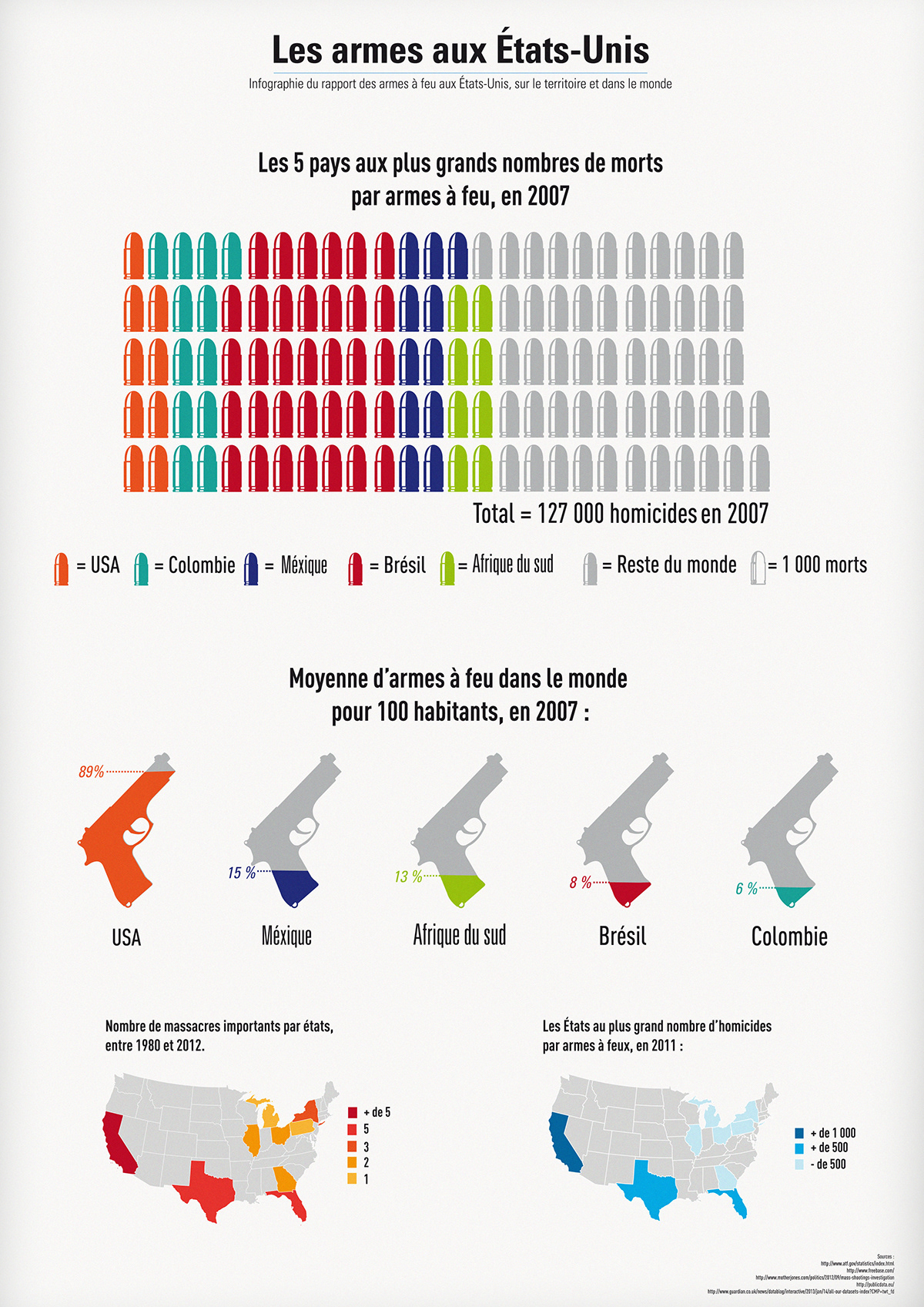
Here are some works about a same data set : the guns in the US and in the world.
(I have to specify that I aint taking sides in the following posters, it's all about subjectivity and show how some graphiscs could be used.)
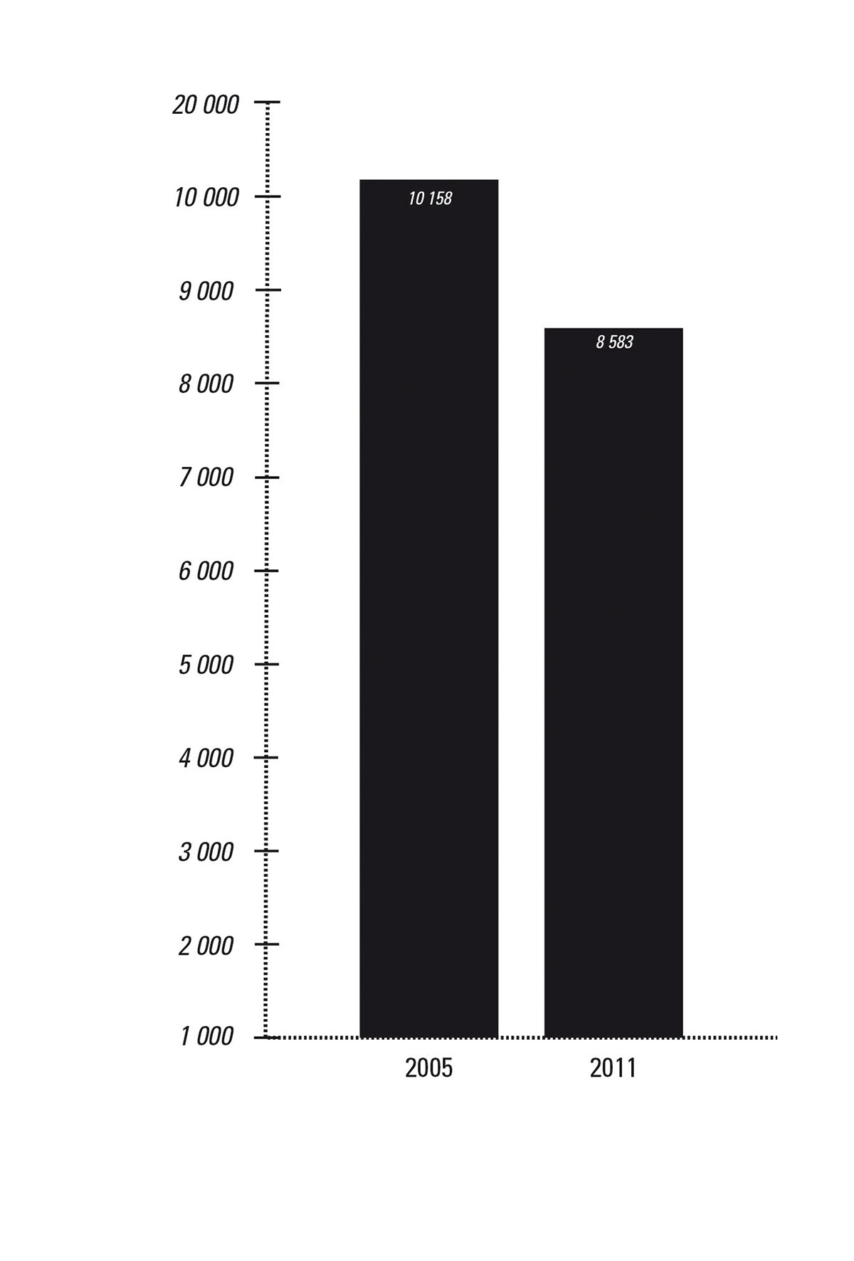
For this two posters hereabove, the aim was to create two differents representations of the same one dataset.
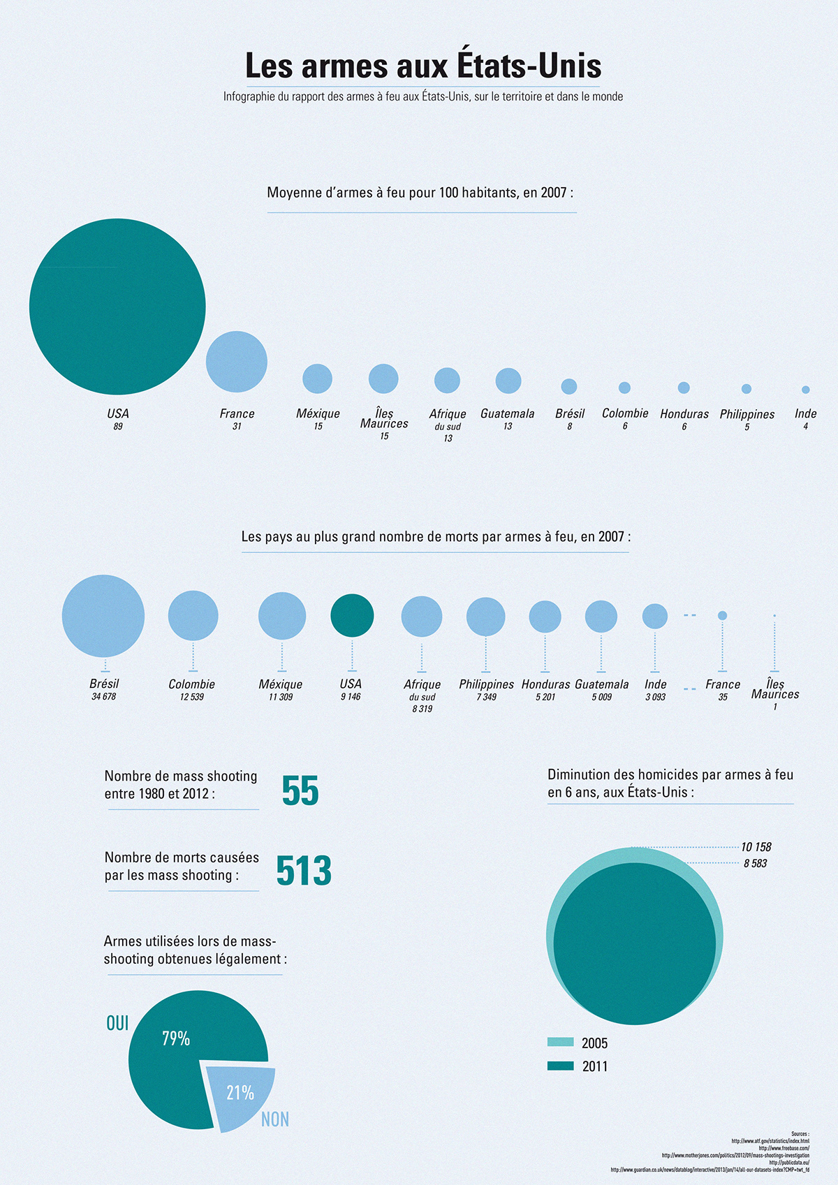
For this last two posters, the aim was to use some regular "mistakes" in infography to show how a poster can catch the eye on a information more than another, by example, with the using the diameter of circle instead of the area with bubbles. Even if the information are true, there is disproportion which play a lot with the eyes of the reader and the poster can imply something more.
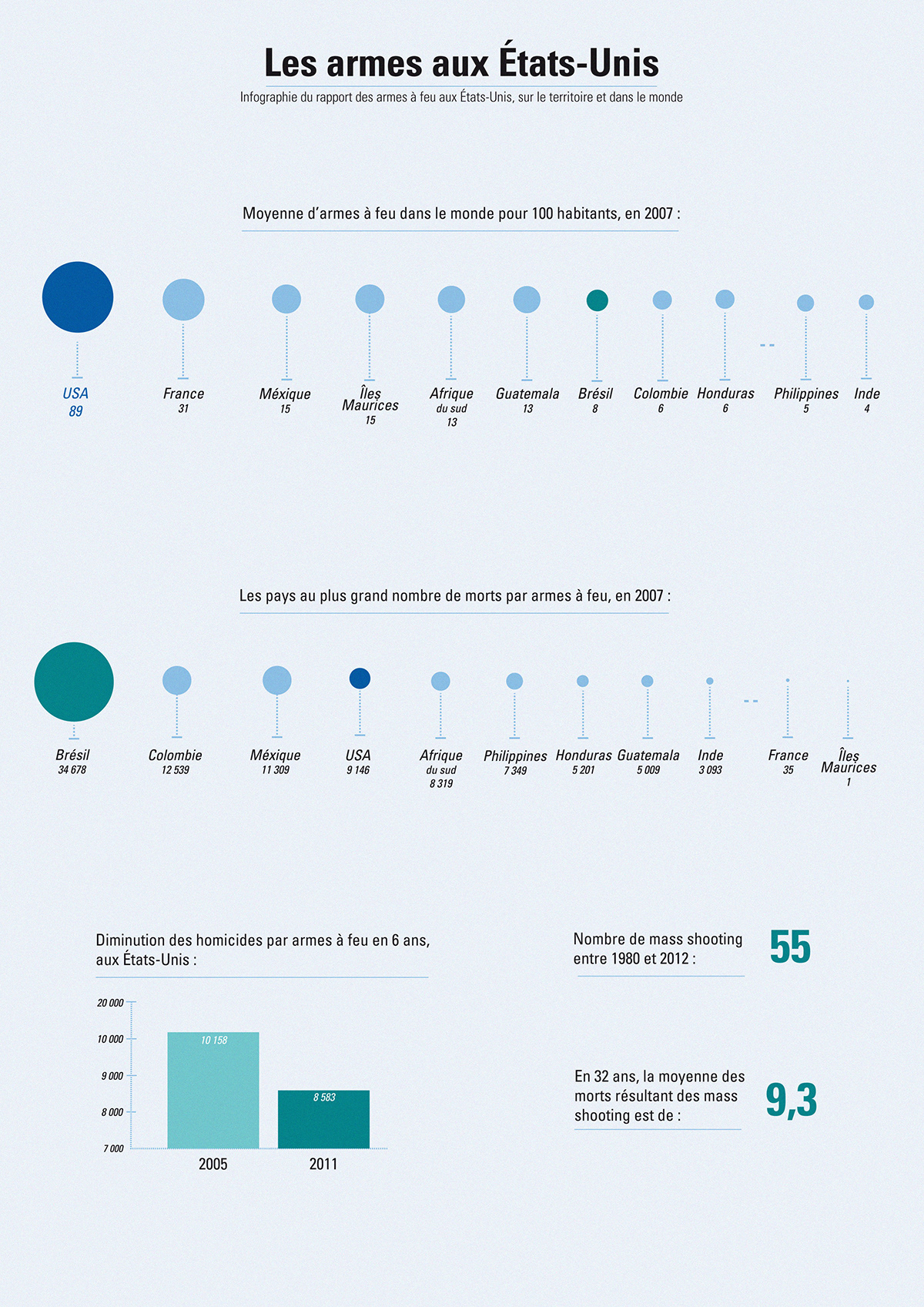
Here are the corrects sizes of bubbles and graphic chart :
Here are the corrects sizes of bubbles and graphic chart :