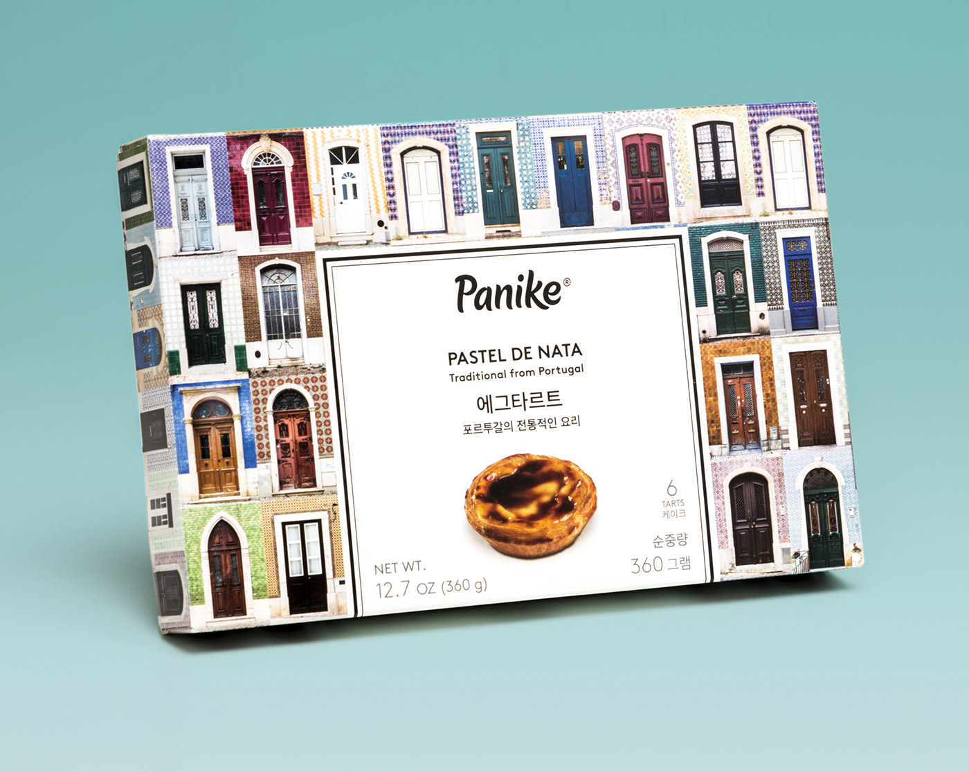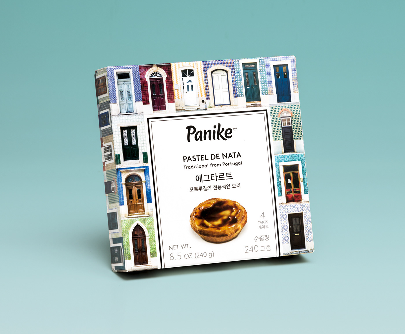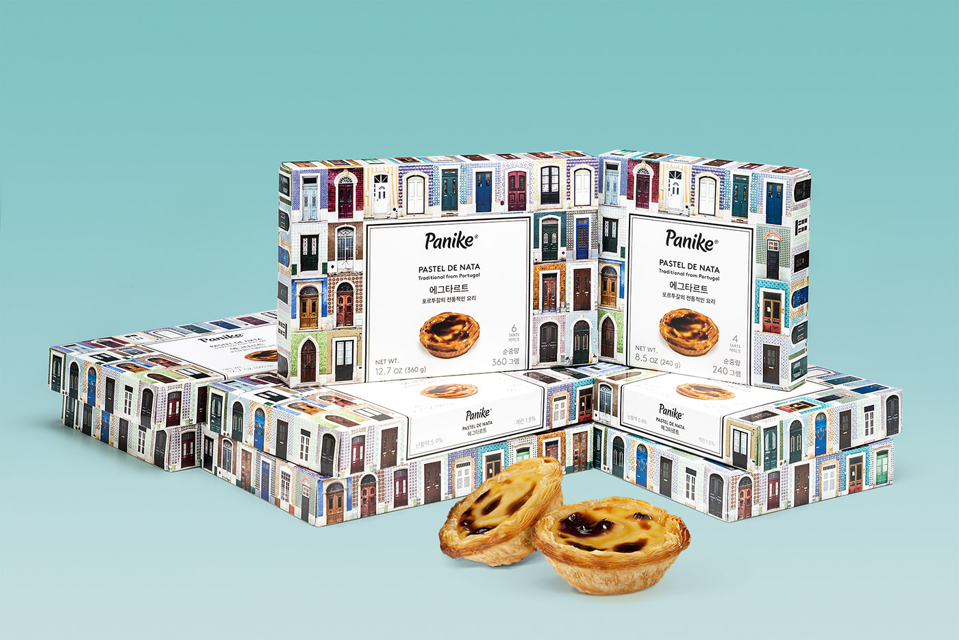
PASTÉIS DE NATA PANIKE
Our client told us that in South Korea this kind of pastry originally from Portugal was imported from China and Panike would be the first Portuguese company to bring the Authentic Pastéis de Nata to Korea, so they asked us to convey in this packaging the essence of Portugal.
We had the catchphrase: Lisbon, the gateway to Europe, which refers to the Age of Discoveries. Significantly, every tourist who travels to Portugal is amazed by its architecture, the cobblestone of its streets and, above all, the façades of its buildings. Pastéis de Nata are as well known in the Portuguese culture as their architecture. That is why we want the Korean consumer to see the product as a souvenir from Portugal and for that, we want to show the variety of facade designs that Portugal has. Thus, the Korean consumer can understand that the Pastel de Nata is the key that opens all the doors of Portugal, all the doors to the taste of the Luso country.
The photographs used to make the packaging are from a Portuguese photographer named André Vicente Gonçalves.
We were very thoughtful with the fonts used since the texts had to appear in both Korean and English (US). We had to use 2 fonts that were very similar in both writings. For Korean, we have used the Apple SD 산돌고딕 Neo font, and for English the Brown Std Font Family.
Nuestro cliente nos comentó, que en Corea del Sur solo existía este tipo de dulce original de Portugal, hechos en china y ellos serían la primera empresa portuguesa en llevar los auténticos pasteles de nata al estado Coreano, por lo tanto, nos pedía que transmitiéramos de la mejor manera, toda la esencia de Portugal.
Nos hemos quedado con la frase: “Lisboa, la puerta de Europa”, que hacía referencia a la época de los descubrimientos. Es muy significativo, que todo turista que viaja a Portugal, se queda maravillado de su arquitectura, el empedrado de sus calles y sobre todo, de las fachadas de sus edificios. Los pasteles de nata son tan reconocidos en la cultura portuguesa como su arquitectura. Por eso, queremos que el consumidor coreano, vea vuestro producto como un souvenir de Portugal y para ello, queremos mostrar la variedad de diseños de fachadas que tiene Portugal. Así, el consumidor coreano podrá entender que los pasteles de nata, son las llaves que abren todas las puertas de Portugal, todas las puertas al sabor del país Luso.
La fotografía que hemos usado para hacer el packaging, es de un fotógrafo portugués llamado André Vicente Gonçalves.
Con las tipografías hemos tenido mucho tacto, ya que los textos tenían que aparecer en coreano e inglés (US), por lo tanto debíamos usar 2 tipografías que fueran muy parecidas en ambos tipos de escrituras. Para el coreano hemos usado la tipografía Apple SD 산돌고딕 Neo, y para el inglés la Brown Std Family font.