Montage.ag
Farm management software that connects your office to your ranch map.

Make It Simple. Spur Growth.
Complexity and limited tools for organic growth along with a desktop-only design were primary challenges for improving a remarkable app.
Mobile First with Organic Growth
Montage built a robust portal for all the information you need to run a farm.
My task was to design a mobile-first version and to improve onboarding, adoption and organic growth.

Encourage Growth
Central to the design refresh was the 'onboarding tree': the user was prompted to complete 8 essential tasks and as each was completed the user would see a new branch grow on their virtual tree. The user got two branches completed upon sign up to give them a feeling of being on their way to understanding the software.
Simplicity
The new design is simpler. I cut the color labels from 14 to the 7 — and used simpler language for tips. Old instruction: Modify the field map by repositioning map vertices. New tip: You can edit your map by dragging its lines and handles.
The new design is simpler. I cut the color labels from 14 to the 7 — and used simpler language for tips. Old instruction: Modify the field map by repositioning map vertices. New tip: You can edit your map by dragging its lines and handles.
Empathy With Users
Challenge: Montage had a robust feature set, but it was complicated. I started with understanding our users which split between a middle-aged farmer used to paper management and the farmer's adult son who was digitally savvy.
Simplifying the UI gave the app a modern feel and make it easier for all users.
Mobile-First Design
A 'mobile-first approach' highlighted real estate challenges of how to show the navigation and input controls while still allowing for visible and usable ranch maps. Compare the space for the onboarding tree in mobile and desktop designs.
Saving Space
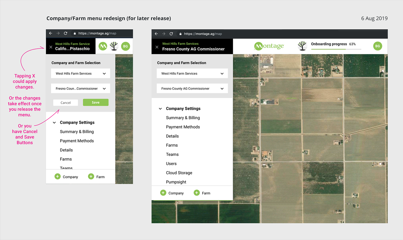
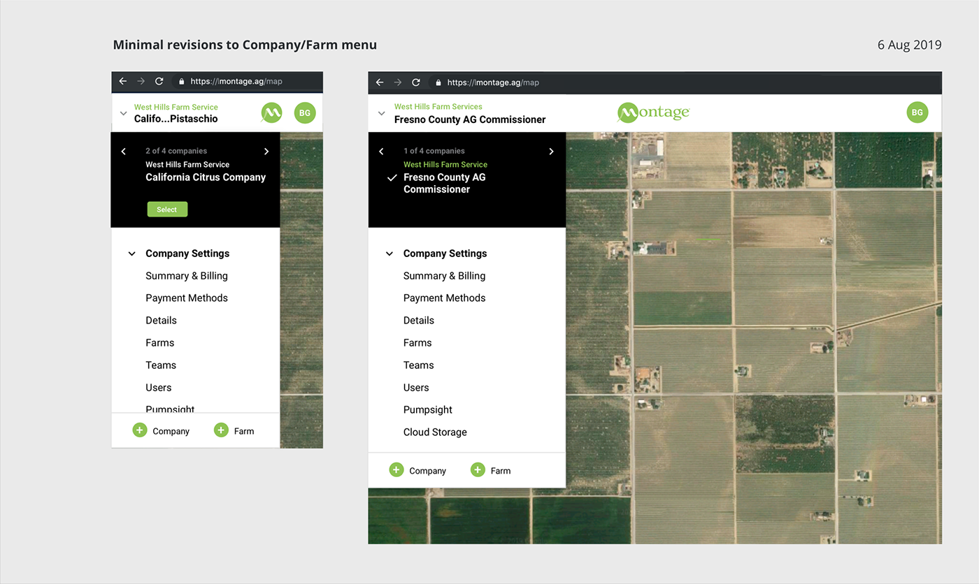
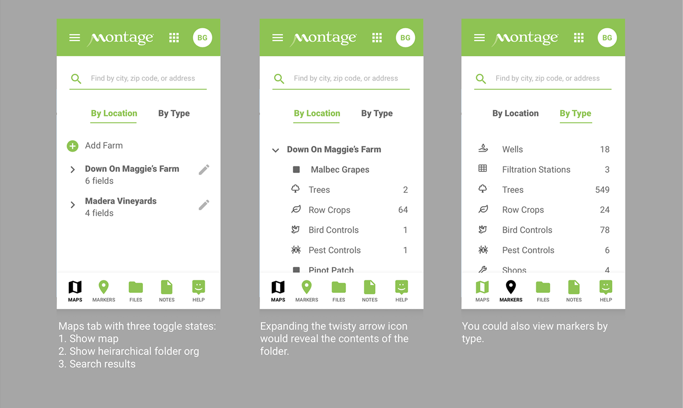
Working with engineers, we created a consistent system of icons and labels. Previous designs had redundancy with a "+" button with the label 'Add Farm'. Farm names were truncated at the end. Truncating in the middle of long farm names helped, as the end of the name often held identifying information.
Just In Time UI
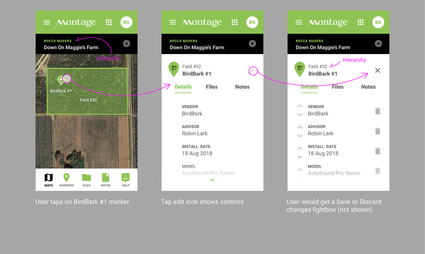
Engineers on the project had designed for all controls to be visible which made the app look complicated. Testing showed that users sometimes trashed important information by mistake. Here the trash/delete function is only visible when the user taps the edit icon.
White Space, Contemporary Navigation, and Big Icons
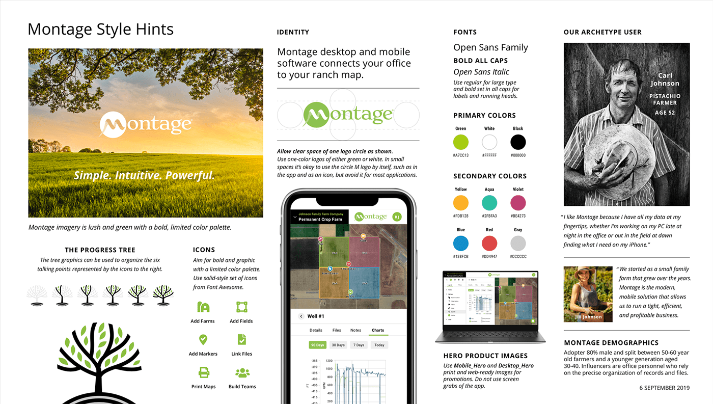
Our older users were less savvy with current UI trends. They didn't understand hamburger icons and were more comfortable with skeumorphic affordances — not so among their younger colleagues (often their sons). It would be a learning curve for the older users, so we opted for trends of modern UI design: ample white space and flat UI design. We used easy-to-see font sizes and weights and bold, simple icons to accommodate the vision of our older users.
Hide Complexity
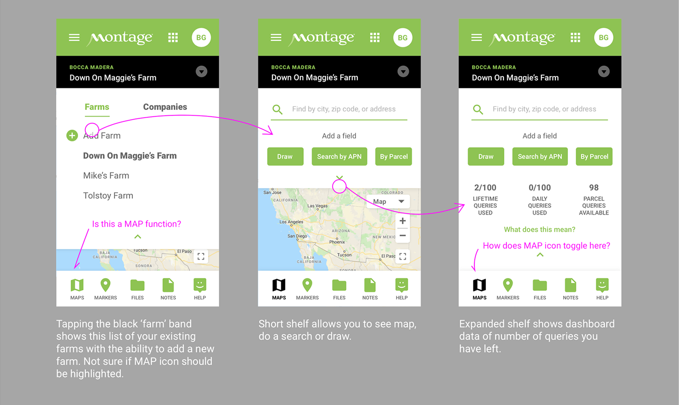
Users are limited to a 100 each of three kinds of searches or queries. This instruction was originally shown all the time which cluttered the page and scared new users. The idea here to tuck that information away as trial users aren't going to hit their limit for some.
I got your free trial, but what do I do?
The existing designs didn't offer much in tutorials or onboarding. To help users, I designed a tour, an onboarding "Growth Tree", and a big, friendly "+" button at the bottom to help users get started. Above is an early prototype showing the tour and the prominent action button. Midway through you can see how the design works on mobile.
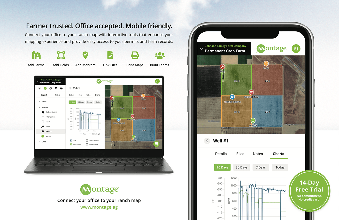
Feature Driven Promotions
The app went through rapid iterations as part of our agile development process while we were marketing the app. This promo was designed to focus on the product benefits without showing the existing UI, giving our marketing video a longer shelf life and freeing the team to make rapid changes to the UI and UX rather than updating promos.

