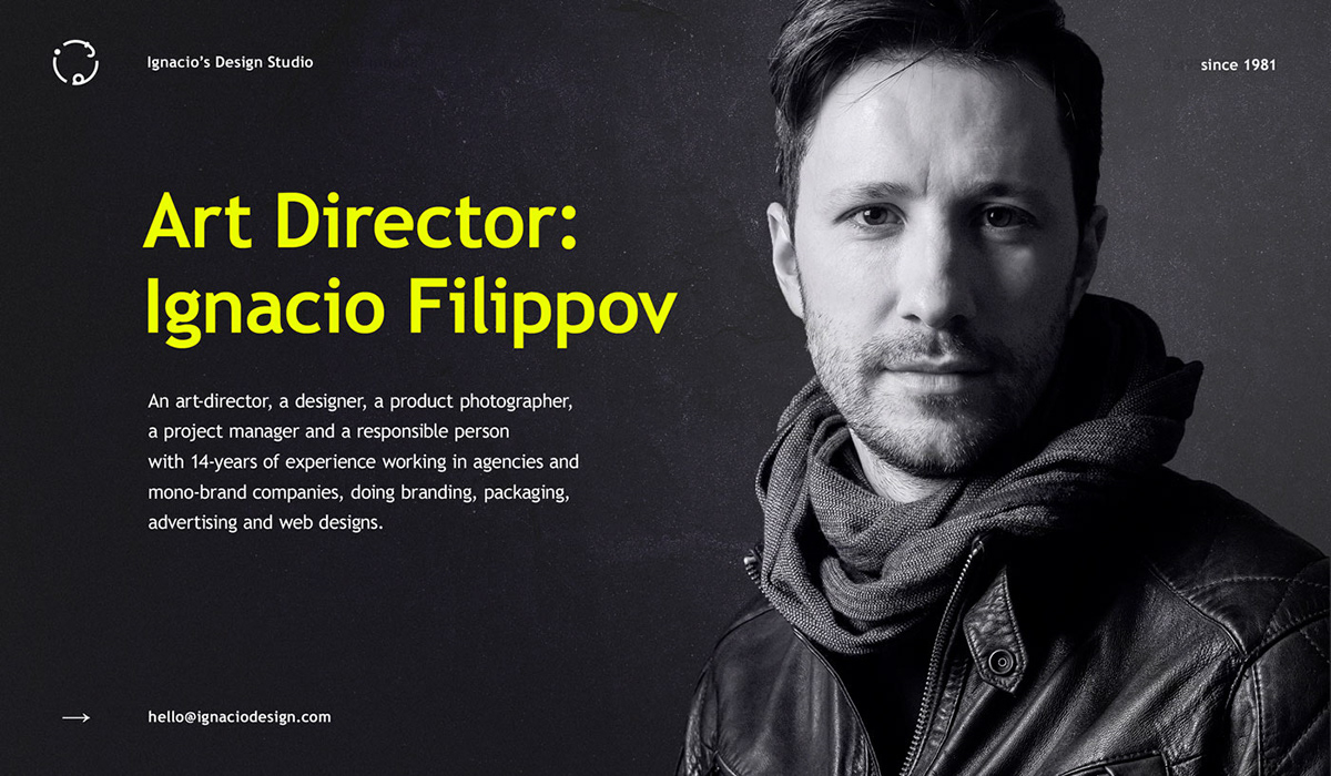
The task: to design a logo, a business card and a presentation of our studio.
Three letters — i, f, d (initial letters of the words Ignat Filippov Design) — are wrapped in a circle. The simple form of the logotype is easy to use wherever and however you want. Its laconic presentation reflects the approach in the studio work. The absence of direct associations does not prevent the studio from diversifying or changing its profile.

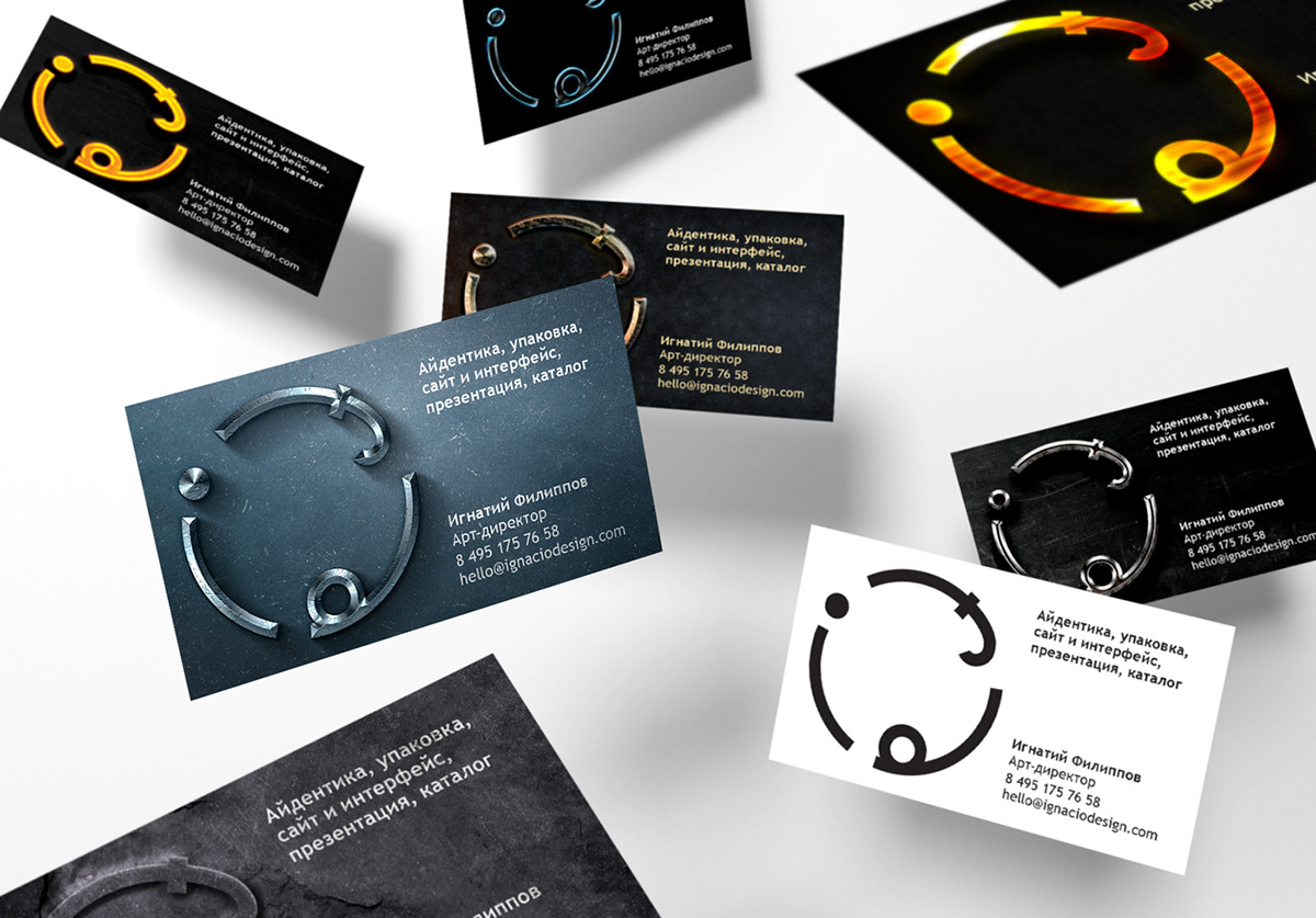
Personal cards have two moods: business and playful. And all funky variants are intended for printing in a single copy and can become as objects for collecting.
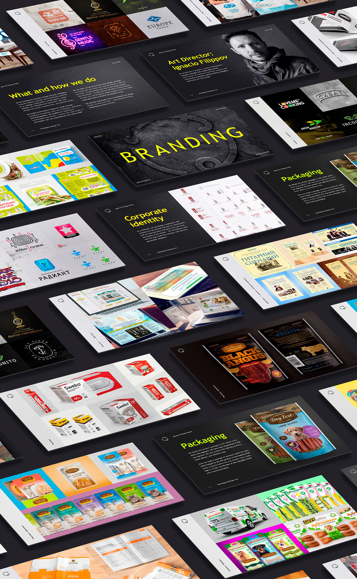
The studio’s presentation: