I begun for the most basic form of cuncussion, a crack.
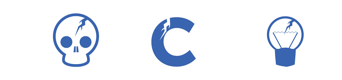
Once I have a recognizable crack, I apply it to different elements. I want to have a logo composed of the crack and something else but I also want to be able to use the crack by itself.

I decided to go with the skull and now I am going to try a few different designs.

This skull is very iconic and far enough from bad connotations. The typography is Museo sans. It is a clean typeface that match very well with the design of the skull.

I realized that the logo looks as the result of a concussion that happened in the past. It is not catching the moment, so I add the vibration of the concussion getting the final design.
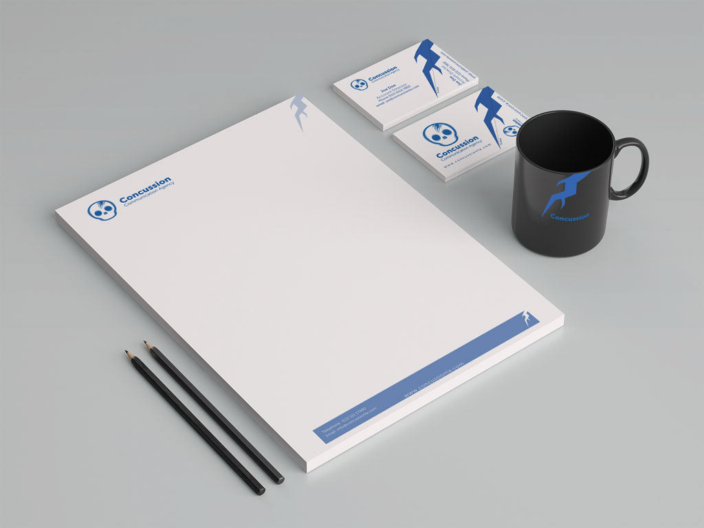
Some collaterals.

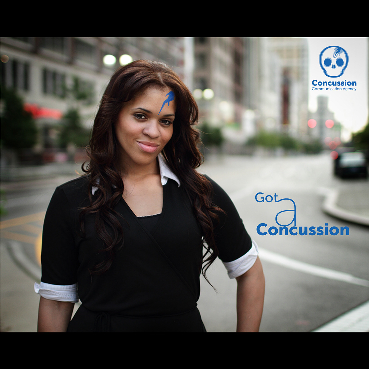
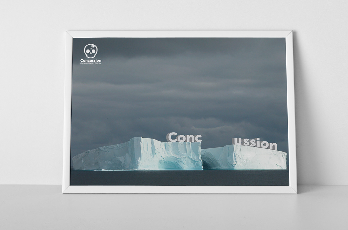
A couple of examples of how to use the brand and the creative path they should follow.