The Gladwell Company, an ice cream treats company, is a project created by Nate Lynch, who contacted me to create a handmade logo. They also required me to work with stripes patterns as branding elements and chosing a companion typeface.
The lettering
Previously, Nate did his own research and came to me with a lot of references and a very clear list of things that they wanted to convey with the lettering: Friendly, Modern Nostalgia, Whimsy, Simplicity, Crispness, Clarity, Quality, Dynamism, Legibility, Fun/Unexpected Ligatures, Unique “G”.

These are some of the early sketches done by hand for Gladwell – acompanied by Arboria Typeface.
The calligraphic approach is based on the brush formal writing.
The calligraphic approach is based on the brush formal writing.

Once the lettering was digitized I incorporated the typeface Arboria for the composition of THE COMPANY.
I tried different compositions, vertical, horizontal…

Final version of the lettering. The digitization process helped to improve the legibility, notice the differences between the first and the second, the first one has a different design for the G (more condensed and with loop) and the a (open).The second is the definitive one.

For the companion typeface, I chose Arboria from Type-Ø-Tones, a geometric sans serif typeface with a retro appeal.

The range of colors is very simple, red, blue, green and red. The gradients of blue and green are only used for the stripes.
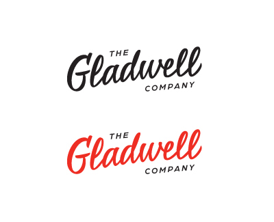
Final Logotype

These are some of the final applications: cards, sticks and the trolley.

Photos @The Gladwell Company

