ICARUS COMPLEX MAGAZINE
a biannual magazine focus on the issue surrounding climate change
-
design Atelier d'alves
editor Afsaneh Angelina Rafii
art direction Sergio Alves
designer Sergio Alves, Cátia Lima, Gilberto Ribeiro
illustrators André Carilho, Gonçalo Viana, André da Loba, Tomba Lobos
photographers Greg Khan (cover), Daniel Beltrá, Grant Hindsley
-
www. icaruscomplexmagazine.com
www.atelierdalves.com/projects/icarus-complex-magazine/
-
Project’s intended purpose
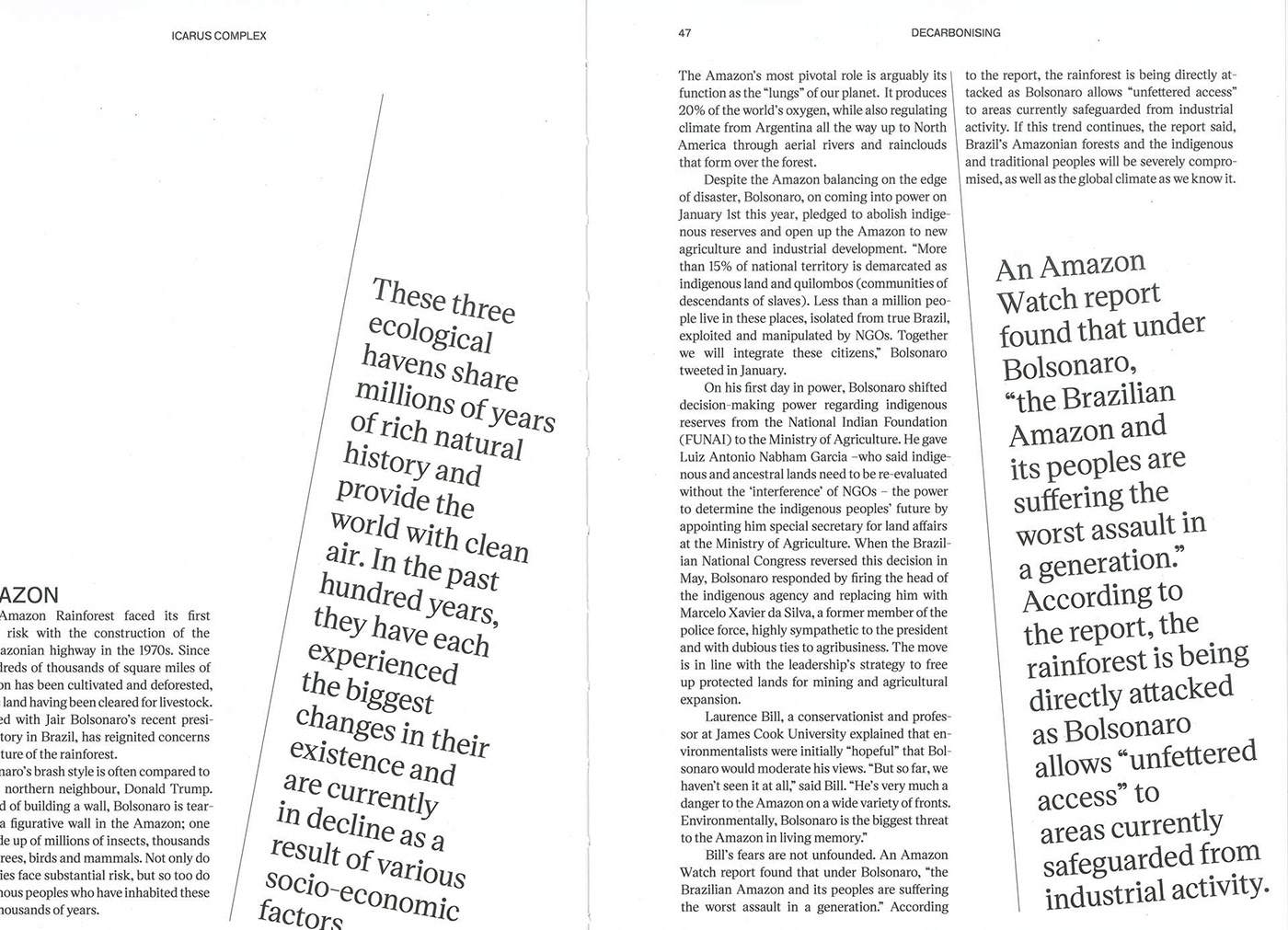
Icarus Complex Magazine is really a project that arose to fill a gap in the magazine market. Over the course of 2018 we kept slowly being confronted with the magnitude of the climate crisis and at the same time left to observe that no major shifts were happening as a response. There was more coverage in mainstream news but often the coverage was focused on particular geographical issues or tainted by political affiliation.
We set out to create a magazine that would take an in-depth look at the macro issues surrounding climate change. What are the challenges and what are the potential weapons of action from an economic, political, legal and grassroots perspective?
The publication aims to dissect humanity’s Icarus complex, this idea that we have jumped off a cliff, mid-flight and confident in our own momentum, but in denial about the impending crash if we do not change course. And though we believe that climate change should be recognised as the most essential threat facing humanity today, we do not want that recognition to be coupled with a sense of fatalism. We refuse to be complacent.
That’s why we sought to look at the issues and solutions around climate change in a holistic way, and inspire individuals and institutions to not only take, but also demand both institutional and governmental action. We want to ask the right questions, so that we can help point to the right answers.
Approach
Our aim was to create a serious, intellectually engaging publication that was visually striking. through its sleek design and compelling photography. With our well-researched articles, we wanted to attempt to navigate the fine line between rattling the reader’s sense of revolt and the propensity we all have to switch off and bury our head in the sand.
The challenge was to create a magazine that appeals to a mainstream audience while being part of the new wave of indie magazines. We wanted to be beautiful, but not too beautiful. We didn’t want the aesthetics to be used to drown out the message of the magazine, its content - our intended contribution to move the needle of change. We needed the aesthetics to work at the service of the content.
Result
We sought to create that balance through the typography first. Allowing it to navigate the type of content and creating a rhythm that always keeps the reader alert, and we wanted to do this with just two type weights. Victor serif Medium and F Grotesk book appeared as the perfect couple.
Of course, the themes and content that are at the heart of the magazine are serious, but we didn’t want to always stay politically correct and polite. We needed to give a voice to it and the most efficient way to do that was to measure graphically the tone we could and should give to the typography.
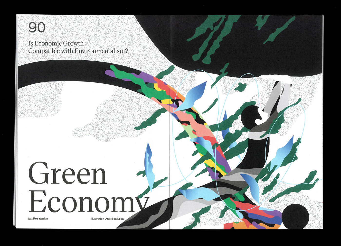
But the typography doesn’t stand alone. The photography and the illustration work side by side with the content. In terms of the illustration, the challenge was do understand what was the perfect balance. Not all the articles were “illustratable”. We wanted to give illustrators the opportunity to create their own version of the “story”.
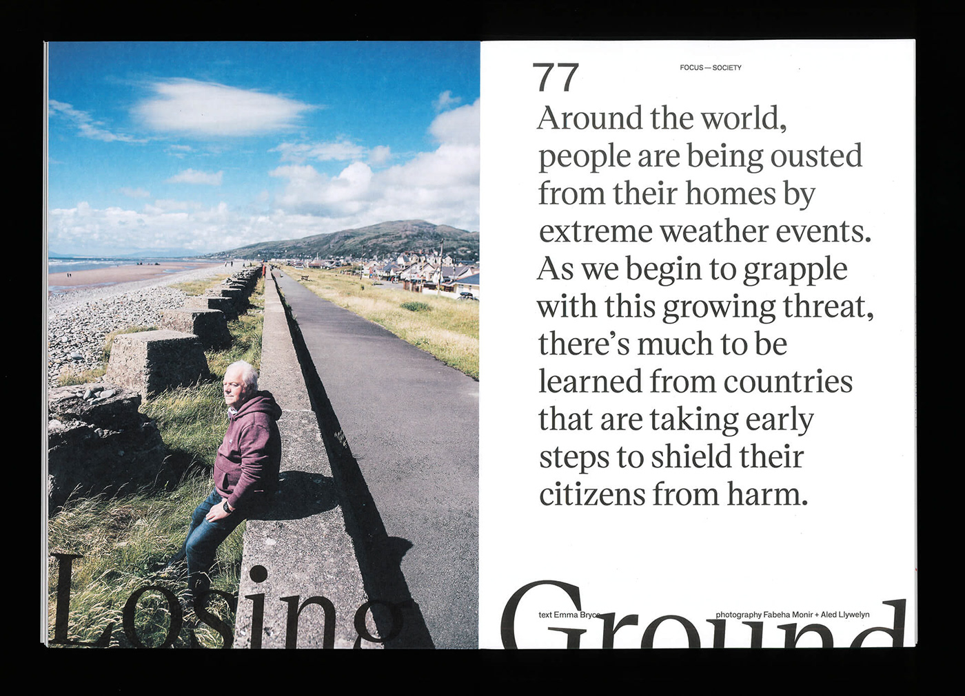
We knew that finding the right photographic images could prove challenging. We were on a journey surrounded by thousands of images and we needed to understand what were the ones that showed what we wanted to show. Not what people want to see necessarily, not what people normally see, but again a perspective that confronts the reader with something that is not obvious.
The cover for example. It would have been easy to find a “punch in the gut” image that shows a developing country, with a kid crying in a middle. It’s not to say that such an image wouldn’t work, but it would not have conveyed the message we were so desperate to convey, namely that climate change is not a far way problem, it doesn’t just impact areas of the world that are far away from our reality. Climate change is here, just one door away. Greg Kahn’s work shows that reality perfectly. After we came across his work, we understood that was the perspective we wanted to show. The kid, in the middle of North Carolina that would be normally riding her bike in the street was now swimming.
All of this mixture creates an aesthetics that pushes the reader inside a theme that is not beautiful but needs to be treated with the maximum respect. Icarus Complex is an in-depth look at the issues surrounding Climate Change, and it is that “in-depth look” that the design approach serves.