De Novo Nutrition
FIT were first contracted by De Novo to help bring a consistent style to their brand, primarily on their social channels and then extending to a new range of packaging.
Shortly after, they decided this upgrade was only a facelift, and they wanted to dig a bit deeper and rebrand fully. We worked closely with them on their brand platform before any visuals were put together. We looked at their brand promise, mission statement and brand values. This ensured the brand identity had a solid base before it started to come together.
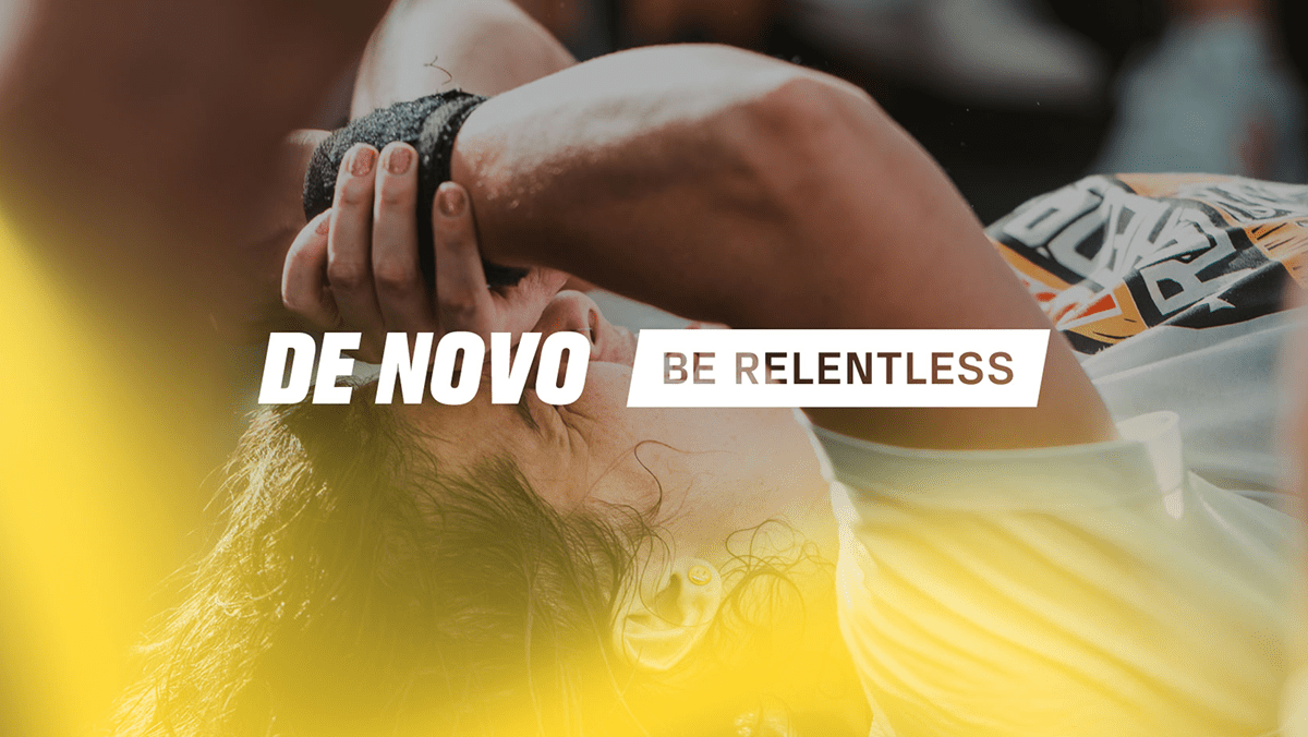
‘Be Relentless’ became everything the brand stands for. That never give up attitude. The constant strive to be better and do better than before. The bold logo and shorter DN mark was adopted to show stability and structure, with the slight forward angle suggesting a progressive brand with forward momentum. The visual language expands using the lines and gradients, suggesting a dynamic, constantly moving brand.


A large part of the new brand identity was bringing more to their social channels. This included generic sales posts, athlete announcements and engagement posts.
We also worked with the team to expand on some early ideas to bring the ‘Be Relentless’ mission statement to life through social campaigns and videos.
The #MYRELENTLESSFACE asked individuals to show us what they consider their Relentless face. For some it’s screaming down the lens of the camera, and for others, it was a calm exterior with a burning relentless drive deep within them.
Why I Train is a series of interview style videos featuring each of the De Novo athletes answering questions on why they train. For some it’s to be the best, and for some it’s just for the love of it.


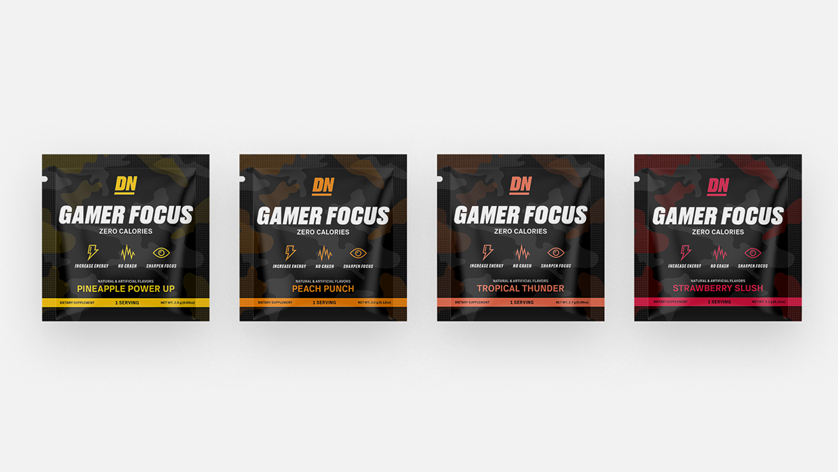
The largest part of the De Novo project was redesigning the packaging for their entire range of supplements. This included Utopia, Ignite, Suppress, Gamer Focus, Zen and a few other products not yet released.
We wanted the tubs to be more than just a label glued to plastic. There is a story being told, and an experience to be had. The wave pattern leads the customers’ eyes around the tub, revealing more of the information on either sides. The gradient colour is brighter at the centre of the tub. This was to suggest the focus and concentration you receive when taking the product. The flavour of the product is also denoted by the gradient colour.
We finished the tub using a matte varnish and metallic surface, further enhancing the customer experience when they can physically feel the difference in textures.


GAMER FOCUS is the same product as Utopia, but relabelled and targeted at the Esports/Gaming market. Supplements for gamers has been on the rise for a number of years now, but unfortunately a lot of these other products are full of sugar and caffeine and do not have the correct dosage of ingredients to work effectively.
We changed the look and feel of the label to reflect more of what a gaming audience would be used to seeing. We also adjusted the copy on the labels to speak to this new market, including renaming the flavours.
Sample packs were then designed for all flavours and products in the whole De Novo range. These have been used at various expos/conventions/powerlifting meets in both the USA and UK.