

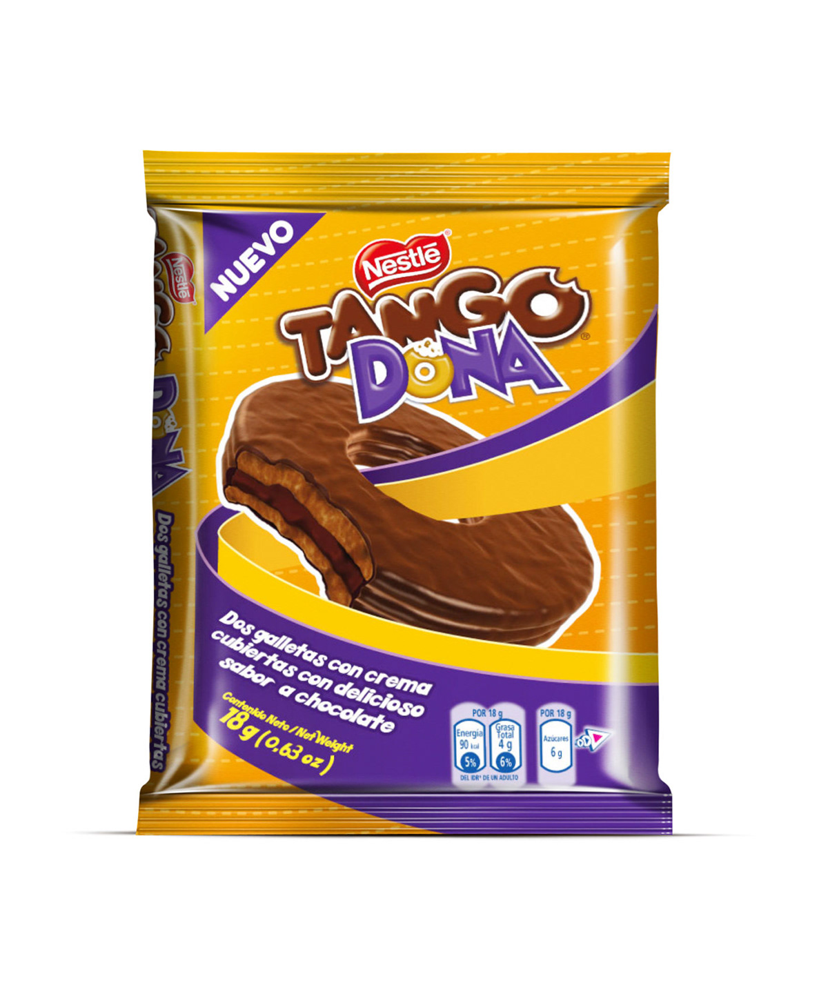
TANGO DONA
Packaging design.
Tango is a chocolate covered pair os biscuits with vanilla cream in the middle. It's a very strong brand in Nestle's Ecuadorian portfolio, so this year, the client wanted to create an innovation from the original product.
They created a new shape of the Tango with a hole in the middle, so we had to create a concept for this new shape, before we start designing the pack.

The resulting idea was to making it funny calling it simple as a Donut (Dona in spanish).
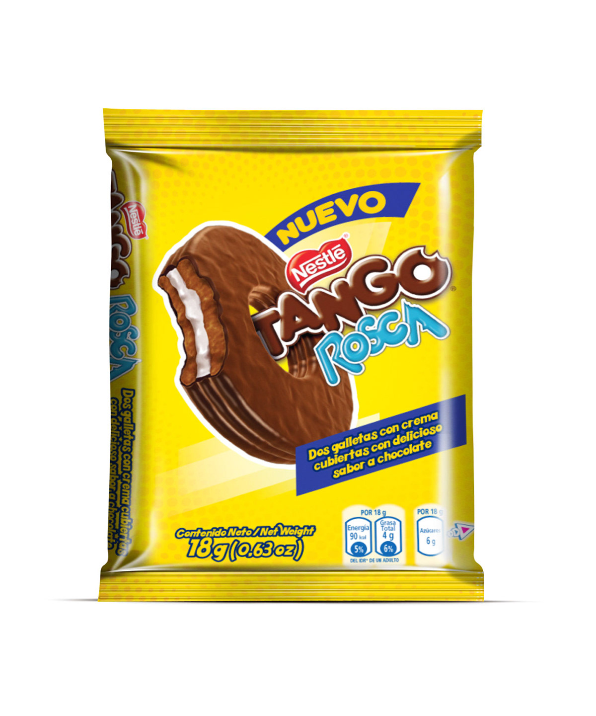
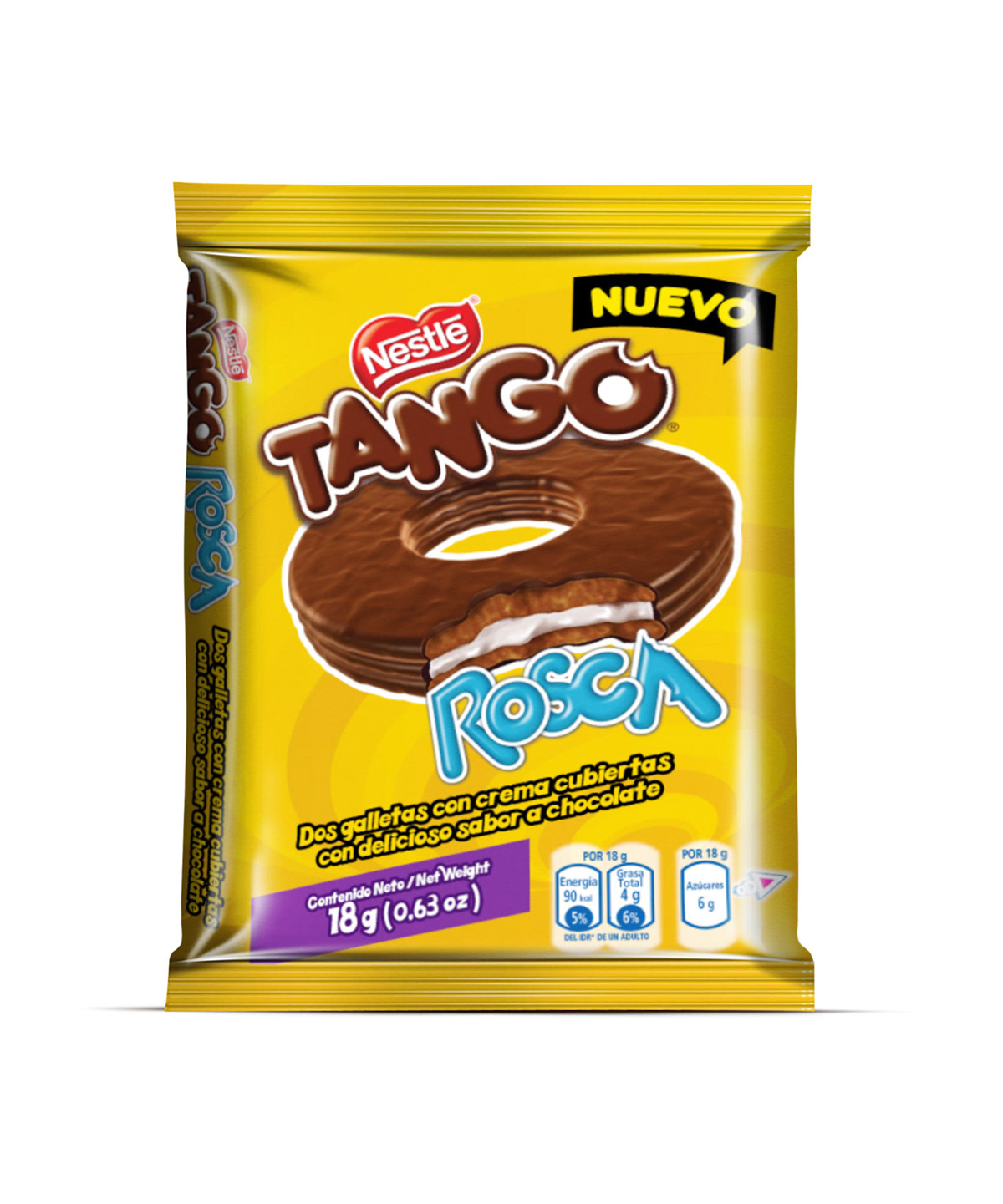
But, in Ecuador another rounded shape of bread is called 'Rosca', too.
So we decided to try with both names.
So we decided to try with both names.

First Logo design for the new product shape.
The next step, as my usual procedure, was to create the new shape of Tango in 3D to make my own perspectives or the packaging design.
Using C4D with only primitive objects and a simple texture, to make it easy. The resulting render was nearly what I wanted.


First render. The chocolate texture recipe is my own manufactured shader.

Then I made with Photoshop, a simple bite illustration.
Then I made my first packaging designs.
The original color of the regular Tango pack is orange. So, I decided to work with several options of colors, in order to make a difference of the Tango Portfolio, following the concept of fun.


In this option, the idea was to make the background silver plated, wich, it would make a really strong packaging design.
This is the same layout of the earlier design but trying to make a closer version of the regular Tango color.

In this option, because we use the name Donut, we decided to use a character known by it's love for donuts. Homer Simpson, sadly, this option wasn't approved by the client.
The client wasn't tottally happy with the earlier options.
The first change was to keep only the word 'Dona' (Donut). The other word was dismissed.
My new challenge was to create another packaging design, but keeping it closer of the regular Tango colors.
So, I made another Logo design options.


Another change was the flavor of the the cream and the biscuits. In the regular Tango the biscuts and the cream are made with vanilla flavor. So, In this new option, to make a real difference, they would make it with every layer in chocoalte flavor. So, a little adjustments in the illustration were made.


Despite the client's request, I also made two other options with different color. This two options handle the idea of making a real change in the Tango Portfolio, because another 3 innovations of Tango were in the road (Blackberry, mint and raspberry) and they will use their own color: green, violet, and magenta.
So, if we wanted to spot a difference, we needed to make a special color to this Tango.

Blue!

My idea to make a Silver Plated style pack, was to make a really eye-catching style in the store. And explaining this to the client, they were completely happy with this concept. So, this was the one they approved.
And after the printed color tests, This is the final result of this design.
The final illustration of the naked product was made by Alex Coello.

3D model of the Pack By David Chung.


