branding
Frutas Doce Mel
Frutas Doce Mel é mais que uma marca reconhecida internacionalmente. É um movimento que acredita no poder transformador da alimentação saudável. A história da Doce Mel começou na década de 80 com a tradição familiar de cultivar frutas, legumes e verduras na Paraíba, região Nordeste do Brasil.
Tomar a decisão de atualizar a marca nunca é simples, principalmente para uma empresa tradicional, familiar e líder em sua área de atuação. Nosso desafio nesse projeto de rebrand foi manter aspectos marcantes de sua identidade e, ao mesmo tempo, trazer um ar de renovação que transmitisse sua atitude para os próximos anos.
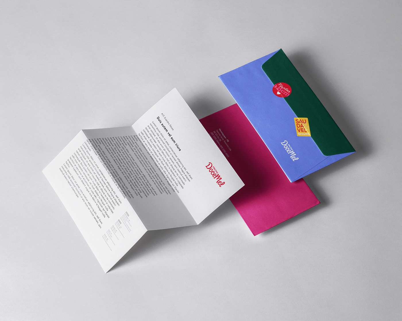
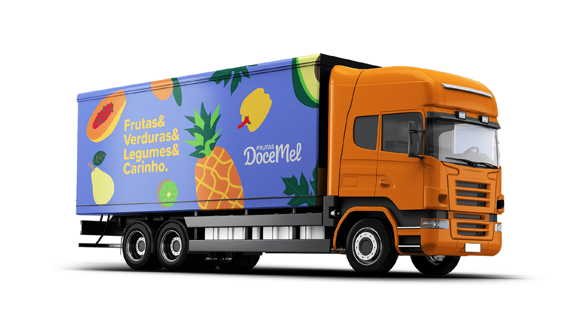
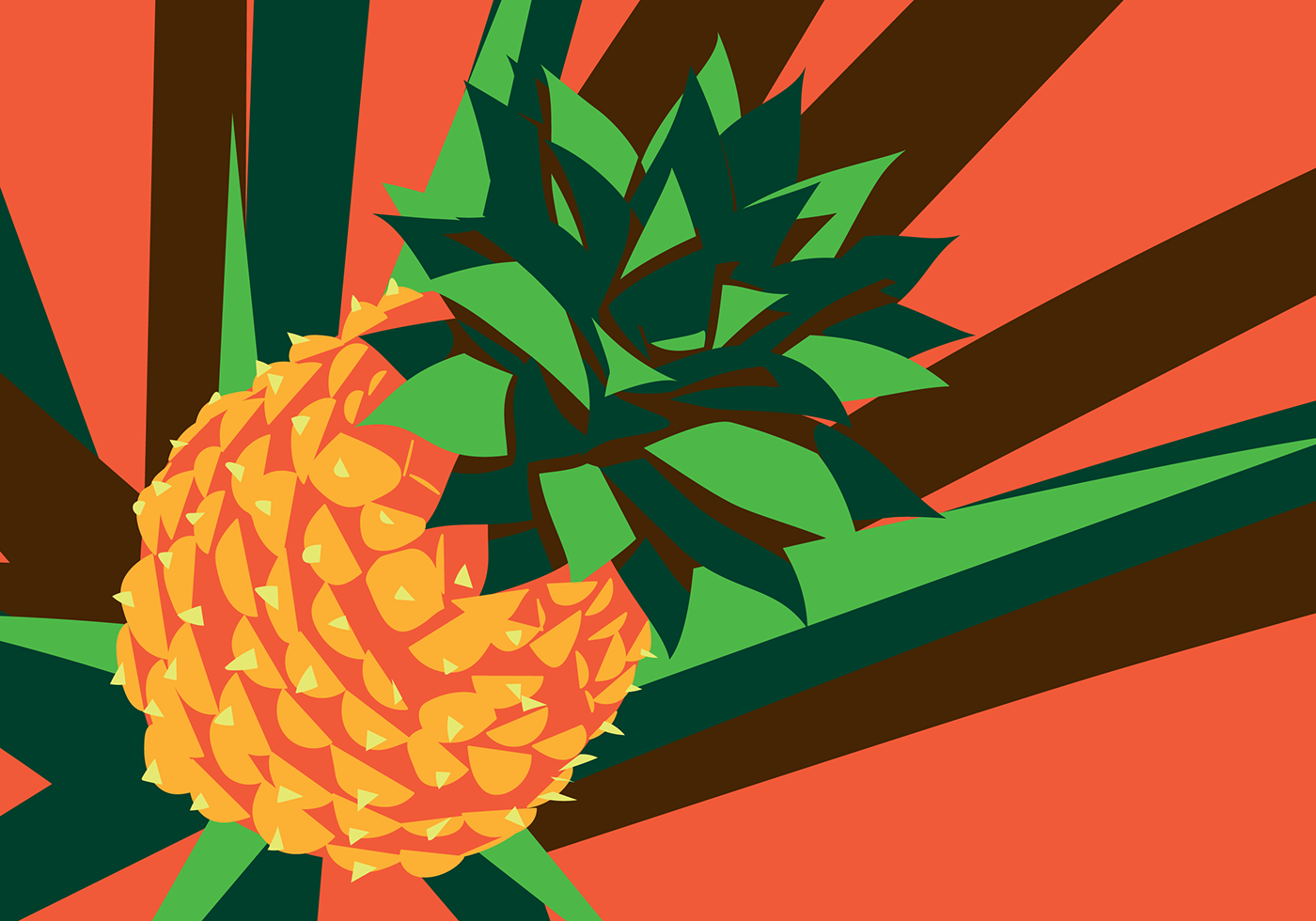
O conceito central da marca é "Sabores que inspiram". Isso informa a atitude do negócio e direciona toda a comunicação, que deve ser criativa, responsável e vibrante. Criamos uma identidade que transmite a ideia de um movimento em prol da alimentação saudável de forma divertida e inspiradora. Exploramos características estéticas das frutas, como cores e texturas. No logotipo, mantivemos o visual "líquido" e "suculento" da fonte sem ser tão literal.
A paleta de cores é diversa e vibrante. Tivemos a sensibilidade de nomear as cores inspiradas nos próprios produtos da empresa, facilitando a sua lembrança e uso no dia a dia. São as cores que dão o tom da série de ilustrações que fazem parte do arsenal de elementos da marca.
Doce Mel é a combinação de frutas & legumes & verduras & carinho. É inspiração para um estilo de vida "in natura".
Frutas Doce Mel is more than an internationally recognized brand. It is a movement that believes in the transformative power of a healthy diet. Doce Mel's history began in the 1980s with a family tradition of growing fruits and vegetables in Paraíba, Northeastern of Brazil.
Making the decision to update the brand is never simple, especially for a traditional, family-owned company and leading in its sector. Our challenge in this rebrand project was to maintain the main aspects of its identity and, at the same time, to bring an air of renewal that would convey its attitude for years to come.
The central concept of the brand is "Flavors that inspire". This informs the business attitude and directs all communication, which must be creative, responsible and vibrant. We created an identity that conveys the idea of a movement in favor of a healthy diet in a fun and inspiring way. We explored aesthetic characteristics of fruits, such as colors and textures. In the logo, we kept the "liquid" and "juicy" look of the font without being so literal.
The color palette is diverse and vibrant. We had the sensitivity to name the colors inspired by the company's own products, making it easier to remember and to use on a daily basis. It is the colors that set the tone of the series of illustrations that are part of the arsenal of elements of the brand.
Doce Mel is the combination of fruits & vegetables & affection. It is an inspiration for a "in natura" lifestyle.
2019