Student Project
Wolpertinger is a new alcoholic beverage being released to the public soon. It is a dark beer with the bold flavour that Germany has always been known to produce. Although new, the brand seeks to remind customers of the long history of German brew and give the feel of a traditional Bavarian beverage. Wolpertingers’s flavour can be describes as robust, hoppy, and enriching.
Wolpertingers’s target audience is males from ages 25 to 35. Beer connosseurs and classical men alike are invited to enjoy the experience that Wolpertinger provides. Not one customer should be ashamed to drink Wolpertinger in any situation. In order to maintain the proud image of Wolpertinger, it is to only be sold in bottles or draught.
The name of Wolpertinger derives from the name of a mythical creature said to inhabit the Black Forest of rural Bavaria. The creature is best described an American cryptid jackalope but with the addition of wings and fangs.
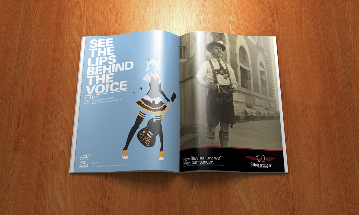
For the print ad series of Wolpertinger, the stance of making a point of Wolpertinger’s authority on authentic Bavarian beer was taken. Consumers want to know that what they are drinking is true to its word. Bavarian scenes were a theme featured in the packaging and the print advertising should continue with that. The Bavarian trope addressed in the series is the famous lederhosen. Each image in each advertisment would feature a hosen-clad person related to the Wolpertinger experience. The people featured in the prints are Wolpertinger’s founder, employees, and fans. Each of these people give off an air of true Bavarian culture and therefore carry that impression onto the Wolpertinger name. The images have been colour matched so as to support the continuity of the series. The desaturated colour gives a more classic feel as well.


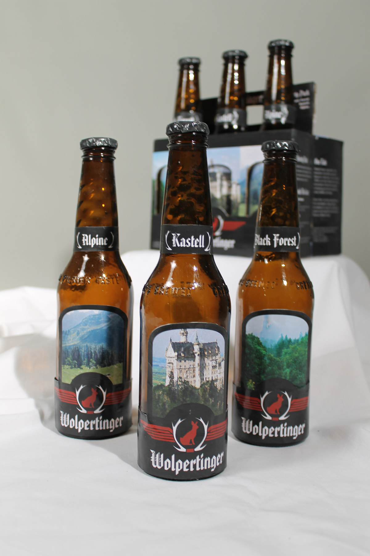
The packaging for the bottles was created with the intention of once again pushing the feel and authority of a Bavarian brewery. To accomplish this, each bottle features a Bavarian scene such as the Black Forest, the mountains, or the castles. Each box would have a die-cut in the image on the side. Here, I bottle would have the same image printed on the label so that when inserted, it would complete the scene.